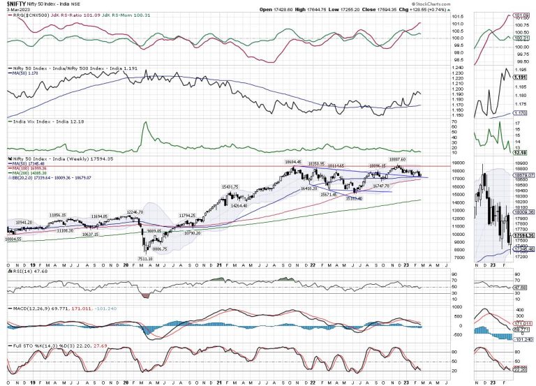
It was largely a troubled week for the Indian equities as the markets spent four out of five days struggling to keep their head above the crucial 200-DMA which currently stands at 17404. Had it not been for Friday which saw a sharp surge in the Indices, the week was very much on track for a negative close. Given the decline in overall volatility, the trading range of the markets remained narrow. As compared to the previous week where the NIFTY moved in the 582.55 points range, the index moved in a 389.55 points range. However, while it was able to keep its head above the important 200-DMA, the headline index ended with a net gain of 128.55 points (+0.74%) on a weekly basis.
The coming week will be a truncated one; Tuesday will be a trading holiday on account of Holi. The importance of VIX levels has resurfaced again; INDIAVIX is again at one of its lowest levels seen in the recent past. The previous week has seen INDIAVIX coming off by 14.13% again to 12.18. This is something that warrants caution again. While we approach the markets, one eye will have to be on the volatility as such low levels of volatility depict the complacency of the market participants and often ends up giving a rude shock to the indices.
Besides this, from a technical perspective, NIFTY has taken support on a falling trend line which also coincides with the 50-Week MA which is currently placed at 17345. This level marks an immediate for the NIFTY on a closing basis. The coming week is likely to see a quiet start to the week; the levels of 17650 and 17800 will act as likely resistance levels. The supports come in at 17350 and 17180 levels.
The weekly RSI is 47.68; it remains neutral and does not show any divergence against the price. The weekly MACD is bearish and trades below the signal line.
The pattern analysis of the weekly charts shows that the NIFTY has formed a minor falling channel on the charts. Besides that, the index has taken support on a falling trend line; this trend line begins from the high point of 18350 and joins the subsequent lower tops. This pattern support also coincides with the 50-Week MA which currently stands at 17345. This makes the zone of 17350-17400 an immediate support zone for the NIFTY.
Overall, the sharp decline in volatility over the previous week and with INDIAVIX at breaching the most immediate low point seen in early February is certainly a cause of concern. It may not cause any immediate harm but persistently low levels of volatility denote complacency of the market participants. Any spike in the VIX will adversely impact the markets in general. Even if there is no major decline, it is capable of injecting markets with some spikes in the near term. It is strongly recommended that one needs to keep leveraged exposure at very modest levels and stay invested in the low beta stocks and with the ones that have improving relative strength. A cautious approach is advised for the coming truncated week.
Sector Analysis for the coming week
In our look at Relative Rotation Graphs®, we compared various sectors against CNX500 (NIFTY 500 Index), which represents over 95% of the free float market cap of all the stocks listed
The analysis of Relative Rotation Graphs (RRG) shows NIFTY PSE, Auto, FMCG, and IT indices firmly placed inside the leading quadrant. The MidCap 100 Index has also rolled inside the leading quadrant. These groups are likely to show resilience and may relatively outperform the broader NIFTY500 Index.
The NIFTY Infrastructure index has rolled inside the weakening quadrant. Besides this, Banknifty, Metal, Services Sector, Financial Services, Commodities, and PSU Bank Indices are inside the weakening quadrant.
NIFTY Energy Index is seen badly languishing inside the lagging quadrant along with the Media Index. It may continue to relatively underperform the broader markets. The Realty Index is also inside the lagging quadrant; it is seen improving its relative momentum against the broader markets.
NIFTY Consumption Index is inside the improving quadrant along with the Pharma Index. Both these indices are seen slightly giving up on their relative momentum against the broader NIFTY500 index.
Important Note: RRG™ charts show the relative strength and momentum of a group of stocks. In the above Chart, they show relative performance against NIFTY500 Index (Broader Markets) and should not be used directly as buy or sell signals.
Milan Vaishnav, CMT, MSTA
Consulting Technical Analyst

