Archive

2024

Browsing

It made it! The Dow Jones Industrial Average ($INDU) closed above 40,000 for the first time, another record close for the index. What an exciting week!

And most of that excitement came in the last few minutes of the trading week. We’ll take it. After a few weeks of lethargic activity in the stock market, the optimism is back.

Get the live chart.

CHART 1. DOW JONES INDUSTRIAL AVERAGE CLOSES ABOVE 40,000. Investors will be looking for the upside momentum to continue next week.Chart source: StockCharts.com. For educational purposes.

A Recap of Stock Market Activity

The stock market regained its mojo on Wednesday, when inflation data came in cooler than expected. It then took a bit of a breather on Thursday and, for the most part, on Friday, but the last few minutes of the trading day did reinject some optimism, which is unusual for end-of-week trading. The stock market got what it wanted, reacted, and then decided to get a head start on the weekend.

Next week, investors will be focused on looking for upside follow-through. Now that interest rate hikes are off the table and it looks like cuts will happen sometime this year, investors have renewed their confidence in the stock market.

Get the live chart here.

The CBOE Volatility Index ($VIX) continues to be low, further confirming that investors are complacent. $VIX is close to its December 2023 lows, when investors’ confidence in equities reignited following the October 2023 lows.

CHART 2. DAILY CHART OF THE VIX. The VIX is close to its December lows, coinciding with the time investors renewed their confidence after the pullback in October.Chart source: StockCharts.com. For educational purposes.

While equities have trended toward the upside, commodities have also broken out. The daily chart of the Invesco DB Commodity Tracking Index Fund (DBC) shows the index has broken out above a downward trending channel, suggesting that the pullback in commodities may be behind us.

Follow the live chart.

Commodities are inflation-sensitive, and, given that inflation may be cooling, commodities may be breaking out of the flag pattern you see in the chart below.

CHART 3. COMMODITIES BREAKING OUT. Commodities are also showing strength as they break out from a flag pattern.Chart source: StockCharts.com. For educational purposes.

Get your live chart here.

Copper and silver prices soared on Friday, and gold looks like it’s on its way to revisit its all-time highs. Silver saw a significant breakout on Friday. It’s worth looking at the chart of iShares Silver Trust ETF (SLV) to get a sense of the breakout magnitude.

CHART 4. SILVER SEES SIGNIFICANT BREAKOUT. The iShares Silver Trust ETF (SLV) has broken above its 2021 high. How much higher can it go? The next resistance is at around $35.Chart source: StockCharts.com. For educational purposes.

SLV has broken out above its February 2021 high. The price action on Friday suggests that price will continue higher next week. The next resistance level could be the 2012 highs, which is around $35, so there’s room for upside movement in SLV. If you want to get in on the silver rally, opening a position in SLV may be something to consider. However, be sure to identify your stop losses before entering a trade. Although SLV seems poised to move higher, anything can reverse the move. Make sure you’re comfortable with the risk/reward ratios.

SLV is well above its 20-week exponential moving average, and the Percentage Price Oscillator (PPO) shows that momentum is rising. If the trend continues, then SLV could see a strong rally. It’s been a while since silver got some love.

And There’s NVIDIA

Next week should be interesting. The highlight is NVIDIA’s earnings—the company reports on Wednesday after the close. Analysts estimate earnings to come in at $5.57 and revenues at $24.57 billion. If NVIDIA (NVDA) beats, it could be a big catalyst for the markets to move higher. But the worry would be if NVDA misses expectations. A downside move would be of a much greater magnitude than an upside move. NVDA has had a significant impact on the stock market’s performance, so just about every investor will be tuned in to the news after the close on Wednesday.

End-of-Week Wrap-Up

S&P 500 closes up 0.12% at 5,303.27, Dow Jones Industrial Average up 0.34% at 40,003.59; Nasdaq Composite down 0.07% at 16,685.97$VIX down 3.46% at 11.99Best performing sector for the week: TechnologyWorst performing sector for the week: IndustrialsTop 5 Large Cap SCTR stocks: MicroStrategy Inc. (MSTR); Vistra Energy Corp. (VST); Super Micro Computer, Inc. (SMCI); Robinhood Markets (HOOD); Vertiv Holdings (VRT)

On the Radar Next Week

 Earnings from Nvidia (NVDA)Fed speechesApril Existing Home SalesNew Home SalesMay Michigan Consumer Sentiment

Disclaimer: This blog is for educational purposes only and should not be construed as financial advice. The ideas and strategies should never be used without first assessing your own personal and financial situation, or without consulting a financial professional.

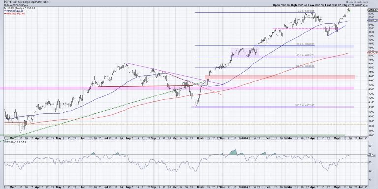
As the S&P 500 and Nasdaq 100 have once again made new all-time highs, and the Dow Jones Industrial Average has briefly broken above the 40,000 level for the first time, how should we think about further upside for our equity benchmarks?

There are two general ways to play a chart pushing higher into uncharted territory, pun intended. First, we can use technical tools to identify potential upside objectives, using things like Elliott Wave or Gann or pattern measurements. I tend to avoid this sort of approach, only because I’ve learned that when something is working, you want to keep it working as long as possible!

Peter Lynch famously compared this approach to growing a garden. If you’re selling your winners and doubling down on your losers, it’s like pulling your flowers and watering your weeds! To grow a beautiful garden, you want to pull the weeds and water your flowers.  So in a portfolio context, that means riding winning stocks higher as long as they continue to help your portfolio.

So the second general approach is to become a trend-follower, tracking the uptrend and looking for signs of any change in that trend. Here’s one chart I’m using now to make that general assessment for the S&P 500.

This chart has three series, starting with a high yield index option-adjusted spread from Bank of America. If you’re confused by that wordy title, allow me to simplify. Bonds are quoted in terms of a spread above a risk-free rate. So US Treasury bonds are considered a “risk-free investment” because it is highly unlikely that the US government would be unable to pay interest on their debt obligations. Any corporate bond, issued by a particular company, by definition will bear additional risk than a Treasury bond. So a corporate spread of any kind tells you the additional yield you should expect to receive for taking on that additional risk.

Lots of corporate bonds include call options, meaning the bond can be redeemed by the company before maturity. In this case, we’re using an “option-adjusted spread”, which means you are stripping out those options to compare bonds on more of an apples-to-apples basis. And this spread is based on high-yield or “junk” bonds, meaning the bonds of risky companies with lower credit scores.

So to summarize, we are tracking how much of a spread bond investors are demanding for taking on the risk of junk bonds. I’ve plotted this series upside down because wider spreads mean additional risk, which usually means bad news for equities. You can see that when spreads are widening (the line is going lower on this chart), that tends to coincide with downtrends for the S&P 500 (bottom panel). Conversely, narrowing spreads tend to coincide with uptrend for the major equity indexes.

High-yield spreads are currently at the lowest levels in years, suggesting that bond investors are expecting a low-risk environment for the foreseeable future. If and when we see spreads start to widen, as they did in early April, that would be a bearish sign for stocks.

The middle series shows the VIX, because markets tend to rise on low volatility and stocks tend to drop with much higher volatility conditions. I’ve plotted this series upside-down as well, because it makes it easier to compare volatility to the S&P 500 trend. The VIX is also at its lowest levels that we’ve seen in the last two years, demonstrating what I would describe as a low-volatility environment. If and when the VIX would increase above 15, and especially if it would eclipse the 20 level, that would indicate a much more bearish environment for risk assets like the S&P 500 and Nasdaq 100.

To be clear, this chart is currently quite bullish, with the S&P 500 trending higher along with narrow high-yield spreads and very low volatility. If and when we see a widening of credit spreads, and if and when volatility begins to increase, that could be a great opportunity for equity investors to really question the sustainability of the bull market phase.

RR#6,

Dave

P.S. Ready to upgrade your investment process? Check out my free behavioral investing course!

David Keller, CMT

Chief Market Strategist

StockCharts.com

Disclaimer: This blog is for educational purposes only and should not be construed as financial advice. The ideas and strategies should never be used without first assessing your own personal and financial situation, or without consulting a financial professional.
The author does not have a position in mentioned securities at the time of publication. Any opinions expressed herein are solely those of the author and do not in any way represent the views or opinions of any other person or entity.

Top 5 Stocks in “Go” Trends

Trend Continuation on Rising Momentum

GoNoGo Charts® highlight low-risk opportunities for trend participation with intuitive icons directly in the price action. The resurgence of momentum in the direction of the underlying price trend is an excellent entry opportunity, or the chance to scale up positions.

GoNoGo Icons® illuminate these events on the chart with green solid circles (or red circle to highlight continuation of NoGo trends). When GoNoGo Trend® is painting blue or aqua bars, a green solid circle will appear below price each time GoNoGo Oscillator® finds support at zero.

Below are the top 5 stocks/ETFs in “Go” trends with surging momentum by volume in the S&P 500 as of the daily closing price action:

StockCharts Scan for GoNoGo “Go” Trend Continuation

Walmart Inc – (WMT)

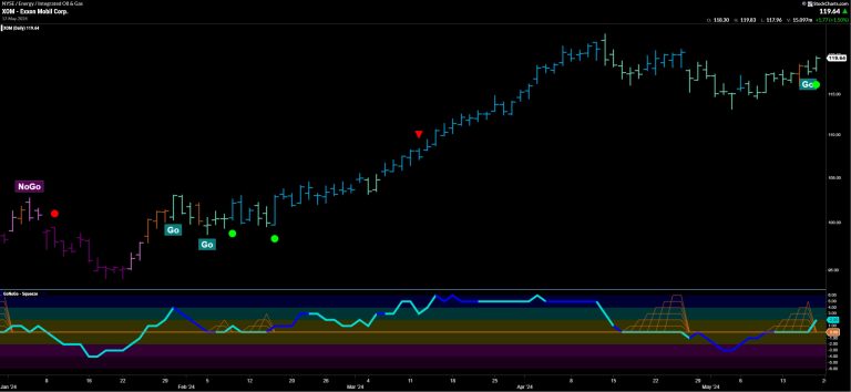
§ GoNoGo Icons signaled a trend continuation on Thursday (05/16/24).

§ After Wednesday’s reversal candle on neutral amber trend conditions, price action gapped higher finishing the week on strong “Go” conditions painting blue bars.

§ GoNoGo Oscillator found support at the zero line, racing higher to overbought momentum on Friday.

§ Walmart has traded on heavy relative volume all week.

General Motors Co. (GM)

§ GoNoGo Trend returned to strong blue “Go” conditions to conclude the trading week at prior highs just under $46/share.

§ GoNoGo Icons signaled a trend continuation on Thursday (05/16/24).

§ GoNoGo Oscillator ended the week in positive territory breaking out of a Max GoNoGo Squeeze® as momentum compressed at the neutral zero line the past two trading weeks.

Newmont Corporation (NEM)

§ GoNoGo Trend sustained strong blue “Go” conditions to throughout the trading week.

§ GoNoGo Icons signaled a trend continuation on Friday (05/17/24).

§ GoNoGo Oscillator ended the week in positive territory after retesting the zero line on light relative volume.

American Intl Group, Inc. (AIG)

§ GoNoGo Trend returned to strong blue “Go” conditions to end this trading week.

§ This recovery follows weakening trend conditions and corrective price action.

§ GoNoGo Icons signaled a trend continuation on Friday (05/17/24).

§ GoNoGo Oscillator tested and found support at the zero line.

§ Momentum broke to positive territory on Friday rallying on heavy relative volume.

EQT Corp. (EQT)

§ GoNoGo Trend ended the trading week on strong blue “Go” conditions.

§ GoNoGo Icons signaled a trend continuation on Wednesday and Friday (05/17/24).

§ GoNoGo Oscillator entered the trading week at the neutral zero line, building a small squeeze, rallied, and retested before ending the week in positive territory again on Friday.

§ EQT Corp. has traded on light relative volume since early May.

On this week’s edition of StockCharts TV‘s StockCharts in Focus, Grayson walks you through the “heart and soul” of StockCharts – Your Dashboard – and explains how he customizes his layout to serve as a one-stop-shop for following the latest market action. Grayson demonstrates how the “Chart Panels” can be configured to serve as a helpful index-tracking tool, bringing advanced charts right into your dashboard alongside the other powerful features.

This video originally premiered on May 17, 2024. Click on the above image to watch on our dedicated StockCharts in Focus page on StockCharts TV.

You can view all previously recorded episodes of StockCharts in Focus at this link.

Both the S&P 500 and the NASDAQ are sitting at new highs as we wind down a very positive earning season. So far, almost 80% of S&P 500 companies have reported a positive earnings surprise, with the year-over-year earnings growth rate at the highest level since Q2 of 2022.

Amid this corporate growth, we’re now seeing interest rates pull back following Wednesday’s core CPI data, which came in lower than expected. In response, the yield on the key 10-year treasury bond fell to as low as 4.3% before ticking higher into today’s close.

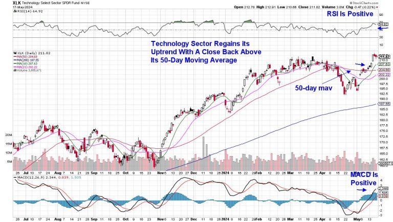
This is great news for growth stocks such as Technology, which have been struggling as the markets march to new highs. A rising rate environment is a negative for growth stocks such as Technology.

Daily Chart of Technology Sector (XLK)

While Apple’s (AAPL) 12% advance following the release of their earnings 3 weeks ago is certainly a factor in Technology’s new uptrend, a reversal in both Semiconductor and Software stocks this past week is poised to be the latest driver.

As subscribers to my MEM Edge Report are aware, I’ve been on the lookout for renewed interest in these high growth areas, as our watchlist had top Semi and Software names that have now been added to the suggested holdings list.

Daily Chart of Semiconductor Group (SOXX)

Daily Chart of Software ETF (IGV)

Next week could prove to be pivotal for these groups amid earnings reports from key players. Most impactful will be Nvidia (NVDA), which is due to report earnings next Wednesday after the markets close. Going into the report, analysts are anticipating significant revenue growth, driven primarily by their data center segment due to AI demand.

Among Software stocks, Palo Alto (PANW) is due to release their quarterly results after the market closes on Monday. The Software Security stock is recovering from a gap down in price after their last quarterly report, where management announced a product release shift. PANW has entered a new uptrend as it moves closer to closing its gap lower.

Other non-growth sectors have also been moving into favor amid increased AI growth prospects and a lower interest rate possibility. If you’d like to be tuned into these newer areas, as well as the stocks best positioned to take advantage, use this link here to trial my twice-weekly MEM Edge Report for a nominal fee.

Warmly,

Mary Ellen McGonagle

MEM Investment Research

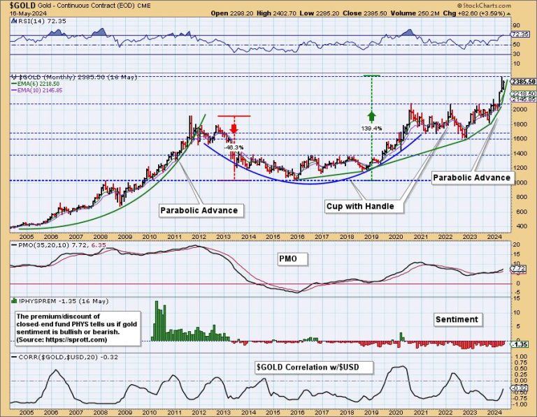
While we don’t typically begin with a monthly chart, it seems like a good place to start because most of the good news is present there. Beginning on the left side of the chart we can see how gold made a parabolic advance into an all-time high in 2011. Parabolic advances beg for correction, and boy did gold correct. It declined almost -50% into a low in 2015, then it advanced for over three years into a new all-time high in 2020. During that time it formed the bullish cup formation.

Next it consolidated for over three years (the handle), ultimately breaking out of a 12-year consolidation. I think it is an important point that gold took over 12 years to digest the huge advance into the 2011 top. In my opinion, it puts a solid floor under the most recent advance.

Currently, we can see that gold has gone parabolic again, and it is hard to know when it will top. The preferable resolution to this vertical move would be a sideways consolidation, but we’ll just have to wait and see. In my opinion, we shouldn’t see any kind of parabolic crash.

Another bullish sign is that sentiment is still bearish. We assess sentiment by seeing if the closed-end Sprott Physical Gold Fund (PHYS) is selling at a discount or a premium. As you can see it has been selling mostly at a discount for 11 years, clearly showing that the public is still not yet excited about owning gold. We think this is because crypto currencies are attracting a lot of the money that might otherwise be moving into gold. In any case, bearish sentiment is bullish for gold.

Looking at the daily candlestick chart below, we can see that the Gold ETF (GLD) closed at an all-time high today, just above a solid level of support. To clarify, GLD is a vehicle that can be used to trade/invest in gold, while the symbol $GOLD is a continuous contract dataset used to track the price of gold, but it cannot be owned.

Conclusion: Gold spent a long time, over 12 years, consolidating huge gains in the early part of the century. It recently broke out decisively from that trading range, and it appears to be at the start of another strong, long-term rally.

Learn more about DecisionPoint.com:

Watch the latest episode of the DecisionPointTrading Room on DP’s YouTube channel here!

Try us out for two weeks with a trial subscription!

Use coupon code: DPTRIAL2 at checkout!

Technical Analysis is a windsock, not a crystal ball. –Carl Swenlin

(c) Copyright 2024 DecisionPoint.com

Disclaimer: This blog is for educational purposes only and should not be construed as financial advice. The ideas and strategies should never be used without first assessing your own personal and financial situation, or without consulting a financial professional. Any opinions expressed herein are solely those of the author, and do not in any way represent the views or opinions of any other person or entity.
DecisionPoint is not a registered investment advisor. Investment and trading decisions are solely your responsibility. DecisionPoint newsletters, blogs or website materials should NOT be interpreted as a recommendation or solicitation to buy or sell any security or to take any specific action.

Helpful DecisionPoint Links:

Trend Models

Price Momentum Oscillator (PMO)

On Balance Volume

Swenlin Trading Oscillators (STO-B and STO-V)

ITBM and ITVM

SCTR Ranking

Bear Market Rules

There is a certain ebb and flow in uptrends. Often we see some sort of stair step higher with big advances and smaller corrections along the way. In Dow Theory terms, the primary trend is up and declines within a primary uptrends are considered secondary price moves. Also called corrections. Corrections and subsequent reversals offer traders a chance to partake in the uptrends. Today’s report will focus on the Bitcoin ETF (IBIT). ChartTrader at TrendInvestorPro specializes in such setups and IBIT was featured in Thursday’s report and video.

The chart below shows IBIT doubling with a move from 22 to 44 (January 23rd to March 12th). Bitcoin, the underlying asset, hit a new high in March so I will assume this is a new high for IBIT, even though it started trading in January. Despite its short history, we can see the classic ebb and flow of an uptrend on the price chart. The 100% advance is part of the primary uptrend and the decline back the low 30s is a secondary move, or correction.

Also notice that this correction retraced 50-61.8 percent of the prior advance and formed a falling wedge. This retracement amount is normal for a correction. Think two steps forward and one step backward. The falling wedge is also typical for corrections and provides us with clear resistance levels to watch for breakouts. IBIT broke the upper trendline and exceeded the early May high with a surge this week. This breakout signals a continuation of the bigger uptrend and targets a move to new highs. The green shading marks re-evaluation support at 34.

I featured this IBIT chart in the ChartTrader report and video this past Thursday. We are also seeing a similar setup in a related ETF and this was posted on Friday (17-May). ChartTrader reports and videos focus on tradable setups within bigger uptrends. Recently we highlighted Vertex (VRTX), Oracle (ORCL), Crowdstrike (CWRD), the Cybersecurity ETF (CIBR) and the Home Construction ETF (ITB). Click here to learn more.

——————————————–

No Confirmation In Volume.

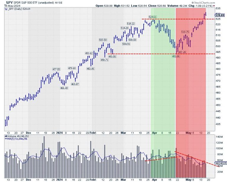
This week, the S&P 500 is breaking out above its previous high, undeniably a bullish sign for the market.

After the initial break on Wednesday, the market held up well on Thursday. However, a few things are holding me back from getting overly enthusiastic.

One of the issues is the volume pattern, as can be seen on the above spy chart. The lower pane holds the volume combined with its moving average (the blue line). During the decline from the 525 peak at the end of March all the way down to 494 in the second half of April, the volume rose slightly. So, we had a declining price on rising volume.

The rally out of the low has taken place on declining volumes. The technical rule is that volume should increase in the direction of the trend. So, if we were in a full-fledged uptrend, I would have expected the volume to decline during the move lower and then rise again from 494 to current levels. Also, higher volumes do not accompany the break above resistance, which usually makes upward breaks (more) reliable.

Sector Rotation Not Supportive

The relative rotation graph above shows long and strong tails for defensive sectors. As you know, the traditionally defensive sectors are utilities, consumer staples, and healthcare.

Utilities and staples are inside the improving quadrant and on a strong RRG-Heading toward leading. The healthcare sector is inside the lagging quadrant and has just started to curl back up.

Reading from the JdK RS-Ratio axis, energy is the strongest sector at the moment. Although it is not considered a really defensive sector, it has a low beta compared to other sectors, which is also a defensive characteristic.

On the other hand, we see a really offensive sector like consumer discretionary inside the legging quadrant and moving further into it. Other sectors inside the lagging quadrant are technology and real estate. Both move lower on the JdK RS-ratio scale at a stable negative RS-momentum level.

Other more offensive or cyclical sectors, like materials, industrials, and financials, are inside the leading quadrant. Still, they have rolled over and are now out of the zero to 90-degree RG heading. Overall, this combination of rotations is not what you would expect during a strong rally in a bull market.

A strong rally in the S&P 500 is not in line with this type of sector rotation.

Obviously, there are two ways this situation can be resolved. The first one is that the sector rotation will move to a more offensive trajectory in the coming weeks, matching and catching up with the rally in the S&P 500. The second one is that the S&P 500 gets back in line with a more defensive rotation.

Asset Class Rotation Turning Towards Bonds

Finally, the third observation that makes me cautious is the current state of asset class rotation. as seen in the RRG above.

The tail for SPY is inside the leading quadrant but has been moving lower on the RS momentum scale for a few weeks already, almost crossing over into the weakening quadrant. The tails for fixed-income-related asset classes, government bonds, corporate bonds, and high-yield bonds are inside the improving quadrant, and all are moving at a positive RRG-heading.

Bringing that relationship back to the SPY:IEF chart shows us that this ratio is struggling with the resistance offered by the previous peak, around 5.7.

At the same time, the RSI plotted below the price chart shows a buildup of negative divergence. As you know, this is usually a sign of, at least, a pause or a turn in the existing trend.

A clear reversal of this trend would mean that bonds are taking over the leadership role from stocks. And this usually happens when stocks are moving lower.

All In All

All in All, these three observations make me very cautious regarding the quality of the upside break in the S&P500.

#StayAlert. Have a great weekend, –Julius

Gold is on the verge of breaking into all-time high territory, and silver is poised to challenge its four-year highs. Both metals are rallying, and it seems probable that both assets will rise above the current threshold levels.

Supposing they do, what’s next?

In terms of analyst price forecasts, most consensus targets for 2024 have already been reached, well ahead of schedule.  From a technical standpoint, both metals could trend higher, disregarding any potential short-term dip. However, what economic factors might be driving this trend?

The World Bank Predicts an 8% Rise in Gold and 7% Rise in Silver

According to the World Gold Council, central banks worldwide bought nearly 300 tonnes of gold in the first quarter alone in 2024. Although data on silver purchases is hard to come by, the Silver Institute expects total industrial demand for silver to reach a record of 690 million ounces in 2024, not counting investment demand (as silver is also a “monetary” metal).

Overall, several factors are expected to drive both metals higher:

Heightened geopolitical tensions.Central banks’ gold purchases as a hedge against economic instability and currency depreciation.Persistently high inflation rates and expectations of lower interest rates.Rising industrial demand for silver, particularly in light of solar energy project expansion.

So, what might this look like in terms of today’s charts?CHART 1. DAILY CHART OF $GOLD. Gold is gaining momentum as it approaches record-high territory.Chart source: StockChartsACP. For educational purposes.

Looking at gold ($GOLD), watch the resistance level at $2,448.80 (see red line); a break above this price marks an all-time high for the yellow metal. Note that the Moving Average Convergence Divergence (MACD) line is about to cross over the signal line, and the histogram is about to rise above the centerline, both indicating bullish momentum.

The dotted blue line at the $2,585 range approximates the World Bank’s 8% price target. If you follow gold news, you’re probably aware that a few analysts predict gold prices will exceed this level. However, the higher levels depend on geopolitical variables, which, although conceivable, are too distant to be certain (at least for now).

CHART 2. WEEKLY CHART OF $SILVER. Can silver’s price increase break through its two significant technical challenges? Chart source: StockCharts.com. For educational purposes.

JPMorgan, Commerzbank, and Citigroup set their silver price targets to $30, which the metal had reached on Thursday. Silver is just a few points away from challenging its four-year high at $30.35. Above that, you can see an approximation of the World Bank’s 7% target at the $31.80 range.

Could silver reach its 2011 highs—the $50 per ounce range? A few analysts maintain that target, but, considering the now-tempered expectations of aggressive rate cuts by the Federal Reserve, especially following the latest Consumer Price Index (CPI) and Producer Price Index (PPI) readings, several analysts who had previously set higher targets for silver have now revised them lower.

But if silver has a reputation for volatility, it’s because the factors driving its price as a monetary and industrial metal are also subject to volatility. Just look at how analysts have underestimated the timing of the price forecasts and the now-downward revision of silver’s price target.

The Takeaway

If you’ve followed gold and silver price forecasts over the last year, you might have noticed how targets have adjusted in response to incoming economic data (particularly inflation data), Fed rate cut expectations, and geopolitical factors. Gold negatively reflects the erosion of purchasing power and dwindling sentiment in monetary policy. Silver does, too, to a certain extent, but it’s also driven by industrial demand. So, if you’re a gold or silver bug, it’s important to consider all of these developments—technical levels, dynamics in momentum, inflation, geopolitical developments (particularly the BRICS bloc), and industrial supply and demand.

Most importantly, does it make sense to open long positions now? If you’re hedging your purchasing power (in light of persistent inflation and global de-dollarization) by allocating a small percentage of your portfolio to gold, it may be. If you’re seeking growth driven by silver’s industrial consumption (and less so as a safe haven), you should be more skeptical in the near term. But these conditions change; ultimately, it depends on your long-term goals and percentage allocations.

Disclaimer: This blog is for educational purposes only and should not be construed as financial advice. The ideas and strategies should never be used without first assessing your own personal and financial situation, or without consulting a financial professional.
Under Armour announced a broad restructuring plan on Thursday as it said sales in its largest market, North America, plunged 10% and predicted the trend will get worse throughout its current fiscal year. 

The athletic apparel retailer also saw profits sink by more than 96% during its fiscal fourth quarter, compared with the year-ago period. 

It’s unclear how many employees Under Armour will lay off as part of the restructuring, but the plan is expected to cost between $70 million and $90 million, a portion of which will be used for employee severance and benefits costs. The company declined to share more information with CNBC about its restructuring.

The company’s shares were down more than 2% in morning trading. 

Here’s how the athletic apparel retailer did in its fiscal fourth quarter compared with what Wall Street was anticipating, based on a survey of analysts by LSEG:

The company’s reported net income for the three-month period that ended March 31 was $6.6 million, or 2 cents per share, compared with $170.6 million, or 38 cents per share, a year earlier. Excluding one-time items, the company reported earnings of 11 cents per share. 

Sales dropped to $1.33 billion, down about 5% from $1.4 billion a year earlier. 

During the quarter, sales in North America declined 10% to $772 million, worse than the $780 million that analysts had expected, according to StreetAccount. 

Under Armour said it expects sales to continue to worsen in North America. The company anticipates they will drop between 15% and 17% in its current fiscal year. 

“Due to a confluence of factors, including lower wholesale channel demand and inconsistent execution across our business, we are seizing this critical moment to make proactive decisions to build a premium positioning for our brand, which will pressure our top and bottom line in the near term,” founder and CEO Kevin Plank said in a statement. 

“Over the next 18 months, there is a significant opportunity to reconstitute Under Armour’s brand strength through achieving more, by doing less and focusing on our core fundamentals,” he added.

Across Under Armour’s business, the company is expecting revenue to be down “at a low-double-digit percentage rate” in its current fiscal year, while analysts had expected sales to grow by 2.1%, according to LSEG. 

The company is planning to cut down on promotions and discounting, which it expects will lead its gross margin to rise between 0.75 and 1 percentage point for the fiscal year. 

It’s expecting diluted earnings per share to be between 2 cents and 5 cents and adjusted diluted earnings per share to be between 18 cents and 21 cents for the year. Analysts had expected earnings per share of 52 cents, according to LSEG. 

Under Armour’s rough quarter comes about two months after the retailer announced former Marriott executive Stephanie Linnartz would be stepping down from her role as CEO after barely a year on the job and Plank would once again take the helm of the company he founded in 1996. 

Linnartz was the second CEO the company has cycled through in less than two years. 

She was hired on a bet that her experience building out Marriott’s renowned Bonvoy loyalty program and driving digital revenue for the hotel giant would offset her lack of experience in the retail industry. Before her departure, she managed to overhaul Under Armour’s C-suite and build out its loyalty program. She was attempting to pivot the brand’s assortment to a more athleisure-focused offering that had more stylish options for women. 

Ultimately, she was ousted before those plans could become a reality. Following the announcement of Linnartz’s departure, a number of analysts downgraded Under Armour and lowered their price targets. Shares of the company were down about 23% year to date, as of Wednesday’s close. 

Read the full earnings release here.

This post appeared first on NBC NEWS