Archive

2024

Browsing

It was a bit of a seesaw week in the stock market, but, overall, the market seems to think everything is looking good.

The May employment report indicated that the change in Non-Farm Payrolls (NFP) was stronger than expected. It came in at 272,000, significantly higher than the estimated 190,000. The unemployment rate climbed to 4%, and wages rose 4.1% in the past year.

The market’s initial reaction? Well, treasury yields spiked after the report was released, and equity futures turned sharply lower. However, that didn’t last long. At one point, the S&P 500 reached a new all-time high but closed lower. The number of added jobs weakens the probability of an interest rate cut. But isn’t that what the market is expecting? Long-term, things are looking fine. Let’s take a closer look.

Starting with the weekly chart of the S&P 500 ($SPX), it’s clear the trend is still bullish, as is momentum (see chart below). Until this changes, there’s no reason to think equities are setting up for a significant selloff.

CHART 1. WEEKLY CHART OF THE S&P 500 INDEX. The bullish trend is still intact and momentum continues to be strong.Chart source: StockChartsACP. For educational purposes.

The weekly perspective remains strong, with the S&P 500 trading above its 21-week exponential moving average (EMA). The index bounced off its 21-week EMA (red line), and, with the exception of a reversal last week—which didn’t put much of a dent in its bullish path—it continues to trend higher.

The Linear Regression Forecast (LRF) indicator (blue line) also indicates an upward trend. Since the LRF is based on the line of best fit, it can be considered a good indicator to measure the near-term trend. The last point of this indicator forecasts price direction, which, in the weekly chart, points higher.

Momentum also seems strong, with the moving average convergence/divergence trending higher and the stochastic oscillator well in overbought territory. So, from a weekly perspective, the S&P 500 looks bullish.

Does the picture change on the daily chart? Let’s take a look.

CHART 2. DAILY CHART OF THE S&P 500 INDEX. It may be a little more choppy than the weekly chart, but the trend is still bullish, and the momentum is strong.Chart source: StockChartsACP. For educational purposes.

The daily chart is a little more choppy than the weekly one, but it still suggests the S&P 500 is trending higher. The market had a bumpy ride at the end of May, but it recovered.

Watching a breadth indicator to see if it supports the trend is a good idea. There are several breadth indicators available in StockCharts.com, such as the Advance-Decline Line, McClellan Oscillator, and the Bullish Percent Index (BPI).

The chart below displays the BPI for the S&P 500. When the BPI is above 50, it indicates that bulls have the edge, with 70 representing overbought levels and 30 oversold, although you can use different thresholds.

CHART 3. S&P 500 BULLISH PERCENT INDEX. The BPI indicates the S&P 500 is still bullish.Chart source: StockChartsACP. For educational purposes.

It’s interesting to note that the S&P 500’s BPI hasn’t been below 30 since the end of October. This suggests that the overall market continues to be bullish.

Another confirming indicator is the Volatility Index ($VIX), which continues to be low. Investors are not showing any signs of panic.

Bond Market Action

One interesting piece of the stock market puzzle is the bond market, which tends to move on the jobs data. With yields coming down, bond prices started to move up. The daily chart of the iShares 20+ Year Treasury Bond ETF (TLT) below shows that TLT broke out above its downward-sloping trendline and broke above its last significant high (May 16). But Friday’s price action sent Treasury yields higher, and bond prices fell below their May high.

CHART 4. DAILY CHART OF ISHARES 20+ YEAR TREASURY BOND ETF (TLT). After breaking above its last high, bond prices declined. It remains to be seen if this is a correction or a sign that bonds are still struggling.Chart source: StockChartsACP. For educational purposes.

While one day’s action doesn’t signify a trend reversal, it’s a good idea to watch the action in the bond market. Add this chart to your ChartLists and keep an eye on whether TLT breaks above its May high. If it does, it could further confirm that bonds are trying to come off their lows.

Another point not to be missed is the action in the US dollar, another asset that reacts to jobs data. The greenback spiked in today’s trading. So, we have a situation where bond yields spiked, the dollar spiked, and equities were relatively flat. On the other end of the spectrum, metals got clobbered. Do metal traders know something about the inflation data?

Everything rests on next week’s action, which is a data-heavy week. There’s the Consumer Price Index (CPI) and FOMC meeting. Given that today’s jobs data showed that wages data came in higher, you can bet the CPI data will be watched closely.

Let’s see what the Fed says next week. The CME FedWatch Tool shows a small probability of a rate hike in the September meeting, but that could change. The key point to listen for is whether inflation is coming down at the rate the Fed wants to see. The market has priced in one rate cut possibility this year. If we hear otherwise, the market could react either way.

The Takeaway

Technical indicators look good, which suggests that the stock market is still bullish. But watch market breadth and the VIX. If they start to turn—it has to be a significant reversal—then you can start worrying. In other words, if you think the stock market is toppy and it’ll sell off, wait for the confirming indicators to show you the market will sell off.

End-of-Week Wrap-Up

S&P 500 closes down 0.11% at 5,346.99, Dow Jones Industrial Average down 0.22% at 38,798.99; Nasdaq Composite down 0.23% at 17,133.13.$VIX down 2.86% at 12.22Best performing sector for the week: TechnologyWorst performing sector for the week: UtilitiesTop 5 Large Cap SCTR stocks: NVIDIA (NVDA); MicroStrategy Inc. (MSTR); Super Micro Computer, Inc. (SMCI); Vistra Energy (VST); Applovin Corp. (APP)

On the Radar Next Week

May CPIFederal Reserve’s interest rate decision and press conferenceMay PPIJune mortgage ratesJune Preliminary Michigan consumer and inflation expectationsFed speeches (Goolsbee, Cook)

Disclaimer: This blog is for educational purposes only and should not be construed as financial advice. The ideas and strategies should never be used without first assessing your own personal and financial situation, or without consulting a financial professional.

Breaking Down Into Growth / Value

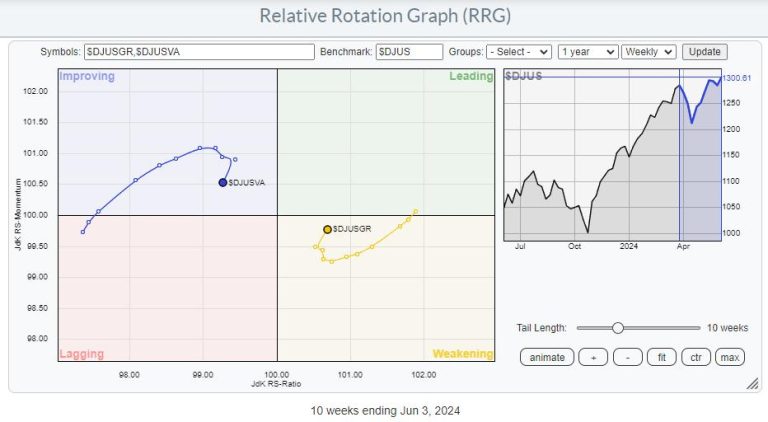
Using Relative Rotation Graphs to help break down the US stock market into various segments can help us identify pockets of strength or weakness.

The first RRG below shows the relationship between value and growth stocks.

The first important observation is that the growth tail is still on the right-hand side of the graph, inside the weakening quadrant, while the value tail is on the left side of the graph, inside the improving quadrant. This indicates the continuing strength of growth stocks.

However, since mid-March, there has been a strong improvement for value stocks, which pushed the tail into the improving quadrant at a strong hanging. By default, the growth tail moved in the opposite direction into the weakening quadrant at a negative heading.

However, over the last three to four weeks, that temporary countertrend move seems to have ended, and the preference is now back to growth stocks.

Breaking Down Into Size

Another way to break down the US stock market is to use size segments: large-cap, mid-cap, and small-cap stocks.

The relative rotation graph below shows this breakdown and the rotation of the various tails over the last 10 weeks.

The rotation for these size segments shows characteristics similar to those we have seen in growth and value. Large caps have predominantly been on the right-hand positive side of the graph, while mid- and small caps were positioned on the left-hand negative side of the RRG.

Here also, a countertrend move was traced out since mid-March, when mid- and small-caps turned to a positive heading at large-caps’ expense. Over the last few weeks, this counter-trend move has ended, and the outperformance for large caps is back in full swing.

Combining Style & Size

By splitting the growth and value segments into their respective size segments, we can see a more granular rotation that combines the two ways of dividing the stock market on one RRG.

Now things are getting interesting. Out of the six tails on the graph, only ONE is inside the leading quadrant and moving at a positive RRG-Heading. All other tales are traveling in a negative heading.

The strongest negative rotations are found for mid- and small-cap growth stocks. Both tails are further into the lagging quadrant in an almost straight line. A clear offset against the positive rotation for large-cap growth stocks.

The value tails across all size segments have rolled over, and they are now all rotating back toward the lagging quadrant after a brief stint through improving.

These rotations indicate that currently, only one market segment is traveling at a positive RRG heading, which is a large gap in growth stocks.

Although this segment contains all the biggest market-cap names, it also inhibits a risk as the base is very narrow.

Chart-by-Chart

Simply plotting all the price charts of these six segments under each other reveals that ONLY large-cap growth has surpassed the late March peak where all charts lined up.

And changing the price bars to relative lines (vs. $DJUS) makes things even clearer.

The Only Pocket of Strength Left

As always, price pays, or in terms of RRG; You must check the price chart before making any decisions.

Despite the still visible uptrend, the build-up of negative divergences between price and RSI / PPO keeps me alert. This type of setup usually occurs at the end of a trend and signals, at least, a pause in that trend or a reversal.

The only caveat is that we need to get a confirmation in the price chart in the form of a break of support, completion of a top formation, etc. And that has not happened yet.

So, The music is still playing, but the noise from outside of people leaving the party is getting louder.

#StayAlert, have a great weekend. –Julius

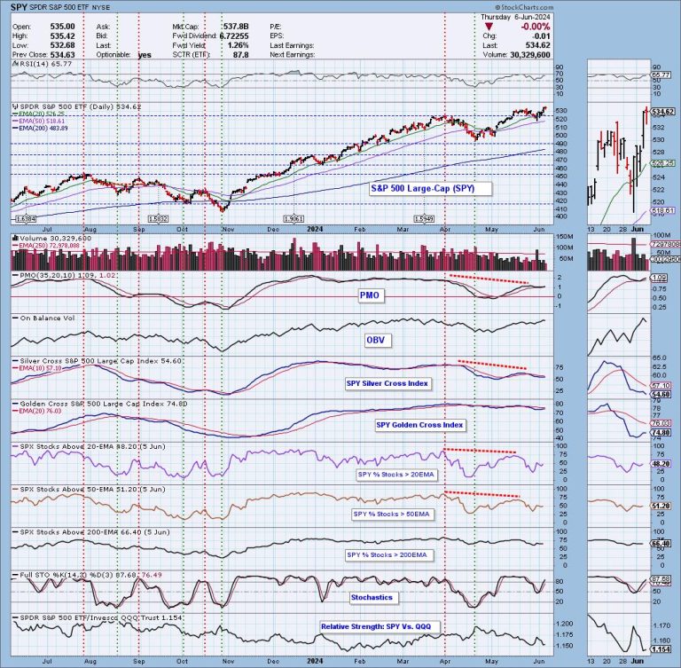
The Technology Sector (XLK) continues to dominate and drive the rally, but fewer and fewer stocks within the sector are participating in the rally. We know this because our Silver Cross Index (SCI), which shows the percent of stocks in the Technology Sector with Silver Cross BUY Signals (20-day EMA is above the 50-day EMA), is only at 54.60%. Almost half of the stocks are not on BUY Signals.

Further, looking at the seven years of data we have on the SCI (chart below), we were unable to find another case where XLK was making all-time highs with a Silver Cross Index reading so low that didn’t lead to price weakness. Of course, we owe this dislocation to the magic of cap-weighting. While fewer and fewer Technology stocks are participating in the rally, the mega-cap stocks are the ones making new highs, and driving up the price of every price index of which they are a component. The numerous negative divergences we can see are telling us that this probably won’t continue for long.

Conclusion: Participation within the Technology Sector has been fading since the beginning of the year. Mega-cap stocks are keeping prices elevated for now, but that probably won’t last.

Learn more about DecisionPoint.com:

Watch the latest episode of the DecisionPointTrading Room on DP’s YouTube channel here!

Try us out for two weeks with a trial subscription!

Use coupon code: DPTRIAL2 at checkout!

Technical Analysis is a windsock, not a crystal ball. –Carl Swenlin

(c) Copyright 2024 DecisionPoint.com

Disclaimer: This blog is for educational purposes only and should not be construed as financial advice. The ideas and strategies should never be used without first assessing your own personal and financial situation, or without consulting a financial professional. Any opinions expressed herein are solely those of the author, and do not in any way represent the views or opinions of any other person or entity.

DecisionPoint is not a registered investment advisor. Investment and trading decisions are solely your responsibility. DecisionPoint newsletters, blogs or website materials should NOT be interpreted as a recommendation or solicitation to buy or sell any security or to take any specific action.

Helpful DecisionPoint Links:

Trend Models

Price Momentum Oscillator (PMO)

On Balance Volume

Swenlin Trading Oscillators (STO-B and STO-V)

ITBM and ITVM

SCTR Ranking

Bear Market Rules

VanEck Vectors Retail ETF (RTH) is a peculiar beast. It holds 26 retail stocks, 70% in the Consumer Discretionary sector and 30% in Consumer Staples. It’s tilted toward cyclical growth, but occupies enough “defensive” space not to get hammered too badly when the economy undergoes a downturn.

On Wednesday, RTH popped up on a StockCharts scan—”Entered Ichimoku Cloud.” With a not-so-great, but improving, SCTR score of 64.1 (the following day), this particular scan effectively finds potentially “good” stocks in decline.

Retail: The Macro Picture

Let’s take a look at the weekly chart of RTH over the last 10 years.

CHART 1. 10-YEAR CHART OF RTH. On a wide time scale, it’s nothing short of pure uptrend.

Following the 2020 pandemic crash, RTH’s swings became wider and more volatile. Still, the 50-period and 200-period simple moving averages (SMAs) held steady in their decade-long uptrend.

Looking at relative performance, RTH, again comprising 70% Consumer Discretionary and 30% Consumer Staples stocks, is outperforming the former by 26% and the latter by 68% (see panels below price chart display relative performance of RTH:XLY and RTH:XLP). The Chaikin Money Flow (CMF), in the lowest panel, has shown a steady stream of positive flow and buying pressure, fueling RTH’s ascent.

So, what does this mean for RTH today?

RTH’s Range Reflecting Broader Retail Uncertainties

The daily chart of RTH shows that the ETF pulled back in April and has traded within a small range since then.

CHART 2. SIX-MONTH DAILY CHART OF RTH. A closeup of support and resistance levels mirroring the general fundamental uncertainty of retail discretionary forecasts.

Its sideways movement between support and resistance (roughly $196 to $205; see dotted blue line) reflects the limbo that the broader retail industry is somewhat caught in, much of it focused on whether the Federal Reserve will hold, cut, or even hike interest rates. Nevertheless, traders and investors will jump the gun (as they typically do), speculating on the outcome that fundamentals will either validate or deny later. We’ll see these actions clearly when price breaks above the two levels of resistance or below near-term support.

While the CMF suggests that buyers may have the technical upper hand, note that the Ichimoku Cloud (specifically, the Kumo) has turned from a bullish green to a bearish red; its top level suggests resistance and coincides with the market-based resistance levels we currently see. If price breaks above the current resistance level, RTH will challenge its high of $213. 

But what if it breaks below $196? Take a look at the chart below.

CHART 3. EIGHT-MONTH DAILY CHART OF RTH. If price breaks below support, how far down can it sink?

If there’s no bullish economic news driving discretionary retail, then you can expect price to break below support at $196. While some bullish might attempt to jump in at $193, the 38.2% Fibonacci Retracement level, the 50% ($187) and 61.8% ($180) levels are more likely to see stronger buying activity, as the latter roughly coincides with RTH’s 2022 and 2023 highs (as you can see in the weekly chart above).

All eyes are on the Fed, along with other economic reports and conditions that will likely affect market sentiment.

The Takeaway

VanEck Vectors Retail ETF (RTH) presents a balanced mix of consumer discretionary and consumer staples stocks. Despite recent volatility, its long-term uptrend remains intact. The key will be watching how it reacts to upcoming economic news and Federal Reserve decisions. Whether RTH breaks above or below its current levels, mapped out before you are the levels in which you can anticipate market action.

How to Run an Ichimoku Scan (or any technical scan)

Log in to your StockCharts accountGo to Your Dashboard, and in the Member Tools window, scroll down to Reports & More, and click on Sample Scan Library.The Ichimoku Patterns are in the Candlestick Patterns section.Click the Run button next to the scan (in this case, Entered Ichimoku Cloud) and see a list of the filtered stocks and ETFs.

Why This Scan?

As mentioned above, you might want to run this scan, particularly when the broader market is rallying, to see if any strong stocks are pulling back. Depending on the stock, the Ichimoku Cloud can often serve as a support range, making it an ideal tool for identifying “buy-the-dip” opportunities.

Also, you’ll want to look at other indicators in addition to the price action, in order to avoid catching a falling knife when you intend to buy the dip.

Disclaimer: This blog is for educational purposes only and should not be construed as financial advice. The ideas and strategies should never be used without first assessing your own personal and financial situation, or without consulting a financial professional.

Note to the reader: This is the twenty-fourth in a series of articles I’m publishing here taken from my book, “Investing with the Trend.” Hopefully, you will find this content useful. Market myths are generally perpetuated by repetition, misleading symbolic connections, and the complete ignorance of facts. The world of finance is full of such tendencies, and here, you’ll see some examples. Please keep in mind that not all of these examples are totally misleading — they are sometimes valid — but have too many holes in them to be worthwhile as investment concepts. And not all are directly related to investing and finance. Enjoy! – Greg

What better way to see how all this information on rules-based trend analysis can actually be put to work and used in a successful practice? The following are interviews with Jud Doherty, then-president at Stadion Money Management, LLC, and Will McGough, then-VP Portfolio Management. (These interviews were conducted prior to 2013.) Stadion is a money management company that, in 2004, Defined Contribution news named Advice Provider of the Year in the retirement plan industry. As of 2013, Stadion has more than $6 billion under management in separately managed accounts, six mutual funds, and retirement 401(k) plans.

When did you first get interested in the markets?

(Jud) My first job out of college in 1991 was in 401(k) recordkeeping, which was an operational role. But it gave me exposure to the mutual fund world and insight into the behavior of the typical investor. To gain greater investment knowledge, I entered the CFA program, which led to the next phase of my career, which was institutional investment consulting.

(Will) From a young age I decided to focus my studies on math over literature, after all there are only 10 basic numbers (counting 0) versus 26 letters, so the odds were in my favor! Mathematics was a natural segue to financial market interest as I grew older. I was also fortunate enough to have family members who tweaked my interest in the markets. My grandfather was a big IBD proponent and gave me a few shares of stock after I graduated from high school. Watching the volatility during the late 1990s/early 2000s, I knew there had to be a better way to invest than to watch wild swings and P&L. Then, freshly out of school, I was supposed to study for the CFA program by getting to work early, but, instead, spent all my time during the morning darkness studying the markets. Each day, the markets behave differently, which is essential in keeping the thirst for knowledge alive.

Can you describe the overall methodology of your approach to the markets?

(Jud) I am a firm believer in active management to add safety, not return, and that a disciplined process is critical to success. Gut feelings, emotions, predictions, and forecasts may work once in a while, but are a long-term recipe for disaster.

(Will) It’s all about probabilities. We want to participate when the odds are in our favor of price continuing to go higher, and want to protect against times when the odds are signaling detrimental price action. We do this from analyzing price trends, the strength of those trends via market breadth, which is equal-weighted participation, and through relative strength, which is determined when speculative markets like small-cap and emerging markets are leading the way. From there, we get an overall picture of market health, which we have broken down into various levels to drive asset allocation, security selection, and sell criteria metrics. The final key is knowing when to cut losses via sell criteria; there is no question that we have the discipline to follow this approach no matter how wrong it may feel at times.

How did you come up with the breadth indicators that you use today?

(Will) Most of the measures we use are simple variations of classic indicators that are common to the technical analysis community.

How have these procedures done over the years?

(Jud) Active management has underperformed since the lows of 2009, but this is to be expected. Anyone who has kept pace with the market the last few years should be questioned, because they likely have not made any moves that would (or will) protect their portfolio when the next inevitable bear market occurs.

(Will) Trend following with momentum has the ability over the short term to disconnect from market performance. Whipsaws will eventually lead to underperforming bull markets, and large loss avoidance will make the strategy very appealing after bear markets. But it’s the full market cycle that counts. After combining the strengths during bears and weaknesses during bulls, the goal is to have market-like returns with unmarket-like volatility.

Have you made any changes to the procedures over the years?

(Jud) Changes to philosophy and model have been nonexistent, but due to changing markets and opportunities, various indicators and components within our model have changed. For example, breadth will always be an indicator of market health in my opinion, but how breadth is calculated or measured may change over time based on index construction and market evolution.

(Will) Changes are much akin to natural evolution. A Lexus today isn’t the same Lexus as 20 years ago, but it’s still a Lexus. Stadion’s investment philosophy is still the same and the tactical model still follows the same mandate. The beauty of our approach is that we are not reliant on a single indicator; it’s the collective voice of our basket of indicators that guides us. Therefore, when research dictates a new method, calculation, or rule be added, the plug-and-play nature of our approach means changes are along the fringe rather than at the heart of what we do.

What changes have you made and why?

(Will) One example of a change is our relative strength measure. For many years, actually over a decade ago, we measured speculation by looking at exchanges, primarily, the NYSE versus Nasdaq. Over the years, listing requirements have changed and new vehicles like ETFs have come about causing the price indices that track these exchanges to be influenced by factors that were not a part of the original indicator thesis. Therefore, we moved to a pure common stock approach by measuring the same original intent by using the S&P 500 and Russell 2000.

What type of assets does Stadion manage; only mutual funds?

(Jud) Stadion manages 401(k) accounts, collective investment trusts (CITs), separately managed accounts, and mutual funds. But the underlying philosophy of all of these vehicles is active management to protect during devastating bear markets.

Is your model used for all the assets or just some?

(Jud) All assets we manage at Stadion are governed by strict rules, and in a team environment. Virtually all are managed actively/tactically, though we do have a small portion that is allocated strategically in our 401(k) accounts.

(Will) As Stadion grows there could be different types of models and strategies, but everything we do will be outlined by following a rules-based disciplined process.

Why do you think breadth does so well in a trend following model?

(Will) Breadth is a derivative of price. The most common type of breadth is advancing versus declining issues, which looks at the number of stocks moving up or down in price across an index or exchange. When market cap or price-weighted indexes performance is driven by those higher-weighted constituents in the face the equal-weighted voice of the entire index, you begin to see breadth divergences. This leading of price gives breadth merit in trend-following systems.

What do you think of the NYSE having about 50% of its issues as interest sensitive? Does that affect your model?

(Will) Funny you mention that. Earlier, when I talked about changes to our process, the one item affecting our relative strength measure that I didn’t bring up was interest-sensitive securities like preferred issues. Not only did this constituency affect our relative strength measure, but it was detrimental to our source of breadth. Since these securities would move contrary to more common equity stocks, our breadth measures using NYSE data were affected. Using a purer stock membership and speculative index in the Nasdaq has enhanced our trend following breadth measures.

You said that you look at only Nasdaq breadth data. Why? Is there any other breadth data that you use?

(Will) Currently, our approach is predicated off of Nasdaq market data. We believe the Nasdaq to represent the broadest, most speculative measure of risk in the U.S. market place. The Nasdaq has less stringent listing requirements, so it has a natural downside bias over time as more securities go from the exchange than come to it, this allows periods of ample speculation to show more predominately than its bellwether brother NYSE.

What is the Ulcer Index?

(Will) The Ulcer Index attempts to quantify risk around measuring drawdowns. Drawdowns are the true source of risk that investors face, not some normal distribution variance around a mean return. Note from author: The Ulcer Index is also covered as a ranking measure in Part 4 of this section.

Do you care to comment on this? “Nobody can feed a family with reduced downside; however, it is far easier to recover from difficult periods.”

(Jud) Total return is what matters in the end. But if two strategies have identical returns and one of them has bigger drawdowns, most people simply can’t tolerate that and will abandon the strategy. We believe lower drawdowns lead to better sleep at night and a higher likelihood of investors sticking with a given strategy. In other words, high drawdown equals strategy abandoning equals performance chasing equals lack of meeting investing goals.

(Will) Most definitely, this is the value of compounding at its finest. To recover from a 20% loss takes a 33% return. To recover from a 5% loss takes a 5.3% return. It is much easier to recover from small losses than it is large losses. Most people focus on how much return they can get in upmarkets, but the key to investing is really the loss avoidance.

I believe you said you would share some of the research that Stadion has done in regard to the indicators and models you mentioned earlier. How about it?

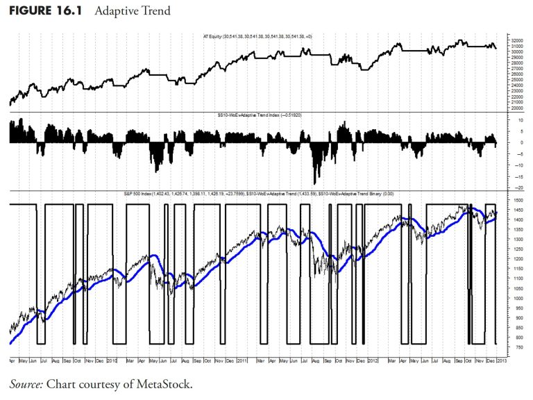
(Will) Thanks Greg, let me show you two different ways we approach indicators and systems. The system part will actually reference this, and your previous book on breadth and will fully disclose those indications. First, let me show you a specific trend following price indicator. This is a classic variation of common approaches. We call it “adaptive trend.” Since it’s proprietary, I can’t tell the exact formula, but here is what it is: it is a midpoint moving average with a volatility-adjusted average true range band around it as a buy/sell trigger. As volatility and range expands, the lower-bound band tightens up for quicker exits, and the exact happens for smooth trends, low volatility and more “standard” ATR allows more investible flexibility. Our Adaptive Trend indicator averages about four to five trades per year while only being invested approximately 60% of the time, which annualizing a return of about 14 percent from 1971 to 2012 (versus 8 percent for the Nasdaq). It has a peak drawdown of 30 percent, and an Ulcer Index (risk) of 7.5, which is about 20% of the risk buy-and-hold carries with the Nasdaq Ulcer index of 35. Our results include no return on cash and do not factor in for trading costs or slippage. Based on our actual trading data using ETFs for many years, our actual costs vary between 10 and 20 basis points per year. Figure 16.1 shows the equity line in the top plot, the adaptive trend index in the middle plot and the S&P 500 with adaptive trend in the lower plot. The binary of the signals is overlaid on the S&P 500 in the lower plot. You can clearly see it does an excellent job of picking market turns.

Figure 16.2 is a view of the equity line (top line) versus the Nasdaq Composite (lower line) over the longer term. As you can tell, chipping away at upmarkets but avoiding the bears is the key to success.

Next, let me show you how to take trend following one step further. Building a basket of indicators to identify trends can be very helpful, so let me explain. I’m going to make this one very simple. As you know, we are huge fans of the work that the McClellans have done over the years. We also believe in the 5% and 10% exponential averages (39- and 19-day respectively). So let’s take three longer-term indications to develop an environment for when trends should occur. Here is what we will use:

Nasdaq McClellan Summation Index > 1000 (using the Miekka adjustment), formula in your book, The Complete Guide To Market Breadth Indicators.Ten percent Trend of Nasdaq New Highs > 10 percent Trend of Nasdaq New Lows, a 19-period exponential moving average of each breadth series (I think this is in your book also).Two-hundred-day exponential average of the Nasdaq Composite.

Table 16.1 is a summary of the stand-alone signal results, obviously better than buy-and-hold but none of them all that great.

Now if we start to combine them in a two-out-of-three and three-out-of-three format (see Table 16.2), we start to see remarkably less risky environments, but with lower return. It’s the classic risk/return trade off. But we do have a solution of keeping a lower-risk environment while matching market return.

For this we now add an intermediate trend following signal (see Table 16.3), the 19/39 price oscillator on the Nasdaq Composite. Once we add this, we can then build out a set of system rules. For the two of three with the price oscillator, we will be 50% invested; for three of three without the oscillator, 75% invested; and, finally, 100% invested when all components are on (3 of 3 for our basket and price trend oscillator positive). You can see from Table 16.3 that this system yielded a return close to Buy and Hold, but with considerably less risk as measured by the Ulcer Index, percent of time invested, and maximum drawdown. I think it is fairly clear this process reduces the risk and helps the return, which was the goal.

Any short bit of advice to investors that you would like to share?

(Jud) Do not chase performance! It is almost a guarantee that the worst time to fire a manager is when you most want to!

(Will) Investors need to understand what it is they want to accomplish by setting goals and staying within rules and boundaries of a process. By having a vision and process combined with the discipline to stick with it, whatever they seek to do will work as long as their methodology is sound and reasonable. For many, this takes many years, patience, and maturity to attain!

Thanks, Jud and Will.

This concludes Part III: Rules-Based Money Management.

Thanks for reading this far. I intend to publish one article in this series every week. Can’t wait? The book is for sale here.

A meniscus tear in his right knee has already forced tennis star Novak Djokovic to withdraw from the French Open. However, the injury may just be bad enough to put him in jeopardy of missing Wimbledon.

According to multiple reports, the 24-time Grand Slam singles champion will undergo surgery today in Paris and the expected recovery process will most likely keep him from competing in the next Grand Slam event on the tennis calendar, Wimbledon, which begins on July 1.

Djokovic suffered the injury to his knee in Monday’s round of 16 match against Francisco Cerundolo, but managed to pull out a five-set win.

The 37-year-old Serb is already the men’s record holder for major titles, but he has never won an Olympic gold medal − something he stated at the beginning of the season was a ‘priority’ of his. Even if he isn’t able to play at Wimbledon, Djokovic could be back in Paris in time for the start of the Summer Games.

The Olympic tennis tournament, which will also be held at Roland Garros, begins July 27.

This post appeared first on USA TODAY

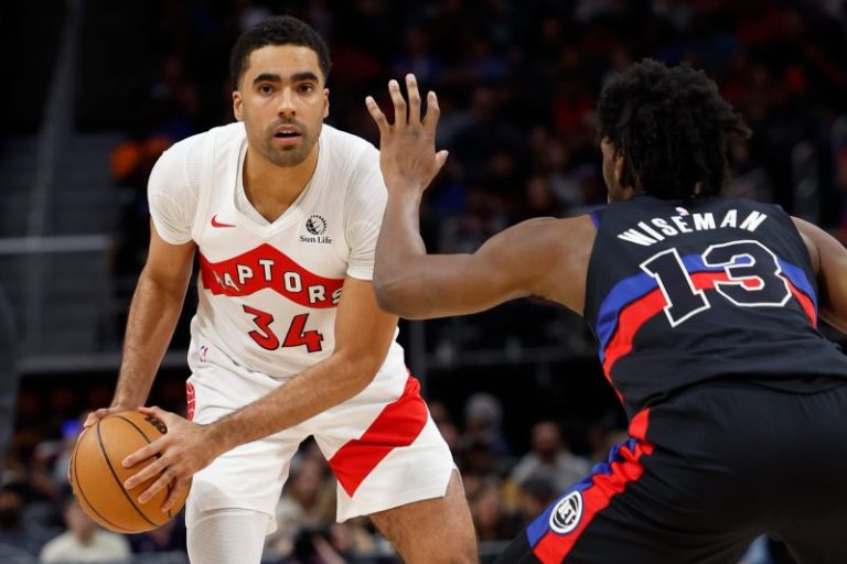
A Brooklyn man authorities say assisted former Toronto Raptors guard Jontay Porter in an illegal sports betting scheme has been arrested and detained pending trial.

Long Phi Pham, 38, also known as ‘Bruce,’ was apprehended at John F. Kennedy airport on Monday holding a one-way ticket to Australia, according to a criminal complaint filed in Brooklyn federal court.

Pham is accused of working with Porter and three other suspects who remain at large to defraud sports betting sites by placing bets on Porter’s performance.

Federal authorities say Porter had racked up large gambling debts to the co-conspirators and was encouraged to underperform in certain games so that their ‘prop bets’ on his performance would cash.

Then on March 20, authorities say Pham and the co-conspirators agreed in a Telegram chat before the game that Porter would take himself out by claiming he felt ill. The bet hit when Porter exited after three minutes, netting the group over $1 million in profits.

Two weeks later, according to the complaint, Porter wrote to the group that they ‘might just get hit w a rico,’ referring to a racketeering charge, and asked if the group chat participants had ‘delete[d] all the stuff’ from their personal cell phones.

If convicted of wire fraud, Pham faces up to 20 years in prison.

The NBA hit Porter with a lifetime ban for his involvement in the alleged scheme, with NBA commissioner Adam Silver saying, ‘It’s a cardinal sin what he’s accused of in the NBA.

This post appeared first on USA TODAY

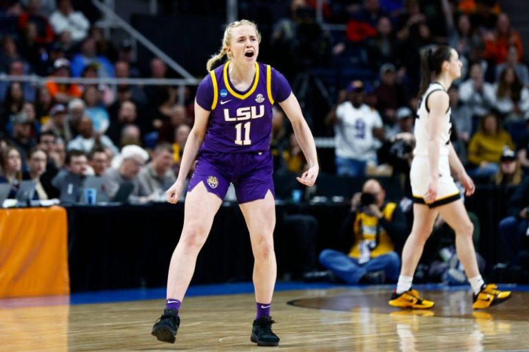
Hailey Van Lith is going to be an Olympian. 

On Wednesday, USA Basketball announced the roster for the women’s 3×3 team at the Paris Olympics, and the college All-American, who will play at her third school in three years this fall, is on the roster. Van Lith will be joined by Los Angeles Sparks forward Cameron Brink, 2022 WNBA Rookie of the Year Rhyne Howard of the Atlanta Dream and Cierra Burdick, a former star at Tennessee. 

It’s been a whirlwind last 18 months for Van Lith, to say the least. 

One of the first athletes to cash in on NIL, Van Lith was an All-American at Louisville in 2022-23 who transferred in the offseason to LSU, joining the defending national champion Tigers before her fourth year. Though she was heralded as the best transfer available in the portal that offseason, Van Lith struggled in Baton Rouge. That was put on full display in LSU’s Elite Eight game vs. Iowa, where Caitlin Clark went off for 41 points, mostly with Van Lith guarding her (Iowa won 94-87). Her draft stock plummeted. Though LSU coach Kim Mulkey said she hoped Van Lith would return for her COVID year, the 5-foot-7 combo guard hit the transfer portal again, ultimate landing at TCU.

In Paris she’ll be joined by fellow Olympic rookie Brink, the No. 2 overall pick in the 2024 WNBA Draft. Howard, who starred at Kentucky before becoming one of the best scorers in the WNBA, and Burdick will also be making their Olympic debuts. 

At 30, Burdick is the oldest player on the team (Van Lith and Brink are both 22, Howard is 24). Though she hasn’t been to an Olympics before, Burdick is a 3×3 veteran, having played in numerous 3×3 events over the past decade. She has gold medals from 3×3 tournaments including the Pan American Games, as well as the 2023 and 2014 FIBA World Cups. 

Jennifer Rizzotti, president of the WNBA’s Connecticut Sun, will coach the team. 

‘I say this all the time but there is no greater privilege than to represent the USA at the Olympics,’ Rizzotti said in a release from USA Basketball. ‘We understand that challenge in front of us as we face tremendous talent and experienced 3×3 teams. I am confident this roster gives us what we need to compete for another gold medal with experience, versatility and a commitment to USA Basketball excellence. I cannot wait to get started.’

The 3×3 event made its debut at the Tokyo games. It’s different than 5-on-5 in that it’s played in the half-court, with a 10-minute game clock and 12-second shot clock. Play is continuous, and teams ‘clear’ the ball behind the 2-point line after a made basket, defensive rebound or steal. The first team to score 21 points – regular field goals are worth one point and shots from behind the arc are worth two – or the team leading at the buzzer, wins. Players say it’s an extraordinarily physical game. 

In Tokyo, the American team of Kelsey Plum, Jackie Young, Allisha Gray and Stefanie Dolson took home the gold medal. Plum and Young, both members of the Las Vegas Aces, are likely to make the USA women’s 5×5 roster, which will be announced in the coming weeks. 

This post appeared first on USA TODAY

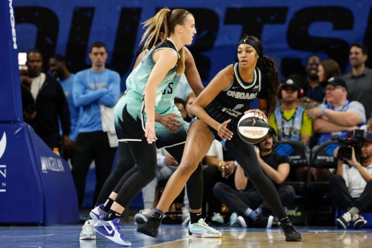
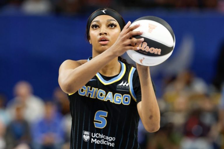
CHICAGO — Angel Reese isn’t the villain here.

Oh, she’s willing to play the role. Has gotten comfortable in it, too, over the last two years. If this is what it takes to get, and keep, people watching women’s basketball, this idea that she hates Caitlin Clark or is jealous of her or any of the other mistruths about her, then fine. She’ll take that on.

But she shouldn’t have to. Nor is it accurate.

“I don’t think there’s any jealousy or hate or any of that. I think we’re appreciative to be a part of this journey,” Reese told USA TODAY Sports ahead of the Chicago Sky’s game against the New York Liberty on Tuesday night.

“Obviously, everybody wants this (increased spotlight) and has wanted this for a long time, especially my teammates who’ve been in this league for a little while now. They’ve deserved this for a really long time,” Reese added. “We’ve all been given these opportunities and we don’t take them for granted. So I’m just happy to be a part of it and continue to help grow the game as much as I can.”

So much of the discourse that has surrounded the WNBA in the first month of the season has been toxic and troubling. Rooted not in facts but in assumptions by people who until now have not paid much, if any, attention to the league.

It came to a head Saturday, when the Sky’s Chennedy Carter shoulder checked Clark hard and Reese was seen applauding. The narrative quickly became that Reese resents the credit Clark gets for the increased TV ratings, attendance and sponsor interest, and, as a corollary, the veterans want to put the high-profile rookie in her place even if it endangers her physically.

It’s an easy storyline to believe, especially the Angel as villain part, given the history between Reese and Clark. Their individual fan bases made up their minds about the other player long ago, and this just served to harden opinions.

But that’s ill-informed, too, zooming in on one play — which, to be clear, was inappropriate — of a 40-minute game without considering the context of the entire game and the rough-and-tumble nature of the league.

Worse, it does a disservice to both Clark and Reese.

“Nothing is malicious,” Liberty veteran Breanna Stewart said, speaking in general about the league’s physicality. “It’s just heat-of-the-moment things. Things happen in a game.”

Neither Clark nor Reese asked for the roles they’ve been assigned, Clark as the savior of the W and Reese the WWE-style anti-hero. By reducing them to these caricatures, it diminishes who they are as both people and players when all either wants is to play basketball and for more people to appreciate the game they love.

Expecting the rest of the W to roll out the red carpet every time Clark steps on the floor erases the progress of the previous 27 years and the women responsible for it. Ignores the role Reese and other young players have in the skyrocketing interest, too. Demanding the league step in and protect Clark is patronizing, suggesting she’s not strong enough to hold her own.

And painting Reese as the female Dennis Rodman disregards her considerable talent and hard work. She needed almost no time to prove wrong those who questioned whether her game would translate to the WNBA, coming into Tuesday night’s game leading the league in offensive rebounds and second to Clark among rookies in points per game.

Reese also is making a place for herself in the fashion world, attending the Met Gala last month and starring in Good American’s new ad campaign. Oh, and when LSU announced its student-athletes of the month Monday, guess who was one of them?

“I know my role and I know my purpose in this world,” Reese said. “God put me in this world for a reason. I’m beautiful, educated, smart — I’m so many different things. If (being a villain) is one of the characteristics that people want to put me as, that’s not a thing on it.

“But it doesn’t bother me,” she added. “I’ll continue to come in every day and work hard and grind for everything I deserve and I know that I deserve.”

Chicago loves hard-working, scrappy players who don’t back down to anyone — see the ’85 Bears defense — and the city has already claimed Reese as one of its own. Her jersey sold out almost immediately after she was drafted.

On Tuesday night, despite storms rolling in, some schools still in session and the Cubs and White Sox squaring off in the Crosstown Rivalry, Wintrust Arena was nearly full, with empty seats visible in only a few of the upper sections. Fans cheered every time the P.A. announcer said Reese’s name and they booed even louder when she was given a weak double technical late in the fourth quarter and ejected.

“I’ve dreamed of a moment like this,” Reese said. “Being able to see the (increased) coverage, so many people watching the games … who love us and enjoy us for who we are. All these players have a story that is just phenomenal. And I think that’s why everybody gravitates to us.

“Every little girl here gravitates to a different one of us,” Reese added. “That’s what’s important.”

Even if she wanted to just be Angel, that last part is why she’s willing to play the villain, too. She knows which one she really is.

It’s too bad so many others don’t.

Follow USA TODAY Sports columnist Nancy Armour on social media @nrarmour.

This post appeared first on USA TODAY

The WNBA has rescinded one of the technical fouls Angel Reese received on Tuesday that resulted in her ejection, a league spokesperson confirmed to USA TODAY Sports.

The league said it rescinded the second technical foul called on her, which was initially given for waving at a referee ‘in resentment to the call.’

Reese will still have to face a $200 fine for the technical foul she did receive − a price Chicago Bulls guard Lonzo Ball said on social media he would pay.

It will also not count toward the total amount of technical fouls she’s been assessed this season. Players get fined $200 for the first three technical fouls a player receives, and the fourth through sixth get fined $400. After a players obtains seven technical fouls, they fined $800 and are suspended for one game. The technical fouls were the first Reese has received this season.

Why did Angel Reese get ejected vs. Liberty?

In the home loss to the New York Liberty, Reese was called for a foul in the final minutes when she ‘disrespectfully addresses’ referee Charles Watson, according to the postgame pool report. After she received a technical foul, Reese waved her hand dismissively as she walked away from Watson, who gave her a second technical foul, resulting in automatic ejection.

Sky head coach Teresa Weatherspoon said she ‘tried to get an explanation’ on why Reese received the technical fouls, but didn’t get any reasoning.

‘Whatever the ref felt like was the correct call is what he made,’ Sky veteran Marina Mabrey said. ‘It’s more about composure for us in our young years in the WNBA. So you’ve gotta get to know the refs and how they respond to things.’

Reese has averaged 12.6 points per game this season, second-most among rookies behind Caitlin Clark. She leads all rookies with nine rebounds per game, but she leads in the league in offensive rebounds per game with an average of five.

This post appeared first on USA TODAY