Archive

2024

Browsing

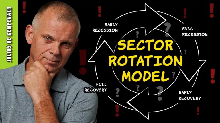
In this video from StockCharts TV, Julius examines the theoretical sector rotation model and aligns it with current state of sector rotation on Relative Rotation Graphs, and the phase of the economy. He makes some interesting observations and highlights some flashing warning signals.

Check out Julius’ Macroeconomic Variables/Metrics ChartList here.

This video was originally broadcast on June 11, 2024. Click anywhere on the icon above to view on our dedicated page for Julius.

Past episodes of Julius’ shows can be found here.

#StayAlert, -Julius

In this edition of StockCharts TV‘s The Final Bar, Dave reviews key charts from a technical analysis perspective, including AAPL, FSLR, MSTR, and STT. He also addresses the potential bearish momentum divergence for the S&P 500 index and reviews the negative breadth conditions, with new 52-week lows outnumbering new 52-week highs by a 2-to-1 ratio on Tuesday’s session!

See Dave’s chart of daily advance-decline data for NYSE here.

This video originally premiered on June 11, 2024. Watch on our dedicated Final Bar page on StockCharts TV!

New episodes of The Final Bar premiere every weekday afternoon. You can view all previously recorded episodes at this link.

In this edition of StockCharts TV‘s The Final Bar, Dave recaps a bullish day for stocks, with 8 out of 11 S&P 500 sectors finishing higher. He breaks down the charts of NVDA, ENPH, FSLR, and AMD, and reviews a potential upside reversal in gold.

See Dave’s chart with Fibonacci retracements for GLD here.

This video originally premiered on June 10, 2024. Watch on our dedicated Final Bar page on StockCharts TV!

New episodes of The Final Bar premiere every weekday afternoon. You can view all previously recorded episodes at this link.

Did you know that the equally-weighted RSP is seriously underperforming the cap-weighted SPY? It is losing considerable ground against the SPY and that suggests that if mega-caps fail, so will go the market. Carl shows us charts to prove his point.

Next up Carl covers the market in general followed by a review of the Magnificent Seven. Their performance is even more important given they are holding the indexes together.

Erin follow up with a review of the sectors and in depth coverage of the Technology sector. The program concludes with viewers symbol requests. Is it time to buy or sell your stock?

Erin will be doing a special presentation on Wednesday called “When to Sell Your Stock or ETF?”. It is free, simply click on this special link to sign up! If you haven’t already, we recommend you sign up for our free email list on our homepage at DecisionPoint.com!

Schedule:

01:10 DP Signal Tables

05:42 Discussion of RSP v. SPY

08:08 Market Bias and Market Coverage

14:21 Magnificent Seven

27:22 Sector Rotation

32:40 Symbol Requests

Don’t miss Erin’s presentation, “When to Sell Your Stock or ETF?” on Wednesday. Sign up for our free email list on our homepage for more information, or use this LINK to register for the presentation.

Want to try out DecisionPoint.com publications for free? Sign up for any DP publication or Bundle package and use coupon code: DPTRIAL2

Watch the latest episode of the DecisionPointTrading Room on DP’s YouTube channel here!

Try us out for two weeks with a trial subscription!

Use coupon code: DPTRIAL2 at checkout!

Technical Analysis is a windsock, not a crystal ball. –Carl Swenlin

(c) Copyright 2024 DecisionPoint.com

Disclaimer: This blog is for educational purposes only and should not be construed as financial advice. The ideas and strategies should never be used without first assessing your own personal and financial situation, or without consulting a financial professional. Any opinions expressed herein are solely those of the author, and do not in any way represent the views or opinions of any other person or entity.

DecisionPoint is not a registered investment advisor. Investment and trading decisions are solely your responsibility. DecisionPoint newsletters, blogs or website materials should NOT be interpreted as a recommendation or solicitation to buy or sell any security or to take any specific action.

Helpful DecisionPoint Links:

Trend Models

Price Momentum Oscillator (PMO)

On Balance Volume

Swenlin Trading Oscillators (STO-B and STO-V)

ITBM and ITVM

SCTR Ranking

Bear Market Rules

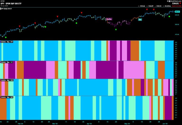
Good morning and welcome to this week’s Flight Path. Equities rebounded this week as we saw a string of strong blue “Go” bars and price hit a new higher high. Treasury bond prices returned to a “Go” trend with their own week of strong blue bars. Commodities struggled again as GoNoGo Trend was unable to maintain “Go” colors. The dollar shows uncertainty at the end of the week with an amber “Go Fish” bar.

$SPY Paints Strong Blue “Go” Bars at All Time Highs

After the weakness we saw the week before, GoNoGo Trend shows that the strength in the “Go” trend returned this week as we saw a run of bright blue bars and price made a new higher high. This came with signs of trend continuation as GoNoGo Oscillator broke out of a GoNoGo Squeeze into positive territory. This tells us that momentum is resurgent in the direction of the “Go” trend.

The larger weekly chart shows that the “Go” trend continues to be strong with another bright blue bar and a higher weekly close. GoNoGo Oscillator is now back in overbought territory at a value of 5 and this shows market enthusiasm in the “Go” trend.

Treasury Rates Remain in “NoGo”

GoNoGo Trend painted strong purple “NoGo” bars for much of this week even in the face of a strong final bar. This week saw a new lower low as the “NoGo” trend was strong. GoNoGo Oscillator is in negative territory but not oversold. Friday’s strong bar saw the oscillator turn up and so we will watch to see if it finds resistance at the zero line in this “NoGo” trend.

Dollar Shows Uncertainty with “Go Fish” Bar

This week saw a “NoGo” take over the greenback for much of the week. However, on Friday, GoNoGo Trend painted an amber “Go Fish” bar and so we will watch to see in which direction the trend goes this week. As price jumped higher to paint the amber bar, GoNoGo Oscillator reversed course sharply from moving lower in negative territory to a value of +1. We will be interested to see if the oscillator remains in positive territory or if it retests the zero line right away.

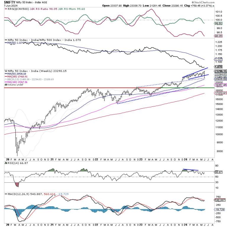
The markets had an incredibly eventful week as they reacted to the exit polls and general election results. All happened in the same week; the Nifty saw itself formin a fresh lifetime high and also came off close to 8% from its peak. A remarkable recovery also followed that led Nifty to a fresh closing high as well. The trading range also remained extremely wide; the Nifty oscillated in a massive 2057.25 points range before closing near its high. The volatility too swung violently. It surged over 40% at one point in time; by the end of the week, it came off by 31.38% to 16.88 as compared to its previous week’s close. Following such a kind of move, the headline index Nifty 50 finally settled with a net weekly gain of 759.45 points (+3.37%).

As we step into the next week, the markets may also show some more extension of the pullback. At the same time, at this juncture, the markets also look vulnerable to profit-taking-led retracements from current or higher levels as well. The more important concern is that of market breadth. The breadth of the broader market is not as strong as it should be; while the broader market index Nifty 500 is inching higher, the breadth is not seen keeping pace with the kind of strength that it should. Furthermore, despite the kind of volatility that the markets have seen, they have played out within the pattern resistance and support levels. Currently, the Nifty has closed just below a pattern resistance level.

The coming week may see the markets opening on a quiet note. The levels of 23400 and 23550 are likely to act as probable resistance levels. The supports come in at 22900 and 22630 levels.

The weekly RSI is 66.87; it shows a bearish divergence against the price. While the price has closed at a new high, the RSI has not. This has led to the emergence of the RSI’s bearish divergence. The weekly MACD stays bearish and below the signal line. A long-legged Doji is seen on Candles. Doji’s are more potent than spinning tops; their occurrence near the high point has the potential to disrupt any ongoing rally.

The pattern analysis of the weekly charts shows that the negative spike that the markets witnessed found support at the rising trendline of the channel that it had broken out from; and on the upside during the rebound, the Nifty has closed just below the upper rising trend line of the small channel that it has formed. The lead indicators continue to show negative divergence and the breadth remains not as strong as it should be. All this continues to leave the markets vulnerable to profit-taking at higher levels.

All in all, the Nifty has seen a strong rebound from lower levels post its extremely negative reaction to the general election outcome. This pullback may get extended a bit more but now the markets stare at some imminent profit-taking from higher levels. The markets are also seeing defensive setups play out the defensive pockets like FMCG and Pharma have started to do well. It is recommended to now use the moves to protect profits at higher levels. Leveraged exposures should be pared and fresh buying should be focused on defensive pockets and the stocks with improving relative strength. A cautious outlook is advised for the coming week.

Sector Analysis for the coming week

In our look at Relative Rotation Graphs®, we compared various sectors against CNX500 (NIFTY 500 Index), which represents over 95% of the free float market cap of all the stocks listed.

Relative Rotation Graphs (RRG) show that the Nifty Auto, Consumption, and Metal Index continue to stay inside the leading quadrant. Besides this, the Nifty Midcap 100 has also rolled inside the leading quadrant. This means that the broader market space may relatively outperform the frontline indices.

The Nifty Energy, Commodities, PSE, PSU Banks, Pharma, and Infrastructure indices are inside the weakening quadrant. The Nifty Realty Index is also inside the weakening quadrant but it is seen improving on its relative momentum against the broader markets.

The Nifty Services sector has rolled inside the lagging quadrant. Besides this, the IT index is also inside the lagging quadrant; however, that is seen improving on its relative momentum against the broader Nifty 500 index.

Nifty Bank, Financial Services, FMCG, and the Media Indices are inside the improving quadrant of the RRG. Among these, the Financial Services and Nifty Bank indices are seen paring their relative momentum against the broader markets.

Important Note: RRG™ charts show the relative strength and momentum of a group of stocks. In the above Chart, they show relative performance against NIFTY500 Index (Broader Markets) and should not be used directly as buy or sell signals.  

Milan Vaishnav, CMT, MSTA

Consulting Technical Analyst

www.EquityResearch.asia | www.ChartWizard.ae

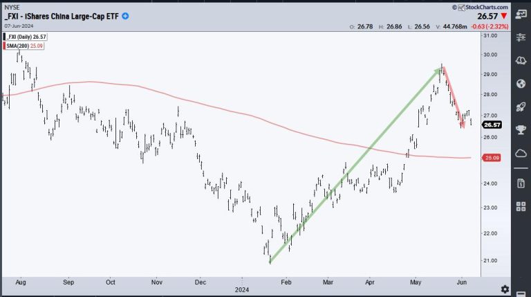
Chinese stocks wet on a tear from mid April to mid May with the China Large-Cap ETF (FXI) gaining some 40% and breaking its 200-day SMA. FXI then fell back over the last few weeks. This surge and pullback created a potential opportunity because some stocks returned to their breakout zones. These so-called throwbacks offer traders a second chance to partake in the breakouts. Today’s example will show Alibaba (BABA), which was featured on ChartTrader this past week.

The chart below shows Alibaba with the 200-day SMA (red line) and the Trend Composite in the indicator window. On the price chart, BABA found support twice in the 67-68 area and broke resistance with a surge in May. The two lows in this area formed a Double Bottom and the breakout reversed the downtrend. Also notice that BABA broke the 200-day SMA.

Traders who did not catch the breakout have a second chance because BABA returned to the breakout zone in early June. This is a classic “throwback” to broken resistance, which turns into support. The stock also returned to the 200-day SMA and the decline retraced around 61.8% of the prior surge. This retracement is normal for a pullback within a bigger uptrend. Overall, I see a Support-Reversal Zone in the upper 70s and I am watching short-term resistance at 80. A breakout here would reverse the short-term downswing and argue for a resumption of the bigger uptrend.

As noted above, the indicator window shows the Trend Composite, which aggregates signals in five trend-following indicators. It moved to +1 in early May, which meant three of the five indicators triggered bullish signals (3 – 2 = +1). Two more indicators turned bullish by the end of May and all five are now bullish (+5). My strategy is to look for tradable pullbacks within bigger uptrends. The Trend Composite signals a long-term uptrend and the decline to the upper 70s is a tradable pullback. Note that this indicator is part of the TIP Indicator Edge Plugin for StockCharts ACP (click here).

ChartTrader at TrendInvestorPro featured BABA and two other Chinese names last week. Recent breakouts in several crypto-related names were also featured because their breakouts signaled a continuation of their bigger uptrends (IBIT, COIN, BLOK). Reports and videos are published twice per week. Click here to learn more.

//////////////////////////////////////////////////

There is no denying that the primary trend for the S&P 500 remains bullish as we push to the end of Q2 2024. But what about the conditions “under the hood” of the major benchmarks? Today, we’ll highlight three “signs of the bear” we’re looking for, of which two may have already triggered, and what sort of confirmation could indicate a bearish reversal into the summer.

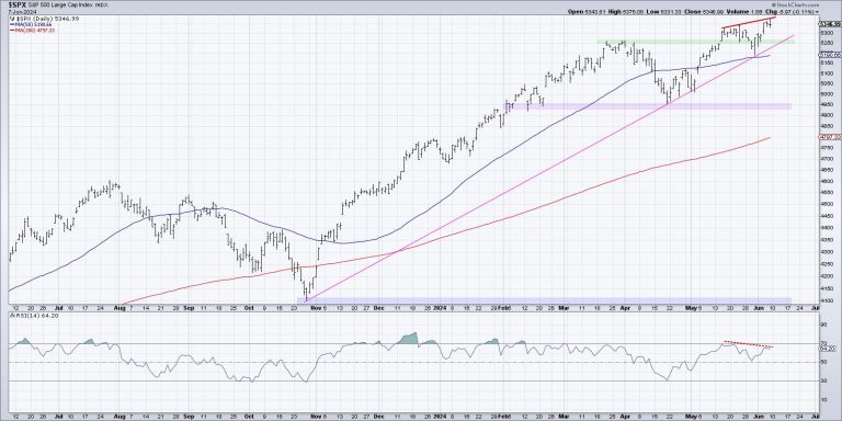
The first thing I’ve noticed about major market tops is that we tend to observe a proliferation of bearish momentum divergences. As prices push higher, we begin to see weaker momentum readings using an indicator like RSI. Let’s check out how the recent upswing for the S&P 500 has looked from a momentum perspective.

Here, we can see that the S&P 500’s RSI was around 70 when it first closed above 5300 in mid-May, but only around 65 on the recent push above 5350. Higher highs on weaker momentum indicates a potential exhaustion of buyers, with less emphasis on the most recent upswing.

And it’s not just about the S&P 500. Check out the daily chart of Amazon.com (AMZN), for a similar example in mid-May.

We can also see the bearish momentum divergence on stocks in the industrial sector, such as Northeast Ohio’s own Eaton Corp. (ETN).

While I would say next week is crucial for the S&P 500, to see if there’s another push above 5350 on stronger momentum, overall, the move higher in June generally speaking has been marked with lower momentum readings.

These “signs of the bear” are all part of a larger list that I call my Market Top Checklist, which is coming in super handy right about now! Want to follow along as we track each of the items on the checklist to gauge a potential market top in the summer? You need to be a Market Misbehavior premium member! Don’t forget to use code STOCKCHARTS for 20% off your first 12 months!

Another sign of the bear that I’d argue is very much in play is a lack of confirmation from market breadth indicators. Here’s a chart of the S&P 500 on a closing basis, along with the cumulative advance-decline lines for the New York Stock Exchange, S&P 500 large-caps, S&P 400 mid-caps, and S&P 600 small-caps.

Note that not only are all four of those advance-decline lines sloping lower over the last three weeks, but three of them finished this week below their 50-day moving averages. When a market moves higher, but breadth conditions fail to confirm those new highs, this suggests narrow leadership and potential toppy conditions.

I know what you’re thinking: “But Dave, isn’t that just because the Magnificent 7 stocks are dominating again?” And yes, you would be correct. And while our major benchmarks can indeed move higher driven by those mega-cap growth stocks, market history has shown that a healthy bull market phase tends to be marked by improving breadth readings. I’d feel way more optimistic about market conditions if I observed more stocks participating in the uptrend!

Now we come to the third sign of the bear, which is the breaking of “lines in the sand” for the major averages. Going back to our daily S&P 500 chart, do you see the pink trendline using the major lows since October 2023?

If you connect the October 2023 low to the mid-April low around 4950, you’ll see that trendline connects almost perfectly with subsequent lows in April and May. As long as the S&P 500 remains above this trendline, then the primary bull trend would remain largely intact. But if and when the SPX fails to hold this trendline, and perhaps if it would break below price and moving average support around 5200, then I would strongly consider planning for much further downside for risk assets.

In established bull market phases, mindless investors tend to think only of potential upside, as they believe the bull market will never end. Mindful investors know that, by looking for signs of a potential rotation, you can better protect your previous gains in the event of a downside correction!

RR#6,

Dave

P.S. Ready to upgrade your investment process? Check out my free behavioral investing course!

David Keller, CMT

Chief Market Strategist

StockCharts.com

Disclaimer: This blog is for educational purposes only and should not be construed as financial advice. The ideas and strategies should never be used without first assessing your own personal and financial situation, or without consulting a financial professional.

The author does not have a position in mentioned securities at the time of publication. Any opinions expressed herein are solely those of the author and do not in any way represent the views or opinions of any other person or entity.

In this StockCharts TV video, Mary Ellen reviews what drove the markets to new highs. She highlights S&P 500 sectors, plus stocks that have reversed their downtrends, pointing out good entry points. Mary Ellen also takes a close look at why stocks did not respond to today’s spike in interest rates.

This video originally premiered June 7, 2024. You can watch it on our dedicated page for Mary Ellen on StockCharts TV.

New videos from Mary Ellen premiere weekly on Fridays. You can view all previously recorded episodes at this link.

If you’re looking for stocks to invest in, be sure to check out the MEM Edge Report! This report gives you detailed information on the top sectors, industries and stocks so you can make informed investment decisions.

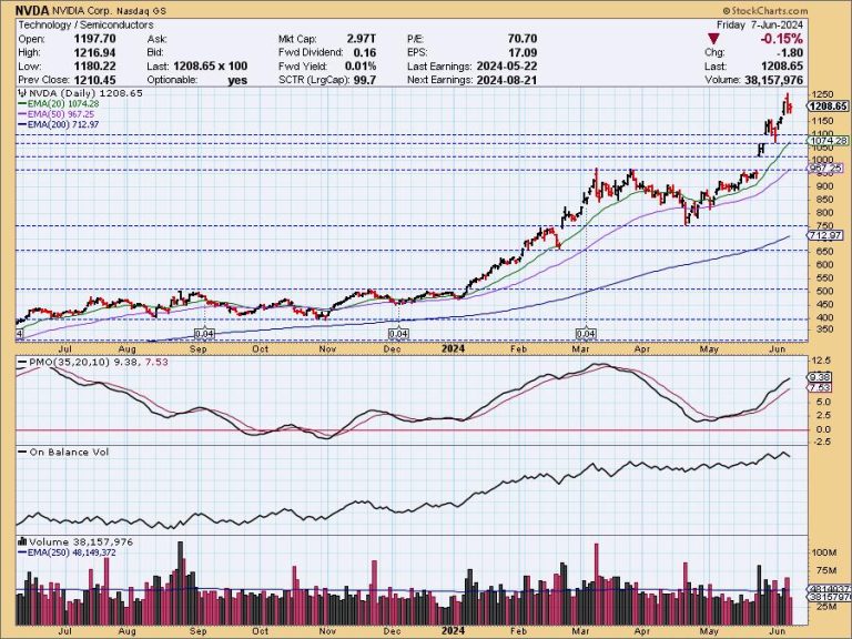
When Nvidia (NVDA) opens on Monday, it will have experienced a 10:1 split, and we should remember that one of the purposes of stock splits is to facilitate distribution. That is to say that the lower price after the split attracts investors who avoided the stock at the higher price (i.e. the little guys). Over the years we have observed that stock splits frequently are followed by price corrections; however, Adam Johnson of The Bullseye American Ingenuity Fund on Fox Business quoted a Bank of America study stating that stocks that have a 5:1 split or greater are on average higher by 25% in the following 12 months, as opposed to the rest of the market being up only 12% in the same period. That may be true, but but a correction could also be in the cards as well.

The problem with NVDA is that it has advanced about 1100% since the 2022 low in an excruciating parabolic arc, and we expect that parabolics will eventually enter a correction. In the case of average companies, the correction can be quite brutal, -50% or more. But NVDA is currently one of the best companies ever, and if a correction comes, we would expect a high-level consolidation, which is a sideways trading range. We can see an example of this after the vertical advance at the beginning of the year, when NVDA corrected about -22% in March and April. There was another consolidation in 2023 involving a pullback of -25%. And finally, there was a -69% correction in 2021-2022, back before the magic of AI took hold.

Conclusion: Vertical advances beg for correction. In the case of a quality stock like NVDA, all that is usually needed is a relatively small pullback or consolidation. That is what we should be looking for sooner or later this year, and there seems to be good support at 970.00 . . . oh, wait. That will be 97.00 on Monday.

Learn more about DecisionPoint.com:

Watch the latest episode of the DecisionPointTrading Room on DP’s YouTube channel here!

Try us out for two weeks with a trial subscription!

Use coupon code: DPTRIAL2 at checkout!

Technical Analysis is a windsock, not a crystal ball. –Carl Swenlin

(c) Copyright 2024 DecisionPoint.com

Disclaimer: This blog is for educational purposes only and should not be construed as financial advice. The ideas and strategies should never be used without first assessing your own personal and financial situation, or without consulting a financial professional. Any opinions expressed herein are solely those of the author, and do not in any way represent the views or opinions of any other person or entity.

DecisionPoint is not a registered investment advisor. Investment and trading decisions are solely your responsibility. DecisionPoint newsletters, blogs or website materials should NOT be interpreted as a recommendation or solicitation to buy or sell any security or to take any specific action.

Helpful DecisionPoint Links:

Trend Models

Price Momentum Oscillator (PMO)

On Balance Volume

Swenlin Trading Oscillators (STO-B and STO-V)

ITBM and ITVM

SCTR Ranking

Bear Market Rules