Archive

2023

Browsing

On this week’s edition of StockCharts TV‘s StockCharts in Focus, Grayson shows you how to build what he calls the “Ultimate Relative Strength” chart template, inspired by the multi-level Sector Summary structure that we covered last week. You’ll learn how to take the concept of drilling down from sector to industry group to the individual stock level and turn it into a chart layout that you can use with any stock. Plus, Grayson will show you how to add the SCTR Line indicator for even more relative strength insight!

This video was originally broadcast on February 10, 2023. Click on the above image to watch on our dedicated StockCharts in Focus page on StockCharts TV, or click this link to watch on YouTube. You can also watch on our on-demand website, StockChartsTV.com, using this link.

New episodes of StockCharts in Focus air Fridays at 3pm ET on StockCharts TV. You can view all previously recorded episodes at this link.

I talk about it almost every week in Sector Spotlight, but I just realized that I have not written about it for quite a while.

The investment decision that has the most significant impact on your results…

Asset Allocation.

Many, especially retail investors, are so focused on the stock market and finding good stocks or sectors to invest in that they forget that other asset classes are out there.

And that could be a costly mistake!

In the academic world, many studies have been written on this subject. Probably kicked off by the work of Brinson, Hood, and Beebower in the ’80s. In their study “Determinants of Portfolio Performance,”;

BHB asserted that asset allocation is the primary determinant of a portfolio’s return variability, with security selection and market timing (together, active management) playing minor roles. BHB’s 1986 study examined the quarterly returns of 91 large U.S. pension funds over the 1974 to 1983 period, comparing the returns to those of a hypothetical fund holding the same average asset allocation in indexed investments. A linear time-series regression yielded an average R-squared of 93.6%, leading BHB to conclude that asset allocation explained 93.6% of the variation in a portfolio’s quarterly returns.

Now be careful this 93.6% is the explanation of the variation in the portfolio’s returns. Not the returns themselves.

Nevertheless, it is safe to assume that your asset allocation decisions have a significant impact. Asset Allocation should be an integral part of your workflow. Maybe not on a daily or even a weekly basis, but I suggest taking a look at least once a month.

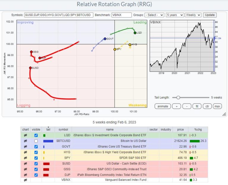
I have gotten used to a setup where I use a few ETFs to track the rotation of major asset classes. You can see that in the RRG at the top of this article. $BTCUSD is switched off as it is so far away from the benchmark that it distorts the image for the remaining asset classes.

The benchmark that I prefer to use is VBINX. That balanced index fund holds 60% in stocks and 40% in bonds. That is a typical balanced portfolio. Adding a few asset classes outside the benchmark allows an investor to find alternative investments that will enable him to “outperform” that benchmark.

The most important reason to think about and actively manage your asset allocation is to mitigate risks associated with the various investments, especially stocks. Even when you decide to stay at a high level with your investment and just buy SPY as a proxy for the stock market, your allocation to SPY will lose value when stocks go down.

Managing your asset allocation will help prevent big swings in your investment portfolio. Unless you are a high-rolling punter (pun intended), that is most likely what you are after.

Commodities and $USD Are Lagging.

Looking at the current state of Asset Class rotation, we find the tails for commodities inside the lagging quadrant, with GSG picking up relative momentum recently. The relative trend for this asset class remains down and is, therefore, less interesting for investments, as stocks and bonds (our VBINX benchmark) are doing much better now.

Also, inside the lagging quadrant, we find the $USD. While it has started to pick up relative momentum over the last weeks, it is still at the lowest RS-Ratio reading in this universe. This tells me that, at least over the previous months, investment in foreign currencies would have done better than in USD, but the deterioration is getting less, and things are starting to look better for USD-based investments. This is information I would consider when I am looking for exposure to foreign markets. It is especially important to consider when investing in foreign markets using ETFs listed on US markets and quoted in USD.

Correlation

The remaining tails on the RRG show the rotations for the asset classes included in our benchmark. GOVT is an ETF that tracks the aggregated performance of US government bonds over all maturities on the Yield Curve. LQD tracks a portfolio of corporate bonds, and HYG does the same for High Yield bonds. SPY, of course, follows the asset class stocks.

Even though GOVT, LQD, and HYG are all three fixed income-related asset classes, they have different risk profiles.

These differences are best visualized using the correlation indicator.

The chart above shows the monthly price chart for SPY, followed by the 12-month correlations with HYG, LQD, and GOVT. In the last pane, I added the correlation with TLT as it has more history than GOVT. The correlation between TLT and GOVT is very high and moves around 0.90.

We can see here that HYG has the highest correlation with SPY; it is always positive and mostly above 0.75. That means that HYG will move very much in line with SPY.

The correlation for LQD is less. Here we see a correlation reading which is still predominantly above zero. But sometimes it dips into negative territory and generally shows much more fluctuations.

GOVT/TLT, finally, show the least constant correlation with SPY, meaning that they go through significant periods of noncorrelated performance.

To mitigate the risks in one asset class, you want to look for another asset class with a low or, even better, negative correlation.

Another way to get a handle on correlations on StockCharts.com is to use the Correlation view.

You can find the correlation view in the dropdown on your chart lists page. The view will show you the symbols in your ChartList, and you can set the symbol you want to calculate the correlations against and the period over which you want to know the correlations.

In the example above, I have created a list with the asset classes that I use in the RRG, set the benchmark to VBINX, and the period to 1 year, matching the correlations shown in the SPY chart with the correlations against the fixed income asset classes above.

The big difference is that the charts show the change in correlations over time, while the table just provides a snapshot of the current values. The correlation charts also show that the correlations between these fixed-income ETFs and SPY have recently started to come down.

Stocks vs. Fixed Income Asset Classes

LQD and HYG show the highest readings on the RS-Ratio scale. LQD has just started to roll over, while HYG began moving in the opposite direction. This shows a preference for HYG over LQD. Hence a preference for the “riskier” asset class High-Yield over the “less risky” Corporate bonds.

The BIG decision, of course, is between Stocks (SPY) and (Government) bonds (GOVT). SPY is still located to the right of GOVT, which points to a preference for Stocks over Bonds. The RRG-heading, on the other hand, is negative for SPY and positive for GOVT. When one crosses over the other on the RS-Ratio scale, that is considered a change in trend. The wider the distance on the RS-Momentum scale, the more meaningful that trend change is.

Looking at the length of the tails and RRG-Velocity (The distance between the nodes on the tail), we can see that it is shrinking, which means that the move is losing power, increasing the odds of rolling in the opposite direction. i.e., SPY curling back up and GOVET rolling over.

The 1-1 comparison between SPY and GOVT may come in helpful here.

This chart shows the ratio between SPY and GOVT and how it contracted since March last year. This contraction is reflected in the tails moving closer together on the Relative Rotation Graph over the previous 6-7 weeks.

The slowdown in RRG-Velocity (distance between the nodes getting shorter) combined with the ratio trying to break out of the triangle-like consolidation and correlation between SPY and GOVT declining leads to the belief that the market is setting up for a new, renewed, further improvement of stocks over bonds in coming weeks.

#StayAlert and have a great weekend, –Julius

Everybody is talking about breadth lately. And, indeed we see or have seen some improvement in New Highs / New Lows, A/D lines, New 52-Week Highs, etc.

As you may, or may not, know, I use Relative Rotation Graphs to visualize market breadth as well from time to time. There are two ways we can do that.

Plotting Percentage of Stocks Above 20-, 50-, & 200-EMA

The first way is to use the indexes that measure the percentage of stocks above a moving average. On StockCharts.com, we keep track of those numbers in a family of indices that start with !GT##XXX, where ## is the number of days of the Exponential Moving Average. This can be 20-, 50-, or 200-days. The XXX holds the symbol for the sector; see it as a measure of market breadth at sector level.

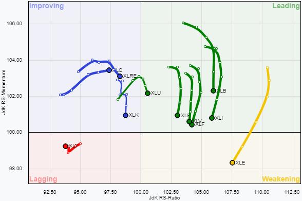
The RRG above shows this rotation for the EMA-20 indices, comparing it against the percentage of stocks above their 20-day EMA in the S&P 500. The recent strength is visible, with the majority of sectors on the right-hand side of the graph, while only the three defensive sectors are positioned inside the lagging quadrant.

But when we look a bit closer, we can see that only the three sectors inside the green oval, Materials, Technology, and Real-Estate, are still moving higher on the RS-Ratio scale, which means that they are strengthening against !GT20SPX. All sectors inside the yellow oval are losing strength, while the three defensive inside lagging have stopped going down.

The one thing that you’ve got to keep in mind using this setup is that the values for these indices are contained between 0-100. So, when one of these extremes is reached and the index remains level at that extreme, RS-Momentum will taper off by definition while RS-Ratio continues higher, but, eventually, RS-Ratio will also come down. As long as the trend for these numbers is still up, it will not go below 100.

The second chart shows the same image, but now uses the 50-day EMA percentages. As you can see, the universe is now a bit more spread out, with Materials at 93.10% while Staples has only 18.18% of stocks above its 50-day EMA. Only Materials and Energy have a positive RRG-Heading, and Technology and Real-Estate are still moving higher on the RS-Ratio scale. Inside the lagging quadrant, we now also find Industrials.

On Feb. 2, 2023, the S&P 500 completed what is known by technical analysts as a “Golden Cross”, which is when the 50-day simple moving average crosses above the 200-day. It has an okay, but not amazing, track record of catching the big trending moves, although as with any trend-following system there are some bad signals. 

I want to introduce you this week to another way of looking at the Golden Cross, and its supposedly evil twin the Death Cross (which is when the MAs cross going the other way). The key insight is about what is happening with prices at the moment of the crossing. What I have noticed over the years is that the behavior of prices at that moment will tell us something about what happens next to prices. 

This is related to the principle known as a “rainbow convergence”, something I talk about a lot in my Daily Edition concerning shorter term exponential moving averages (EMAs), and which I addressed in a February 2019 Chart in Focus article. And this same principle works with other pairings of moving averages, including the 50- and 200-day simple moving averages. 

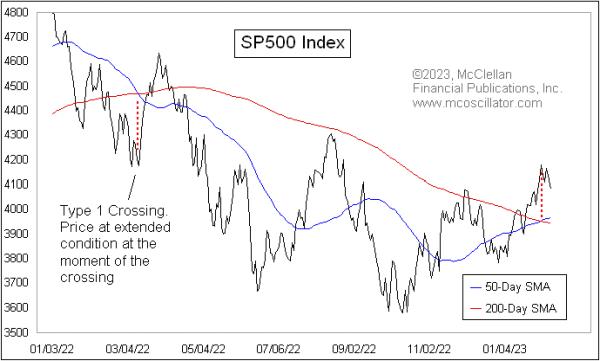
In a Type 1 crossing (or Type 1 rainbow convergence), prices are extended pretty far away from the price point of the moving average crossover. In those cases, the moment of the crossing most often marks a reversal point. It can be a temporary reversal, or a more significant one.

We can see an example of a Type 1 convergence in the chart above, when there was a crossover back in March 2022. That was a so-called Death Cross, which is supposed to be a bearish sign. But instead of living up to that bad omen right away, prices reversed at the moment of the convergence and mounted an 11% countertrend rally. Eventually, prices turned back down again from that countertrend rally, and did finally live up to the bearish signal of the Death Cross, but it was unpleasant at first for those who saw that Death Cross as an immediate bearish signal and took action based on it.

There is a second type of behavior at the moment of the crossing that I call a Type 2 event. It involves seeing prices retrace back toward the price-time point of the MA crossing, and what usually ensues is a resumption of the trend that preceded the retracement.

The chart below takes a longer look at the S&P 500, with examples of both Type 1 and Type 2 events.

Looking closely, we see that, when there is a Type 2 crossing and prices retrace back toward the crossing point, the trend resumes after that retracement. But when there is a Type 1, there is more often a reversal, at least temporarily. This is the key insight: the immediate meaning of the Golden Cross or the Death Cross is different depending on how prices are behaving when the crossing is happening.

That brings us to the current crossing that happened on Feb. 2, 2023. In this case, that day marked the exact top of the recent up move, and prices are reversing downward, as opposed to manifesting the supposedly bullish implications of the Golden Cross.

It does not always work out quite this precisely. For example, the price bottom of the COVID Crash on March 23, 2020 was a week before the crossing of the two MAs, but that is still pretty close in time. And that was a pretty dramatic Type 1 crossing event that, sure enough, brought a reversal, which in that case was a permanent reversal and not just a temporary one.

I have seen this principle work with other pairings of moving averages, although I have not spent the time to test every possible combination to see how universal it is. If you have a different pairing of simple moving averages (SMAs) or exponential ones (EMAs) that you like to use, I encourage you to test out this idea to see if it works for them, as opposed to just assuming that it will.

And then the next time you hear an analyst talking about a Golden Cross or a Death Cross and claiming that it means a bullish or a bearish message, take a look first to see how prices are behaving relative to that crossing point. Because now you know about the special magic message embedded in that information.

I’ve recognized the strength displayed by the S&P 500 and Nasdaq Composite off the October lows. I’ve written about the New Dow Theory buy signal and the improvement in breadth indicators like the percent of stocks above moving averages. So, while I am not as all-in uber-bullish as my friend Tom Bowley, I certainly will admit that the strength we have seen thus far in 2023 usually leads to further strength down the road.

Three charts I’m watching suggest that we may be in short-term pullback mode, with a non-zero probability that it leads to a retest of the December lows. Will this represent a better entry point for investors that have missed all the bullishness of the last six weeks?

Bullish Percent Index Becomes Less Bullish

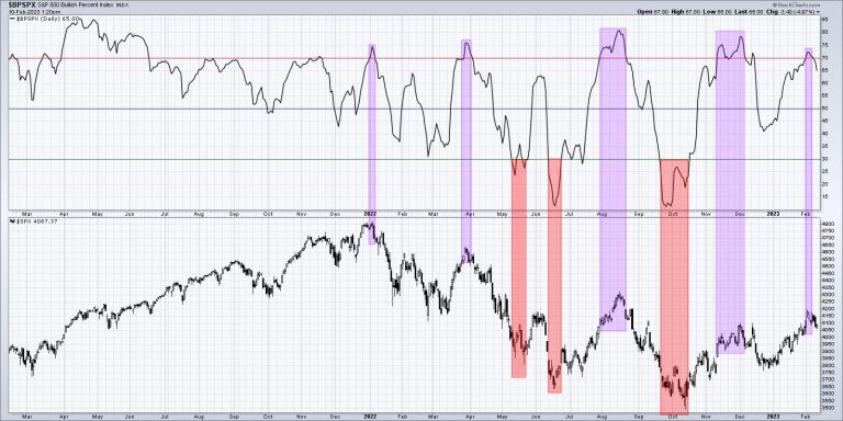
First, let’s review a breadth indicator driven entirely by point & figure charts.

The Bullish Percent Index was one of the most helpful indicators to navigate 2022. Most of the major tops last year saw this indicator move above 70 toward the end of the upswing, then right back below 70 to indicate a downside reversal. We also had three buy signals, where the indicator dipped below 30 and then back higher. Two of those times beautifully indicated the June and October lows.

At the end of January, the Bullish Percent Index pushed above the key 70 level, suggesting the latter stages of a bull move. This week, we have noted this indicator has moved back below the 70 level, which suggests a new leg down for the S&P 500.

McClellan Oscillator No Longer Bullish

I shared a video last week about the McClellan Oscillator, a well-designed adaptation of advance-decline data.

Simply put, the market is bullish when the McClellan Oscillator is above zero, and bearish when it is below zero. There’s certainly more to the indicator, including the bearish divergences indicated with red lines on my chart.

But if you look at what the S&P 500 has done when the indicator is above zero vs. below zero, you can see why this breakdown is an important gauge of market breadth and should give bulls some pause about next couple weeks.

An Foreboding Increase in Volatility

Finally, we can look at volatility, which has remained fairly low since December of last year.

I had a great conversation with Katie Stockton recently about the prospects for the market to rally on lower volatility, which is something we really hadn’t seen since the October low. Well, this week, the VIX pushed back above the 20 level, which may be the beginning of a return to a higher volatility regime.

Why is high volatility a concern? Well, the market doesn’t tend to rally on high volatility. The reason is that, when investors get nervous and panic, they tend to sell quickly and anxiously. This pushes the VIX, or the “fear gauge”, higher to reflect investor uncertainty.

Markets tend to have sustained advances on lower volatility because investors tend to accumulate shares over time during a bull market phase. We don’t anxiously accumulate shares (although that can happen in the “irrational exuberance” phase at the end of bull markets!), so a market uptrend with a relatively low VIX would be pretty bullish. As the VIX has moved back above 20, we’re faced with weakening price characteristics as the SPX dips below 4100, declining breadth indicators with similar signals to previous corrective moves, and stocks like GOOG in a freefall.

Bullish on stocks here? The indicators we shared today could mean an even better entry point to ride the next bull move higher. But these indicators will need to improve, as, otherwise, they suggest a more painful downdraft than some may expect.

Want to learn more about how we use RSI to analyze price momentum? Hit my YouTube channel.

RR#6,

Dave

P.S. Ready to upgrade your investment process? Check out my free behavioral investing course!

David Keller, CMT

Chief Market Strategist

StockCharts.com

Disclaimer: This blog is for educational purposes only and should not be construed as financial advice. The ideas and strategies should never be used without first assessing your own personal and financial situation, or without consulting a financial professional.

The author does not have a position in mentioned securities at the time of publication. Any opinions expressed herein are solely those of the author and do not in any way represent the views or opinions of any other person or entity.

This is not meant to be political. As we have written many times, politics and investing should not be in the same sentence.

With that said, during this past week’s State of the Union Address, we were keenly listening for comments on our macro themes (as reported in the 2023 Outlook) we believe could spike inflation again and keep the market in a trading range. Please consider this an addendum to the E-Book “How to Grow Your Wealth in 2023”.

One such theme in the book is the inflationary impact of “anti-globalism.” The more the country (and countries) talk or enforce independence from global trade, the more strain it puts on natural resources. And the higher prices for real goods could rise. When countries reduce global trade, they prevent themselves from sourcing the lowest-priced goods. Let’s not forget the shortages already reported in copper, lumber, oil, steel, aluminum, and food, to name a few.Foreign Policy — Send money in perpetuity to Ukraine and any other ally, and continue to have a trade war with China. We hear about more government spending and rising costs of American goods. Not to mention the risk to the dollar should other nations decide to buy cheaper goods elsewhere.Build in America — Yes, having USA made semiconductor chips could save us money and create jobs. So will turning our attention to infrastructure—the President pointed out that the U.S. is ranked 13th in the world. BUT there are already 11 million jobs unfilled. And many tech companies are trimming jobs. The mindset for US growth feels very 60 years ago. No mention of automation (replacing jobs). No mention of the metaverse removing the need for brick and mortar. No mention of the aging population and declining birth rate. No mention of the efficacy of technology such as 3D printing to replace materials that grow from the earth for building houses. In fact, NO mention of the digital world at all or how we must prepare for the inevitability of it. AI and technical efficacy can become dystopian if only the wealthy enjoy the benefits.Healthcare—Big Pharma is reputedly known for fixing symptoms rather than finding cures. Putting that aside, we were struck by the great news on the cost of insulin coming down. “One out of twelve Americans has diabetes.” We fact checked: 37.3 million Americans—about 1 in 10—have diabetes. About 1 in 5 people with diabetes don’t know they have it. So yay, insulin is cheaper. But no mention of preventative care or nutrition awareness. And if you read our Outlook, sugar consumption is one of the underlying harbingers of inflation and social unrest. Sugar prices have quadrupled since 2020.Another macro theme is Mother Nature. As we are witnessing, she has her own plans to create havoc. No mention of agri-tech to combat scarcity and high prices. No mention that China owns hundreds of thousands of acres of US farmland. USDA reports that China accounted for 383,935 acres, or 0.9% of total foreign-owned U.S. agricultural land as of year-end 2021. The US aggressively sends money and resources to places devastated by weather events. Until we are more efficient in growing, cultivating, and distributing food, in spite of what Mother Nature has in store, with the increase of these natural disasters, food costs should continue to rise.

The purpose of this addendum is to inform and prepare you for how to invest should the trends already in place continue to spiral.

For an actionable trade idea, please read on.

We at MarketGauge have lots of tools and scanners, as well as trading models and blends, that help you find stocks setup to trade.

This screenshot is from our Complete Trader product after the close on February 9th. We focus on “bullish compression” or stocks in bullish phases that are consolidating and potentially ready to go higher. For our part of the research and to narrow down the picks on the scan, we added a discretionary filter based on our research and bias of more inflation coming.

The top columns show the scans for inside days (when the trading range is withing the range of the day prior). Narrow range day makes sense given its inside day—it also means the trading range is much smaller than what is typical. MR is mean reversion as evidenced by our Real Motion Indicator. Then comes Triple Play (indicator), which tells us how the instrument is performing compared to the benchmark. It also includes a volume trend indicator that compares relative daily volume levels against the price movement in a stock.

The Stock phase is the phase it is in according to our 6 phases, all of which are fully described with examples in Mish’s book Plant Your Money Tree.

On Friday, Mish did a segment for the StockCharts TV series Your Daily Five. One stock on the list, and covered in that segment if you click the link, is NOV. It is in the energy sector—a macro theme and an area covered during SOTU. NOV had a narrow range day coming into Friday. The Real Motion or Momentum Phase is bullish. NOV underperformed the benchmark and showed bearish volume compared to its price. Its stock’s phase is bullish.

On Friday, the stock climbed nearly 4% compared to the SPY, which closed flat.

The E-Book refers to the oil market as the X-factor for how high and how long inflation could run. This research and our tools are designed to give you a focus list for what to invest in during what should turn out to be, quite an interesting and volatile year.

For more detailed trading information about our blended models, tools and trader education courses, contact Rob Quinn, our Chief Strategy Consultant, to learn more.

IT’S NOT TOO LATE! Click here if you’d like a complimentary copy of Mish’s 2023 Market Outlook E-Book in your inbox.

“I grew my money tree and so can you!” – Mish Schneider

Get your copy of Plant Your Money Tree: A Guide to Growing Your Wealth and a special bonus here.

Follow Mish on Twitter @marketminute for stock picks and more. Follow Mish on Instagram (mishschneider) for daily morning videos. To see updated media clips, click here.

Mish in the Media

Mish gives you some ideas of what might outperform in this new wave of inflation on the Friday, February 10 edition of StockCharts TV’s Your Daily Five. She has picks from energy, construction, gold, defense, and raw materials.

Read about Mish’s interview with Neils Christensen in this article from Kitco!

In this appearance on Making Money with Charles Payne, Charles and Mish discuss whether Powell can say mission accomplished.

Mish shares her views on how to approach the earnings announcements of Apple, Amazon, and Alphabet, and gives her technical outlook on how the earnings results could impact the S&P 500 and Nasdaq 100 in this appearance on CMC Markets.

Listen to Mish on Chuck Jaffe’s Money Life, beginning around the 27-minute mark.

Kristin and Mish discuss whether or not the market has run out of good news in this appearance on Cheddar TV.

Harry Melandri and Mish discuss inflation, the Federal Reserve, and all the sparkplugs that could ignite on Real Vision.

Jon and Mish discuss how the market (still rangebound) is counting on a dovish Fed in this appearance on BNN Bloomberg.

Mish discusses price and what indices must do now in this appearance on Making Money with Charles Payne.

In this appearance on TheStreet.com, Mish and JD Durkin discuss the latest market earnings, data, inflation, the Fed and where to put your money.

In this appearance on CMC Markets, Mish digs into her favourite commodity trades for the week and gives her technical take on where the trading opportunities for Gold, oil, copper, silver and sugar are.

ETF Summary

S&P 500 (SPY): 420 resistance with 390-400 support.Russell 2000 (IWM): 190 pivotal support and 202 major resistance.Dow (DIA): 343.50 resistance, 338 support.Nasdaq (QQQ): 300 the pivotal area, 290 major support.Regional banks (KRE): 65.00 resistance, 61 support.Semiconductors (SMH): 248 resistance, 237 then 229 support.Transportation (IYT): The 23-month MA is 244—now resistance, 228 support.Biotechnology (IBB): Sideways action 130-139 range.Retail (XRT): 78.00 the 23-month MA resistance and nearest support 68.00.

In this week’s edition of Moxie Indicator Minutes, TG explains how we could see the pullback building this week, with breadth weakening and many stocks being in extended positions that made getting long a risky proposition. This is good though, and was needed. Now, we need to see if the pullback is into strength or weakness over the next several days.

This video was originally broadcast on February 10, 2023. Click this link to watch on YouTube. You can also view new episodes – and be notified as soon as they’re published – using the StockCharts on demand website, StockChartsTV.com, or its corresponding apps on Roku, Fire TV, iOS, Chromecast, Android, and more!

New episodes of Moxie Indicator Minutes air Fridays at 12pm ET on StockCharts TV. Archived episodes of the show are available at this link.

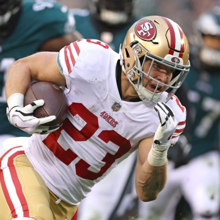
As members of the San Francisco 49ers continue to parade through radio row at the Super Bowl this week, the players’ saltiness about the NFC championship game loss to the Philadelphia Eagles appears to grow. 

‘It’s really tough,’ McCaffrey told Kay Adams on the ‘Up & Adams’ show. ‘You don’t want to make excuses obviously. It just sucks because we wish we had a healthy quarterback for a full game.  

‘It’s a really good team that we played. But it feels like something got stolen from you.’ 

In the first quarter of an eventual 31-7 defeat, quarterback Brock Purdy – who started the season as the team’s third-stringer – suffered a torn UCL after a sack fumble. 

Josh Johnson, a journeyman veteran, was inserted at quarterback. He suffered a concussion and was ruled out, forcing Purdy to return while being unable to throw the ball. 

Super Bowl Central: Super Bowl 57 odds, Eagles-Chiefs matchups, stats and more

McCaffrey mentioned a rule allowing teams to carry a third quarterback. While all teams can dress only 48 of the 53 players on the roster, there is no rule prohibiting them from doing so.

The Niners simply did not have another quarterback, although Adams asked McCaffrey whether Jimmy Garoppolo would have been healthy enough to suit up. 

As the emergency quarterback, McCaffrey said he was ready to assume the position but ultimately did not have to.

This post appeared first on USA TODAY

Buffalo Bills safety Damar Hamlin continues to make significant progress after suffering cardiac arrest against the Cincinnati Bengals on Jan. 2.

Hamlin, 24, was in good spirits during a recent Super Bowl Week appearance. He won the NFLPA Alan Page Community Award for his terrific work off the field.

It’s unclear if Hamlin can make an on-field return. However, NFLPA medical director Thom Mayer believes Hamlin will play football again.

‘I don’t want to get into HIPAA issues, but I guarantee you that Damar Hamlin will play professional football again,’ Mayer said on Sirius XM Doctor Radio show ‘Heart to Heart.’

After attempting a routine tackle on Bengals receiver Tee Higgins, Hamlin attempted to stand up before collapsing. He received medical care on the field before being taken to the University of Cincinnati Medical Center.

Super Bowl Central: Super Bowl 57 odds, Eagles-Chiefs matchups, stats and more

The NFL community rallied around Hamlin in the following weeks. Teams honored him with special ‘Love for Damar’ T-shirts and by painting his No. 3 jersey number on the field during Week 18. Several fans also contributed to his Chasing M’s Foundation toy drive.

Hamlin was later transferred to a local medical center in Buffalo, New York. He was released Jan. 11 and made his first public appearance during the Bills’ AFC divisional round matchup against the Bengals.

In a post on social media, Hamlin expressed his gratitude for all the support. He has also teamed up with the American Heart Association to raise awareness for CPR training and education.

‘What happened to me on Monday Night Football was a direct example of God using me as a vessel to share my passion and my love directly from my heart with the entire world,’ Hamlin said in the message.

Hamlin was drafted by the Bills in the sixth round of the 2021 NFL draft and became a full-time starter this season. In 29 career games, Hamlin has 93 career tackles, four passes defended and one forced fumble.

This post appeared first on USA TODAY

The coda to the greatest failure in NBA history might have taken place in the middle of the night, but even darkness can’t hide the indignity of what the Brooklyn Nets will wake up to on Thursday. 

It was inevitable, perhaps, that this would be how the end of the Kevin Durant era would look in Brooklyn. He’d already asked for a trade once, and with his running mate Kyrie Irving spiraling into conspiracy and eventually careening to a new destination, there probably wasn’t much reason for him to stay. 

But with Durant now headed to the Phoenix Suns and the Nets pivoting to an entirely new franchise paradigm, it is worth tallying up what the last four seasons have wrought. For a team that managed to get three all-time talents on the same roster with Durant, Irving and James Harden, it’s an almost inconceivable scale of disaster to be left with only Ben Simmons standing amid the rubble. 

Once Irving requested a trade last week – a move born out of Brooklyn’s justifiable hesitation to give him a long-term deal – the superteam experiment was over. The only real question was whether the Nets would have enough time before the trade deadline to put a deal together for Durant or whether that piece of business would need to take place in the offseason.

NBA TRADE DEADLINE TRACKER: Durant moved to Suns in blockbuster

BROOKLYN: Nets ship Kyrie Irving to Mavericks

From a purely transactional standpoint, the Nets haven’t done too badly. Now loaded up on future first-round draft picks, they have a lane to spin off even more assets in the offseason and go into a complete rebuild like Oklahoma City. Or, having acquired a lot of functional wing players over the last week in Mikal Bridges, Dorian Finney-Smith and Cam Johnson to go along with what remains on the roster, they can tweak around the edges and try to stay competitive. Given the options, it could have been worse.

But that obscures the bigger picture of the opportunity wasted in Brooklyn. The Durant-Irving-Harden triumvirate didn’t just fail to win a championship, its entire legacy is one postseason series win and eventually being sold for pieces like a company that went belly up. 

Whatever the extenuating circumstances – and injuries certainly accounted for some (but not all) of the issues over the years – there has never been a team that promised more and delivered less. 

And now it’s gone.

It’s remarkable to think that just a month ago, the Nets might have been considered the favorite to win the Eastern Conference. Durant was playing incredible basketball, Irving was determined to avoid any controversy and the supporting pieces around those two stars had gotten comfortable in their roles. 

Had Durant not suffered an MCL sprain on Jan. 8, perhaps this all goes differently. Maybe Irving could have been convinced to just play it out to the end of the season, see if this team could make a deep playoff run and count on good behavior earning him a new deal after the season.

Then again, that probably would have been asking too much. In retrospect, the Nets should have pulled the plug on this team after the controversy in October when Irving promoted an antisemitic film, was suspended and later apologized.

After that incident, which punctuated just how unreliable Irving is over the long haul, it was going to be impossible for Nets owner Joe Tsai to commit to give Irving the maximum contract he wanted. Which meant the relationship, and this team, was ultimately going nowhere.

As it turned out, the fate of the Brooklyn Nets was to get one more tease of championship potential, only to have the rug pulled out from under them for a final time. And as a result, the entire NBA has been reshaped for the stretch run 

With a motivated Irving in Dallas, the Mavericks have hope that a second superstar being paired with Luka Doncic will be enough to get them to the Finals. And assuming everyone comes back healthy after the All-Star Game, a Phoenix team that sits at 30-26 will look like a much more imposing championship contender with Durant and Devin Booker around Chris Paul. 

At minimum, it makes the Western Conference a fascinating place.

With yet another injury sidelining Steph Curry, the Warriors are going to struggle to get into the top six and avoid the play-in tournament but nobody will want to see them if they’re healthy. 

Memphis didn’t make a big move, but boosted its 3-point shooting with the addition of Luke Kennard. Denver, which has led the West for awhile, didn’t do much. The L.A. Clippers retooled some things around Kawhi Leonard and Paul George, but it’s unclear whether they got better or worse. Throw in Zion Williamson getting healthy and Minnesota figuring out its chemistry down the stretch and there are almost an infinite number of variables in how the West playoffs might shake out.

The East seems more ossified – and the Nets, even at 32-22, are not going to be a part of it.

There’s almost no precedent for this. How does a team that was firmly in the championship mix in January suddenly punt on its season and its long-term ambitions in February and get left holding a bag of draft picks and Simmons? 

Even in the most pessimistic scenario you could have imagined when Irving and Durant signed with the Nets in 2019, this is at least five levels worse. And they didn’t even get more than a glimpse of greatness for all their trouble. 

Follow USA TODAY columnist Dan Wolken on Twitter @DanWolken

This post appeared first on USA TODAY