Archive

2023

Browsing

President Joe Biden will aim to draw a contrast between his health care priorities and those of congressional Republicans at a Virginia event next week in advance of his 2024 budget proposals.

Press secretary Karine Jean-Pierre said Biden would use the Virginia Beach event Tuesday to criticize Republicans for demanding concessions for raising the nation’s borrowing limit, while tying the GOP to policy proposals that he says would raise health care prices.

The event is part of his persistent effort to paint Republicans as extreme as he prepares to mount a reelection bid in 2024.

Americans ‘deserve to know what Republicans are looking to cut, given that in countless previous budgets they have repeatedly proposed devastating cuts to essential programs like the Affordable Care Act and Medicaid, which are lowering costs for tens of millions of Americans,’ Jean-Pierre said.

Some Republicans have called for repealing Democrats’ 2022 climate change and health care bill, known as the Inflation Reduction Act, that capped insulin costs at $35 per month for seniors on Medicare and instituted measures meant to bring drug prices down.

Biden, meanwhile, has promised that his budget, coming early next month, would include plans that would cut the deficit by $2 trillion, though he has yet to reveal the details of the proposal.

This post appeared first on FOX NEWS

James Abourezk, a South Dakota Democrat who grew up on the Rosebud Indian Reservation, became the first Arab American U.S. senator and was known for his quick wit as he advocated for populist causes, died Friday. He was 92.

Abourezk died at his home in Sioux Falls on his birthday after entering hospice care earlier this week, his son Charles Abourezk said. While in hospice, James Abourezk was surrounded by his wife Sanaa Abourezk and other family members.

Abourezk represented South Dakota for single terms in the U.S. House and U.S. Senate during the 1970s, where he exemplified a brand of Democratic politician known as Prairie Populist. He fought passionately — and with humor — for those he felt were the downtrodden: farmers, consumers and Native American people.

Abourezk was the first chair of the Senate Committee on Indian Affairs and successfully pressed for the American Indian Policy Review Commission. It produced a comprehensive review of federal policy with American Indian tribes and sparked the Indian Self-Determination and Education Assistance Act, the American Indian Religious Freedom Act and the Indian Child Welfare Act — a landmark piece of legislation meant to cut down on the alarming rate at which Native American children were taken from their homes and placed with white families.

When the American Indian Movement seized and occupied Wounded Knee, South Dakota, in 1973 to protest the federal government’s treatment of Native American tribes, Abourezk and fellow South Dakota Democrat Sen. George McGovern traveled to Wounded Knee to negotiate with activists in a standoff with federal law enforcement.

Abourezk also mounted an unsuccessful effort against natural gas de-regulation that raised prices for consumers and became an outspoken critic of U.S. policy in the Middle East. He declined to run for reelection in 1978.

‘He was courageous, he was outspoken,’ said Tom Daschle, the former Senate Democratic leader who started his political career as an aide to Abourezk. He added: ‘I give him great credit for his advocacy of human rights, especially of the need to recognize the Arab American community in the United States. He was a lone voice for many years.’

Abourezk’s causes often ran afoul of Washington’s political establishment. He jabbed back with banter.

‘He was a great storyteller; he had great humor; he was quick-witted and people loved to be around him,’ Daschle said.

In Abourezk’s 1989 memoir, he wrote of the Senate: ‘Where else are your doors opened for you, is your travel all over the world provided free of charge, can you meet with world leaders who would otherwise never let you into their countries, have your bad jokes laughed at and your boring speeches applauded? It’s the ultimate place to have one’s ego massaged, over and over.’

The trappings of the Senate were another world from Abourezk’s rough-and-tumble childhood on the Rosebud Indian Reservation, where his Lebanese parents had immigrated and ran a general store.

He told colorful tales in his memoir of adolescent adventure: He learned to shoot pool at a local saloon called the Bloody Bucket; drove his father’s car backward to reverse the mileage put on the odometer from an unauthorized, 17-mile trip to see a girlfriend; and challenged a group of school bullies to a fight to distract them from picking on another student.

He didn’t win the fight, Abourezk wrote in his memoir, ‘Advise and Dissent.’ But the bullies left him and the other student alone: ‘It turned out no one was anxious to tangle with even a sure loser.’

Abourezk served four years in the U.S. Navy following World War II. Upon returning to South Dakota, he married his first wife, Mary Ann Houlton, and had three children: Charles, Nikki and Paul. He worked a series of jobs, including as a rancher, blackjack dealer and judo instructor, and then earned a degree in civil engineering from the South Dakota School of Mines.

His job as a civil engineer took him to California, then back to South Dakota, where he worked on the Minuteman missile silos in the western part of the state. He attended law school and opened a solo practice in Rapid City.

Abourezk ran for South Dakota attorney general in 1968 and lost. But he remained undeterred from entering politics and narrowly won a U.S. House seat in 1970. Two years later, he jumped to the Senate. During his term there, he was a seatmate to both former Sens. Joe Biden and Edward Kennedy.

He led a delegation from South Dakota, including members of the University of South Dakota basketball team, to Cuba for a game with the Cuban national basketball team. During the trip, he met with Fidel Castro.

Abourezk also became an outspoken critic of Israel and U.S. foreign policy in the Middle East after touring the region and visiting his parents’ hometown in Lebanon as a senator. The position lost him many political allies, and he decided to retire from the Senate after a single term.

Abourezk returned to practicing law in Washington and founded the American-Arab Anti-Discrimination Committee, where he passionately and colorfully denounced Israeli aggressions in the Middle East. He divorced his first wife in 1980.

Abourezk married Margaret Bethea in 1982. They later divorced.

He set up a law practice in Rapid City where he specialized in American Indian law, but also remained active in advocacy on international policy.

At an embassy event in Washington, he met Sanaa Abourezk, a restauranteur. They were married in 1991, and several years later moved to Sioux Falls where she opened an award-winning restaurant.

In addition to his wife, he is survived by four children, Charles Abourezk, Nikki Pipe On Head, Paul Abourezk and Alya Abourezk; step-daughter, Chelsea Machado; and many grandchildren and great-grandchildren.

This post appeared first on FOX NEWS

One of my early mentors often remarked, “Nothing good happens below the 200-day.”This was his way of recognizing that, while stocks can certainly pop higher from beaten down levels, you’re more likely to experience sustained advances once the price is above the 200-day moving average.

His remarks reminded me of successful chartists like Tom Dorsey relating point and figure charts to football. Can you score a touchdown when the defense is on the field? Sure. But it’s way easier to score a touchdown when your offense has the ball!

So what does it mean that the S&P 500 index is once again testing its own 200-day moving average?

The Precarious Position for the SPX

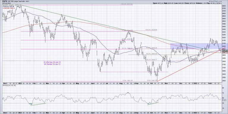
When the S&P 500 broke above its 200-day moving average in January, this represented a significant improvement after the bear market phase in 2022. Instead of failing at this long-term barometer as it had in August and December, the benchmark had finally shown enough positive momentum to break above this important level. Soon after, the S&P also followed through above a trendline using the 2022 highs, again confirming the strength of buying power as the index made another new swing high.

After finally pushing above the 4100 level in early February, the SPX stalled out just below 4200, before pushing back down into the blue-shaded area on our chart (4000-4100). As of Friday’s close, the S&P 500 had broken below 4000, which puts it once again below this “congestion area” we’ve been focusing on since November.

Friday’s drop also put the SPX below its 50-day moving average for the first time since mid-January, and below a trendline using the October and December lows. Now this key benchmark is at the “last line of defense,” the 200-day moving average.

As the S&P tests this important support level, it’s worth noting that the RSI remains just above 40. In bullish phases, the RSI usually bottoms out around 40 during pullbacks. So the bullish thesis for stocks would most likely need the RSI to remain at or above current levels while the SPX holds the 200-day moving average.

Confirming the Breakdown in Key Stocks

While the S&P 500 is testing its own 200-day moving average, a number of stocks have already broken down through their own 200-day. Let’s review some of the most important benchmark names, Apple and Microsoft.

The FAANG stocks struggled in a big way during this shortened holiday week (full disclosure: I currently hold the triple short FANG & Innovation ETN, ticker BERZ), with NFLX turning in a disappointing -8.9% move since last Friday’s close. It’s hard to imagine our growth-dominated benchmarks thriving while these key mega cap names are struggling, and that’s exactly what we have experienced so far in February.

AAPL finished the week at its 200-day moving average, while MSFT pushed below its 200-day on Friday. So while both names managed to gap above this long-term barometer at the beginning of February, this last week showed a major short-term reversal, as both stocks made a new low for the month.

How bullish do we want to be if both Apple and Microsoft are failing to hold above their 200-day moving average? Not very.

And It’s Not Just AAPL and MSFT

Home Depot (HD) came up in a number of conversations this week, including my interviews with Danielle Shay and Dave Landry. We all noted the gap lower this week after Tuesday’s earnings call, but the most negative evidence is the lack of buyers coming in as the price deteriorated into the end of the week.

With the 310 support level now in the rearview mirror, as well as the important 200-day moving average, the question is where HD finds support given the bearish momentum characteristics. My concern is that there isn’t much from a technical perspective in terms of support until you get down to the 2022 lows around $265. That’s another 10% below Friday’s close.

Even broader measures of moving average support indicate that stocks are struggling to remain above their own 200-day. A number of our five favorite breadth indicators have given bearish signals in February, suggesting that the rally off the October lows was at least ready for a pullback, if not a deeper retracement of previous gains.

While a handful of groups (heavy construction, semiconductors come to mind) remain on solid footing, I’m concerned by the fact that some of the most important charts to watch are now at or below their 200-day moving average.

And nothing good happens below the 200-day.

Oh and one more thing…

Interested in my latest take on ARKK and a potential bullish pennant formation? Head over to my YouTube channel!

RR#6,

Dave

P.S. Ready to upgrade your investment process? Check out my free behavioral investing course!

David Keller, CMT

Chief Market Strategist

StockCharts.com

Disclaimer: This blog is for educational purposes only and should not be construed as financial advice. The ideas and strategies should never be used without first assessing your own personal and financial situation, or without consulting a financial professional.

The author does not have a position in mentioned securities at the time of publication. Any opinions expressed herein are solely those of the author and do not in any way represent the views or opinions of any other person or entity.

In this episode of StockCharts TV‘s The MEM Edge, Mary Ellen reviews the markets’ break below key support as inflation remains elevated. She also shares stocks from her watchlist that are trending higher amid a tough market.

This video was originally broadcast on February 24, 2023. Click on the above image to watch on our dedicated MEM Edge page on StockCharts TV, or click this link to watch on YouTube. You can also watch on our on-demand website, StockChartsTV.com, using this link.

New episodes of The MEM Edge air Fridays at 5pm PT on StockCharts TV. You can view all previously recorded episodes at this link. You can also receive a 4-week free trial of her MEM Edge Report by clicking the image below.

The Energy sector seems to be coming back to life.

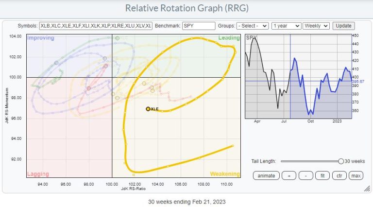
On the Relative Rotation Graph, a long tail is visible that traveled from weakening, starting in July 2022, back up towards and into leading in October 2022. After another rotation through the leading quadrant, the tail for XLE crossed into weakening in January 2023. At the moment, XLE is still inside the weakening quadrant, but the loss of relative momentum (declining JdK RS-Momentum values) has stopped, and over the last two weeks RS-Momentum has carefully started to pick up.

Given the JdK RS-Ratio axis reading, this tail still has room to improve further and curl back towards the leading quadrant without hitting lagging. This will allow investors to embark on an(other) new up-leg within the already rising relative trend.

Looking at the price chart for XLE, we can see that the uptrend that started in 2021 is still in play, with the major rising support line still intact. This trendline already has five touchpoints, making it a reliable and vital trendline. This one to watch!

Since setting a high around 93 in November last year, and testing that peak as resistance again at the end of January puts the chart at risk of a double top formation in the making. The low between these two recent peaks is near 82, while the major trendline is currently coming in around 80 but rising.

This makes the area between 80-82 a very important, double-, support level providing potentially low-risk entry opportunities.

The raw RS-line (second pane) also moves sideways and close to the lower boundary of its range. The move from rising to flat relative strength has caused the RRG lines to level off, as we have seen on the RRG.

When both support levels/areas in price and relative strength can hold up, that will cause the tail to rotate back up further and push XLE into the leading quadrant.

Entry opportunities for XLE will occur in the range between 80-82, with initial stops just below the rising trendline.

Individual Stocks

The RRG of the XLE constituents shows a relatively evenly spread out universe with a slight tilt toward the lagging quadrant. This is because a few heavyweights in the sector, like XOM and MPC, are inside the leading quadrant and rotating at a strong heading. Only one other heavyweight, CVX, is inside the lagging quadrant and at a negative RRG-Heading.

The RRG below highlights the most important tails.

I am especially interested in XOM and MPC moving further into the leading quadrant and CVX, which has returned to lagging from improving.

CVX

CVX has broken below its recent low, potentially completing a double top formation (as described above for XLE). The last resort is now the support offered by the rising trendline. In any case, the recent upward momentum has faded, pulling the relative strength vs. XLE below horizontal support and pushing both RRG lines further down and into the lagging quadrant.

While XLE is holding up well so far, CVX is better avoided.

XOM

XOM is showing a different picture. Price is still trading in a rhythm of higher highs and higher lows and recently pushed to a new high around 119.

The relative strength line vs. XLE also pushed to a new high, making XOM one of the sector’s stronger, if not the strongest, stocks in this sector. With a weight of 24%, this is a significant driver for the sector’s performance as we advance.

MPC

MPC is showing a similar picture as XOM. The uptrend is still fully intact, and price recently set a new all-time high. As they say: “This is not a characteristic of a weak stock.”

The accompanying relative strength line has also pushed to new highs, supporting more strength ahead for MPC.

The RRG lines show an excellent example of a stable relative trend. The JdK RS-Ratio line moves well above the 100-level at a constant level with an initial push higher in JdK RS-Momentum. This was needed to get RS-Ratio above 100. And then RS-Momentum leveled off and remained stable around 100, indicating a steady trend ever since.

Major Shift Underway

XOM vs. CVX is the single one (pair) trade that jumps off the screen for this sector.

The chart above shows the monthly price chart of XOM with RS- and RRG-lines against CVX. The strength and import breaks of overhead resistance XOM are evident.

But the turnaround in relative strength that is becoming more visible might be even more important. From the mid-90s to 2003, XOM dominated the energy sector. From 2003-2009, XOM and CVX moved more or less in sync, and from 2009 to 2021, with a little hiccup in 2014-2016, CVX was the leading stock in the sector.

This relationship seems to be shifting back to XOM again. This process already started in 2021 but is now getting more and more traction.

As this is happening on a monthly time frame, this suggests that a major shift, favoring XOM over CVX, within the sector is underway.

#StayAlert, and have a great weekend, –Julius

This week, the SPY pulled backed to the Daily 50-SMA, which was the target TG was looking for. Now it seems price is trying to hammer out a local bottom. Will it be enough? Will there be more downside? In this week’s edition of Moxie Indicator Minutes, TG dives in to see what the charts tell us and what side we should lean towards.

This video was originally broadcast on February 24, 2023. Click this link to watch on YouTube. You can also view new episodes – and be notified as soon as they’re published – using the StockCharts on demand website, StockChartsTV.com, or its corresponding apps on Roku, Fire TV, iOS, Chromecast, Android, and more!

New episodes of Moxie Indicator Minutes air Fridays at 12pm ET on StockCharts TV. Archived episodes of the show are available at this link.

On this week’s edition of StockCharts TV‘s StockCharts in Focus, Grayson shows the best ways to organize your StockCharts experience, presenting the top 5 most important tools and features YOU need to be using on a daily basis!

This video was originally broadcast on February 24, 2023. Click on the above image to watch on our dedicated StockCharts in Focus page on StockCharts TV, or click this link to watch on YouTube. You can also watch on our on-demand website, StockChartsTV.com, using this link.

New episodes of StockCharts in Focus air Fridays at 3pm ET on StockCharts TV. You can view all previously recorded episodes at this link.

Driving into a dense fog of economic data can sometimes trigger something of an analytical spinout, where directionality and objects on the road are first felt, via gravity and impact, before they’re seen. The January Personal Consumption Expenditure (PCE) report released this morning added another layer to this thick screen of doubt and obfuscation.

In short, inflation, following the last consumer price index (CPI) and producer price index (PPI) reports, came in higher than economists had hoped. The figures dealt yet another sobering dose of economic reality, indicating that inflation, so far, has proven more resilient than the monetary medicine the Fed has administered to cool it down.

What’s at Stake Is the Shape of the Landing

Are we going to see a “soft landing,” a hard landing, or no landing at all—a question Mish Schneider thoroughly examined in an article earlier this week? (Hint: Mish explores a potential “stagflationary” scenario). While the Fed’s Bullard and Mester expressed confidence that it can tame inflation without tipping the economy into a recession, other analysts would beg to differ.

This is the main issue investors seem to be struggling with, and the volatile tracks of price action leaves plenty of evidence that confusion seems to be leading the way. Based on today’s data, it’s likely that there’s more to come in the way of Fed rate hikes. And the central bank may even choose to accelerate the program a bit.

Bullish Optimism Amid a Bearish Stomp

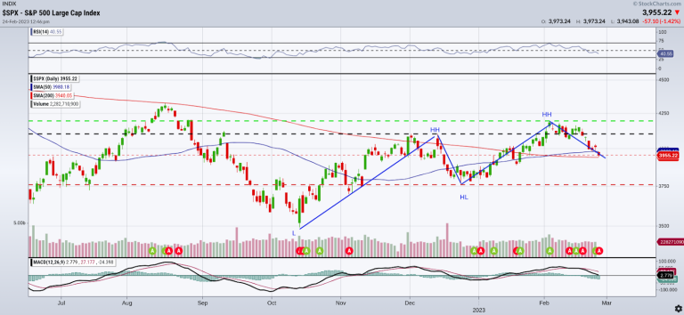
The S&P 500 index ($SPX) has fallen significantly from its January 2002 high. Still, its 10% rise from October 2022 smacks of an optimistic bounceback from a harrowing plunge (see chart below).

Some analysts call this bounceback a “head fake.” The same can be said of fundamental data, considering how many banks have included the R-word (recession) in their client announcements (JPM Chase, BofA, and Citi among the big ones) versus the central bank itself.

On the technical front, we see a golden cross emerging bullishly against the doubtful backdrop of a falling moving average convergence/divergence (MACD) cross and receding relative strength index (RSI) line. It’s about as convincing as the confusing and shifting slew of recent economic data.

When in Doubt, Go Back to the Basics

When your powers of market prediction hit a wall called “present time” and no analytical data proves sufficient enough to resolve forecasting dilemmas (i.e. inflation or recession, soft/hard/no landing, bullish reversal vs. bear market rally), sometimes it helps to get back to the basics.

Trends (or our perception of trends) tend to fluctuate, sort of like inflation data, or current mortgage rate changes. We can’t predict trends (a shout out to legendary trend follower Ed Seykota, who said “trends do not exist in the now”) but we can anticipate their form using simple formulas, like Uptrend = Higher Highs (HH) and Higher Lows (HL). In short, let’s look at basic price action.

Following this basic principle, we can see in the chart above where the consecutive swing highs and swing lows are positioned (see blue lines). And we see that, in December 2022, the S&P broke through triple resistance at 4100 (black line).

If you were to follow the basic uptrend principle of HH and HL, then here’s what to expect: A bullish recovery from October lows means that price must break above the most recent swing high (resistance) at 4195.44 while staying above the most recent swing low (support) of 3764.50. Failure to break out of this level can mean a delayed recovery or a descent into a ranging market. But failure to hold above support can sour sentiment, leading to a retest of support levels at 3698.00 and then, if lower, a retest of the October low itself at 3491.00.

Get a Broader View

If you’re trading the broader market, it helps to look at intermarket factors and markets that can provide significant insights toward current market action. Jayanthi Gopalakrishnan’s article Hey Stock Market! Where Are You Heading? takes this big-picture approach. Wide-ranging insights may not lead to better predictions, but they can lead to more accurate and actionable setups and alternative scenarios.

Disclaimer: This blog is for educational purposes only and should not be construed as financial advice. The ideas and strategies should never be used without first assessing your personal and financial situation, or without consulting a financial professional.

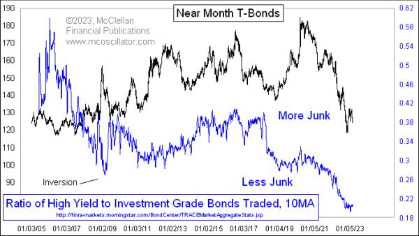
Last week, I wrote about the Advance-Decline data for “high yield” bonds, which are reported every day by FINRA at this website. They also report Advance-Decline data on the “investment grade” bonds there, and those data are (sort of) useful for tracking extremes in that portion of the bond market, as they tend to act more like T-Bonds whereas the high yield bonds act more like the stock market.

Since I have those data on each of the categories of bonds, it occurred to me, a few years ago, to run a comparison of them over time, just to see what information it might provide. That study led to this week’s chart.

What I did was to sum the Advances plus Declines for each bond category (the unchanged numbers are very low, and thus inconsequential). That allowed me to create a daily ratio of how many of each category of bonds trades each day. That data can be a bit noisy, and so I smoothed those daily ratio data with a 10-day simple moving average to get what you see here.

The first observation is that the ratio has been trending downward over time, meaning that there are comparatively more bonds trading that are rated as investment grade, and fewer that are in the junk category. But I wanted to find a deeper meaning, and so I compared these data first to stock prices, then to bond prices, which is what you see above. The bond comparison was much more interesting.

There is an obvious positive correlation between T-Bond prices and this ratio over time, especially over about the last 10 years or so. At times in the late 2000s (the FINRA data begin in 2005), there were inversions of the two plots, which is strange. The biggest inversion came in December 2008, in the throes of the Great Financial Crisis, as investors sought the greater assurance of a guaranteed “return of investment” in T-Bonds, and as companies were not able to issue junk debt. That was a truly exceptional time in history.

So what can we conclude from this mostly positive correlation the rest of the time? As bond prices fall, yields go up generally. So the desire of investors to reach for yield can go down incrementally, making it harder for companies to issue low grade bonds to finance their operations. That leads those companies to either find other ways of getting the capital they need, or make other arrangements, such as mergers, stock issuance, etc.

Right now, we are seeing this ratio at the lowest level of the available data (since 2005), meaning that there is just not as much junk debt out there compared to high grade debt as what has been “normal” for the past few years. That does not necessarily mean there are fewer marginal companies out there, whose debt would be rated poorly, but rather that the ability of those companies to issue debt in this bond market environment is just a lot worse.

It’s always better to be optimistic than pessimistic. It’s always better to be swinging the hammer, rather than being the nail. When should we sell stocks so we don’t become the nail? Is it bad to recommend selling stocks?

Behavior repeats over and over, and that is why we see chart patterns repeat. Fear and Greed. Rallies and market drops. Bull markets, bear markets, rallies and pullbacks, price patterns repeat. Investors show their cards with the price action, not the news.

One of the difficulties in the market today is staring into the winds of danger created by the highest interest rates in 15 years. I recently went through a selection of homebuilder charts, but the biggest thing that showed up to me was the similarity to the chart shapes back in 2006 -2007 the rolled into the last big bear market. Back then investors also hoped for a soft landing. It didn’t work out that way, so can we learn by looking at the charts now compared to then?

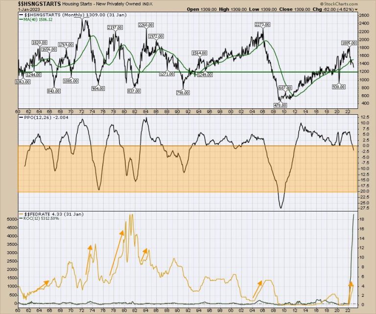
Housing starts have been dropping and the meaningful drop below the 40-month moving average is what got me interested.

On the chart below, I put the Fed funds rate data at the bottom. Ignoring the sudden freeze by COVID, there have only been two major trips below the green line in the last 40 years. Both of those involved large interest moves higher by the Fed. Not all moves by the Fed create a problem, so we can justify the price action until we are wrong. For me, these bullet points look accurate.

Large breaks below the green line should be taken seriously.When the PPO on the center panel is below zero, this chart suggests that the housing data is problematic. This isn’t just a regular pullback. It looks like a problem. Usually this is a multi-year problem according to the chart.The Fed rate increase is the steepest 12 month rate of change increase on the chart, shown in green on the Fed Rate Panel. No, that is not an error! As of Friday morning (Feb 24,2023), the market is now pricing in a Fed Funds rate of 5.36% which will be higher than 2007.It took the Fed three years to get to 5.25%. This move is going to get us there in half that time and double the distance.

Mortgage applications have been dropping as interest rates rise. This also suggests a slowdown in housing.

Since October, homebuilders have been on the rise. Even the TV commentary is still bullish. But it is way more important to watch what investors do with their money, which is why we use charts.

Toll Brothers – TOL

Here is Toll Brothers currently. Apparently, the CEO said everything is going well. I have never heard a CEO say sell my stock.

What I am noticing is the PPO was below zero and has rallied back above. That is bullish. However, this is the most critical place on the chart. This is a run for the highs again after a huge run up. Can it continue?

The full Stochastic is now dropping below 80 so its time to focus on this run as we head into March. What is the seasonality of this?

Here is Toll Brothers (TOL) back in 2006 and the chart rolled over in March 2007.

If the chart above was to play out similarly:

Price would break the uptrendThe PPO would start to roll over onto a sell signal.The full stochastic would continue dropping.

Hovnanian – HOV

Here is the 2023 chart for Hovnanian. HOV

Looking back at 2006, we saw a similar run up heading into March 2007.

What I would recommend is to watch how these charts play out. Do they repeat the chart pattern of 2007 in the face of 2023 Fed Funds interest rate rising higher than 2007 Fed rates? It’s time to watch closely.

My strength indexes can rally at any time, and they are in the buy zone. When they turn up, we’ll be ready for a rally like the one that started in January. Until then, caution is warranted. The situation looks more like November 2021, where the market slowly rolled over, but the strength indexes continued to get weaker.

Would you have liked to get notified three weeks ago that the market was getting weak? To stay on top of all of this movement, check out our offers on Osprey Strategic. A starting rate is $7 for the first month.