Archive

2023

Browsing

Silicon Valley Bank, one of the leading lenders to the tech sector, was shut down by regulators Friday over concerns about its solvency.

The move caused a wider sell-off in stocks and sparked fears that other banks may be at risk of failure.

Here’s how the crisis unfolded and what it means for the tech and financial sectors.

What is Silicon Valley Bank?

Founded in 1983, the bank grew to become the 16th-largest in the U.S, with $210 billion in assets. Over the years, according to reports, its client list grew to include some of the biggest names in consumer tech like Airbnb, Cisco, Fitbit, Pinterest and Square.

Why was it shut down?

On Wednesday evening, SVB announced it was planning to raise $2 billion to “strengthen [its] financial position” after suffering losses amid the broader slowdown in tech sector. It also indicated it had seen an increase in startup clients pulling out their deposits. At the same time, the bank signaled that its securities had lost value as a result of higher interest rates.

By Thursday morning, SVB shares began to see a massive sell-off.

Later that day, SVB CEO Gary Becker pleaded with tech investors to “stay calm.” He said that the only danger posed to SVB was if “everybody is telling each other that SVB is in trouble.”

That appears to have morphed into a self-fulfilling prophecy, with tech titans including Peter Thiel reportedly warning startup founders to reduce their exposure to SVB.

By the end of the day, SVB shares had fallen by 60%.

On Friday morning, CNBC reported that SVB had been unable to raise the cash it had been hoping to assemble, and was looking for a buyer as deposit outflows continued to accelerate.

The bank even called the New York Police Department on Friday morning as customers began lining up outside its Park Avenue offices to get their money, but officers who arrived on the scene left after determining “there was nothing criminal” happening, an NYPD spokesperson said.

By noon Friday, California state and federal banking regulators had seen enough and announced they were taking over SVB’s deposits and putting the bank into receivership.

According to the FDIC, this is the second-largest bank failure in U.S. history, behind the collapse of Washington Mutual in September 2008.

What happens next?

Before the shutdown, some some banking analysts dismissed concerns about a potential “contagion” stemming from SVB’s problems that could unsteady the banking sector — though without ruling out the possibility that the bank could fail.

“We believe the sell-off was overdone as large banks have a lot more liquidity than smaller banks, they are more diversified with broader business models, have a lot of capital, are much better managed in regards to risk, and have a lot of oversight from regulators,” JPMorgan analyst Vivek Juneja said in a note to clients earlier Friday.

People line up outside of the shuttered Silicon Valley Bank (SVB) headquarters on March 10, 2023 in Santa Clara, Calif.Justin Sullivan / Getty Images

Morgan Stanley analysts Manan Gosalia and Betsy Graseck echoed that sentiment, saying in a note Friday morning that the issues appeared “highly idiosyncratic and should not be viewed as a read-across to other banks we cover.”

“Yes, funding is a headwind for the industry,” they acknowledged, but emphasized that they didn’t believe at the time that there was a liquidity crunch facing the banking sector.

Regulators’ intervention midday Friday spooked investors and reversed a short-lived recovery in the broader market, with the Dow Jones index down 1.3% in afternoon trading, the S&P down 1.7%, and the tech-heavy Nasdaq down more than 2%.

Brad Hargreaves, a startup founder who previously served on boards of companies that did business with SVB, said the bank was unusual in that often played a dual role as corporate and personal lender to CEOs.

Often, he said, SVB tied a company’s loan to an executive’s mortgage — and that a default on one would trigger a default on the other.

Silicon Valley Bank is to tech what Bank of America is to Main Street, he said, adding, “They got really integrated into the lives of a lot of founders.”

Many startup executives whose companies banked with SVB are now also likely facing a payroll crisis, Hargreaves said, because the FDIC is authorized to release only insured deposits of up to $250,000. That heightens the risk that these companies could announce furloughs or layoffs of dozens or even hundreds of employees, he said.

SVB referred requests for comments Friday to the FDIC’s takeover notice.

The FDIC said it is now working to determine what portion of SVB deposits are insured to its $250,000 limits. If you have a loan with the bank, you still need to make your payments.

This post appeared first on NBC NEWS

A ‘technical issue’ was causing some Wells Fargo customers to see missing deposits in their accounts, the bank said Friday.

In response to complains on Twitter, Wells Fargo representatives said that the issue may be leading customers to see incorrect balances or missing transactions but that their accounts ‘continue to be secure.’

Wells Fargo said in a statement on Friday afternoon that it was aware that some customers’ direct deposit transactions ‘are not showing on their accounts.’

‘We are working quickly on a resolution and apologize for the inconvenience,’ the statement said.

This post appeared first on NBC NEWS

I’m a big fan of playing the long game as an investor, particularly for long-term accounts that should arguably not be affected by short-term market fluctuations. Talking with experts like Jon Markman, author of Fast Forward Investing, has reminded me that overarching themes like artificial intelligence, electric vehicles, and digital assets are long-term plays.

While the benefits of these technologies are clear, the path between now and some future state are somewhat less clear. It seems obvious to me that blockchain technology is transformative, and it will certainly impact our lives in ways we have not yet imagined.

For now, however, cryptocurrencies have rotated lower in a sudden and powerful way, giving a very “risk off” feel to this area of the financial markets. What downside targets make sense for Bitcoin which could present opportunities for a lower entry point?

Bearish Evidence, Three Ways

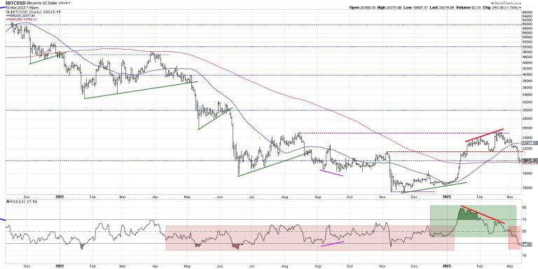
First, let’s review how the chart rotated from a clear accumulation phase to a distribution phase. Momentum divergences, where the price and RSI go from moving in tandem to moving in opposite directions, are one of my favorite leading indicators to anticipate a trend reversal.

Note the higher highs in price from January to February, with Bitcoin testing the August 2022 high around 25,000. Now look at how the RSI was extremely overbought at the January high (almost reaching 90!) versus below the overbought threshold at the February swing high. This weakening of momentum suggested that the buying power was dissipating and a downside corrective move was imminent.

This week, we can see Bitcoin failing to hold its most recent swing low around 21,500. This lined up beautifully with the November swing high, and, if Bitcoin had held this level, it would have indicated a likely end to the short-term correction. However, we can see that level was violated to the downside, pushing Bitcoin down to test its 200-day moving average around 20,000. So now we are testing not just moving average support, but also a “big round number” which has often served as support and resistance for Bitcoin.

Finally, we see the RSI failing to hold the crucial 40 level, now pushing into oversold territory below 30. When the entire range of the RSI moves lower, and selloffs reached the oversold level, this is more characteristic of bear market phases than bull market phases.

Identifying Downside Targets

So how do we anticipate downside price objectives after key support has been broken?

First, we need to focus in on the next level of support. In my opinion, we are sitting at the crucial “line in the sand” of 20,000. If and when we break this key area of support, we need to start looking for additional downside targets.

When you zoom into the last six months or so, we can see some short-term Fibonacci levels that may be important in the coming days and weeks. The bad news for Bitcoin is we’ve already broken down through the first two objectives, which suggests that 19,200 could be considered the “point of no return” for the bull case. If we break that level, it will likely continue down to the November 2022 lows of around 15,500-16,000.

It’s worth noting here that, while I often identify specific price levels based on support and resistance or Fibonacci levels, I usually think of support and resistance more in ranges than specific levels.

When the modern technical toolkit was being refined in the 20th century, stocks were traded on 1/8 increments, so it was pretty reasonable that a stock would reach a specific level and then turn on a dime. That was because there were only eight levels between each dollar! In the modern era of decimalization, dark pools, and high-frequency trading, the expectation that prices would find support or resistance at a precise level seems disconnected from the reality of the financial markets!

What’s Next for Bitcoin?

With any investment approach, separating the long-term thesis from the short-term story is important. I had great conversations with people like Adrien Zduńczyk on the long-term potential for blockchain and digital assets. I still believe very much in the long-term thesis here.

But my recent analysis of the daily chart of Bitcoin tells me that the upswing off the 2022 low has transitioned from “called into question” into more of a “definitely going down” sort of feel. And, unless Bitcoin can hold its 200-day moving average, it appears that we may be retesting the 2022 lows again.

The good news is that if your runway is long enough, this may present a fantastic opportunity to add exposure to a strong long-term story undergoing a cyclical weakness.

Want to see analysis of the recent breakdown of Bitcoin in video format? Head over to my YouTube channel!

RR#6,

Dave

P.S. Ready to upgrade your investment process? Check out my free behavioral investing course!

David Keller, CMT

Chief Market Strategist

StockCharts.com

Disclaimer: This blog is for educational purposes only and should not be construed as financial advice. The ideas and strategies should never be used without first assessing your own personal and financial situation, or without consulting a financial professional.

The author does not have a position in mentioned securities at the time of publication. Any opinions expressed herein are solely those of the author and do not in any way represent the views or opinions of any other person or entity.

In this episode of StockCharts TV‘s The MEM Edge, Mary Ellen reviews next areas of support for the downtrending markets while highlighting what to be on the lookout for in oversold Bank stocks. She also shares best practices for formulating a watch list in anticipation of a stronger period in the markets.

This video was originally broadcast on March 10, 2023. Click on the above image to watch on our dedicated MEM Edge page on StockCharts TV, or click this link to watch on YouTube. You can also watch on our on-demand website, StockChartsTV.com, using this link.

New episodes of The MEM Edge air Fridays at 5pm PT on StockCharts TV. You can view all previously recorded episodes at this link. You can also receive a 4-week free trial of her MEM Edge Report by clicking the image below.

On this week’s edition of StockCharts TV‘s StockCharts in Focus, Grayson shows you how to isolate specific indicators on your charts and save them into their own specific ChartStyles. By breaking your charts apart and focusing only on one indicator at a time, you can bring more clarity to your analysis. You’ll also learn how to use the opacity settings to isolate specific overlays on your charts like Moving Averages, Bollinger Bands, and more. Plus, Grayson will highlight a few of the new interactive features in ACP that allow you to isolate specific indicators on the fly without the need to create different ChartStyles.

This video was originally broadcast on March 10, 2023. Click on the above image to watch on our dedicated StockCharts in Focus page on StockCharts TV, or click this link to watch on YouTube. You can also watch on our on-demand website, StockChartsTV.com, using this link.

New episodes of StockCharts in Focus air Fridays at 3pm ET on StockCharts TV. You can view all previously recorded episodes at this link.

Markets are absorbing the news of another bank failure this morning. As the financial industry starts to wobble with the fallout from the sudden change in interest rates, it is more important than ever to protect capital.

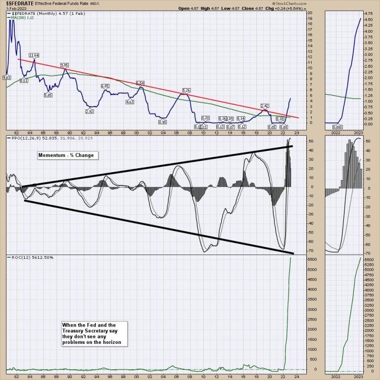
Below is my go-to chart about the change in interest rates. The Fed is expected to raise rates in the coming weeks.

The top panel is the current Fed Funds Rate. The terminal rate is expected to be above the 2007 highs.

The middle panel is the momentum of the Fed rate changes. What is important for me is that it seems that each one of these swings is wider and higher than before. If this was a crankshaft, saying “we are getting wobbly or wobblier” might be a better way to put it. Also, notice the vertical move recently on the PPO. This is all in one year, compared to the period after the great financial crisis taking 8 years to move from low to high.

The bottom panel is the current rate of change. By far, the fastest rate of change. As we have seen two banks fail in the last few weeks, will we start to see more contagion? Janet Yellen mentioned she has multiple banks on her watchlist right now.

Since the beginning of the year, we have seen both SI and SIVB cease. We have also watched the demise of FTX. However, each issue seems to wobble the market, but not break it. That’s the good news.

Here is the last chart of SIVB. The final SCTR top for SIVB was in October 2021. The final price high was at the top of the $NDX in November 2022. In under 16 months, the bank was wiped out.

Here is the chart of SI. Silvergate went public in 2019. After a euphoric move into November 2021, the stock made a series of lower lows and lower highs, dropping from $240 to $2.75 in 16 months.

As this market continues fighting off bad news, this becomes an important week to keep in mind.

I discussed the tender situation for the $SPX on Market Buzz this past Wednesday. Here is a link to the recording.

I’ll also be hosting an information session about protecting capital and taking advantage of bull market runs on March 14th, 2023 at 11:00 AM. Register here to get free access to the live event.

The charts broke long before the companies did. Buying stocks with weak SCTR rankings in industries like finance is part of the problem. Charts give us more information in one picture than all the CEO interviews over the past few years. What investors do with their money relative to the stock is more important than the CEO’s comments, in my opinion.

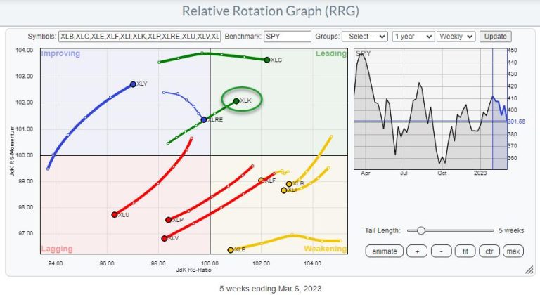
Very likely, the most enticing tail on the relative rotation graph for US sectors is for the technology sector, XLK. XLK has been in a strong RRG heading for a few weeks already and crossed over into the leading quadrant last week, and has continued to push further this week.

Compared to the other “stronger looking” tails on the plot, XLK stands out as it is one of only two sectors inside the leading quadrant and one of only three sectors on a strong RRG-Heading (0-90 degrees).

As always, the proof is in the pudding.

Daily Rotation Confirms XLK Strength

The second RRG shows the rotation for US sectors on the daily time frame. Here we find XLK inside the weakening quadrant but rotating back towards the leading quadrant after a corrective cycle.

This combination of tails makes XLK, the Information Technology sector, one of the strongest sectors in the universe at the moment.

SPY Losing Some Momentum

All of this happens while the S&P 500 is losing some of its recently acquired strength.

After holding just above the rising trendline, the S&P 500 now seems to be breaking lower and only just holding up above the former falling resistance line, now support, coming down from the late 2021 high.

This price action can be seen in more detail on the daily chart above, where a break of the previous low is now visible. The close at the end of Friday’s trading session will probably tell us whether we are facing a real and clear-cut break lower, which will most likely push the market down to its next support level near 375. Or we will remain around current levels and stay in the doldrums for a bit longer.

Technology Remains on Track

Whatever the outcome, the rotation of the technology sector will, most likely, remain on track for further improvement in the coming weeks.

Since breaking out of the falling channel almost two months ago, XLK is holding up well above its newly established support level, near 135. Breaking above the recent high at 145 would confirm 135 as a new higher low and signal a continuation of the uptrend.

In case that does not happen and XLK drops further, there is support showing up at the level of the old falling resistance line, now support. And at the level of the previous low near 120. This will give XLK ample room to maneuver and form a larger base from where the sector can rise further.

From a relative perspective, things are certainly looking strong. The raw RS-Line has completed a double bottom and is now underway to a horizontal level around 0.35, where the RS-Line has peaked a few times in the past. All this has pushed both RRG lines above 100 and, therefore, the XLK tail into the leading quadrant, where it continues to gain on both axes.

Breaking Tech down in Industries

The RRG above shows the industries inside the technology sector against SPY as the benchmark. It is clear and expected that most groups are moving at a strong RRG heading and on track to outperform SPY.

This RRG also makes it very clear which groups inside tech are better avoided now. These are Electronic Equipment, Telecommunications Equipment, and Computer Services.

When we change the benchmark to XLK, the rotational picture changes.

It becomes now clear that the strongest groups are Renewable Energy Equipment, positioned in the lower right corner and, not visible in this image, rotating back up towards leading. And Semiconductors, firmly positioned inside the leading quadrant and picking up pace again on both scales after a short dip in relative momentum.

When you click the image, the live RRG will open, and you can toggle through the groups to see which are the ones heading rapidly toward the lagging quadrant.

The computer hardware group has just moved into the improving quadrant and is starting to pick up relative strength, moving right on the JdK RS-Ratio scale as well.

All in all, the technology sector remains well on track for further outperformance with a focus on Renewable Energy Equipment, Semiconductors, and Computer Hardware.

#StayAlert and have a great weekend, –Julius

The news of SIVB getting into trouble sent huge waves through the market. Financials and bank stocks cratered which then brought the rest of the market down. In this week’s edition of Moxie Indicator Minutes, TG explains question now, which is “are rising interest rates the risk, or is there an unknown out there that will turn into a Black Swan event?” The market is likely to move down, but how far? Is this somewhat localized or will this spread throughout?

This video was originally broadcast on March 10, 2023. Click this link to watch on YouTube. You can also view new episodes – and be notified as soon as they’re published – using the StockCharts on demand website, StockChartsTV.com, or its corresponding apps on Roku, Fire TV, iOS, Chromecast, Android, and more!

New episodes of Moxie Indicator Minutes air Fridays at 12pm ET on StockCharts TV. Archived episodes of the show are available at this link.

Two big things about Campbell Soup (CPB)

First, the company crushed it in earnings last Wednesday. Its second-quarter FY23 results delivered an upside surprise with an EPS that was 8.37% higher than analysts expected and revenue 2.21% higher than Wall Street estimates.Second, CPB is rising from the bottom side of a wide and long trend channel.

What drove the earnings beat? The company said that its strong brand, pricing advantage, increased productivity, and supply chain improvements helped crank up efficiency and, eventually, profits. For the coming quarter, Campbell expects an 8.5–10% increase in sales growth.

Consumer Staples may not be the sexiest thing on Wall Street, but this 154-year-old company has been delivering strong fundamental value to investors (and chicken soup among other foods for every occasion, good and bad) on a consistent basis. Plus, with the economy situated between runaway inflation and a potential recession, the Consumer Staples sector is like Wall Street’s proverbial chicken soup. 

Not-So-Attractive Up Close, Better From a Distance

If you take a look at Campbell’s three-month performance relative to the Consumer Staples sector using XLP as a proxy and the S&P 500 on PerfCharts, it’s clearly an underperformer. 

Backup a year, and it far outperforms both.

A quick StockCharts Symbol Summary check shows that Campbell’s three-month SCTR reading is in the 70s, which is well above XLP’s at around 40. Also note that CPB pays dividends to its shareholders.

And if you look at a chart going back a year…

CHART 1: DAILY CHART OF CAMPBELL SOUP CO. (CPB). The stock has been rising forming a trend channel, which can act as support and resistance levels for entering and exiting trades. Note: Click on chart above for live version.Chart source: StockCharts.com. For illustrative purposes only.

You can see that Campbell’s has been steadily riding the 200-day moving average (MA) and is currently rising from the bottom of a trend channel.

What about trend channels? If you’re unfamiliar with them, trend channels are created by drawing two parallel lines connecting highs and lows. They can be used to identify the direction and strength of a price trend. But traders often look to them as areas of potential support and resistance as well as potential entry and exit levels.

A bullish bias… Given the company’s fundamentals, the market’s broader sentiment toward current economic uncertainties which leans bearish, and the current momentum (note the RSI’s position halfway between the 30 and the 70), CPB looks like it might be well positioned for a bullish move, but will it have enough momentum to hit the top part of the channel?

Support below the 50 price level is underscored by the amount of Volume by Price—that range marking the second longest bar—and revealing how demand pressure exceeded selling pressure.

Strong resistance is expected at 57.50–57.65 coinciding with a 2020 (not illustrated above) and 2023 highs. The trend channel top is looking to exceed these levels, and should the stock break above both, it’s looking at a six-year high (not seen since May 2017). And as far as stop losses are concerned, a few cents below the upper channel might be favorable. 

Now, if you’re able to enter a position as CPB bounces off the channel (say, at around 51.00), and if it manages to reach its most recent highest high at 57.65, then you’re looking at a potential return of $6.65 per share. And if the trade doesn’t go in your favor, you’re probably better off exiting the position. 

Disclaimer: This blog is for educational purposes only and should not be construed as financial advice. The ideas and strategies should never be used without first assessing your own personal and financial situation, or without consulting a financial professional.

The stock market has been struggling the last few days, losing all gains made earlier this month (March). It’s almost as if there’s a tug of war between investors and the news. In the last couple months it was between investors and the Fed but now investors are facing a bigger hurdle—the SVB Financial Group (SIVB) fallout. 

The State of the Stock Market

In the more recent past, Fed Chairman Powell’s comments about possibly continuing to hike interest rates would shift investor sentiment. During Powell’s testimony on Capitol Hill, hawkish comments impacted the stock market. Equity indexes fell, Treasury yields rose (the two-year US Treasury yields, $UST2Y, went higher than 5%), the CBOE Volatility Index ($VIX) rose, and the US dollar inched higher. 

The S&P 500 just didn’t seem to be able to hold on to its gains of the first two trading days in March. In its last up leg, it didn’t make it to its last high and instead stalled at its 20-day moving average with a shooting star candlestick pattern before selling off. 

The S&P 500 Index ($SPX) has fallen below its 200-day moving average, and it’s in a clear downtrend. The next support level is at around the 3800 level. If the index falls below this level, it could retest the October lows. And if you look at relative performance, 10-year US Treasury yields and the US dollar are performing better than the S&P 500. Note: Click on chart for live version.

CHART 1: S&P 500 INDEX TRENDING LOWER. If the index stays below its 200-day moving average, the next support area is below the 3800 level. Chart source: StockCharts.com. For illustrative purposes only.

The Dow Jones Industrial Average ($INDU) and Nasdaq Composite ($COMPQ) followed similar patterns. And the S&P 600 Small Cap index ($SML) really got hit hard. A large chunk of it (17.9%) is allocated to the Financials. In light of the banking fiasco, that shouldn’t be a surprise. The Financial sector was the worst performing sector on Thursday. And we could see it continue given that the banking turmoil is just starting. 

Investors are spooked. Just look at how much the probability of a 25 or 50 basis point interest rate hike by the Fed changes from day to day. If you monitor the CME FedWatch Tool, you may have noticed that after Powell’s testimony the probability of a 50 bps hike rose to 72% but went back to lower than 50% on the negative news from a couple of banks. So, as it stands right now, it could go either way—the Fed could raise interest rates 25 or 50 bps. 

Don’t let what’s happening in the banking sector distract you from inflation, though. Today’s jobs number—311,000 vs. 225,000 estimated—came in hot which means jobs will probably continue to feed inflation. But unemployment rose to 3.6%, higher than the 3.4% projected rate and wage growth is slowing. So mixed messages from the February jobs report but perhaps a little bit of hope that inflation is going in the right direction. 

But the jobs data came at the same time as a pretty ugly event, one that’s more painful than the pain inflation is creating for your wallet. When a bank that’s a big lender to many tech companies fails, it’s not a stretch to think it’ll bring back memories of the 2008 financial crisis. The first thought that could go through investors’ minds: which bank is next? 

The market is feeling the impact. Treasury yields fell. The two-year yield, which was above 5% after Powell’s comments, fell to 4.62% and the 10-year fell to around 3.75%, below the 4+% it hit earlier this month. 

It’s Worth Looking at Bonds

When the market is so dependent on news—going up when the data supports cooling inflation and down when inflation appears to be hot—the investing landscape becomes more complex. Is it time to panic sell or is it time to pick up some value investments? 

Of late, every time the market has sold off, buyers have come in and sparked a rally, albeit short-lived ones. But after SVB’s shutdown, investors seem to be running to bonds. Take a look at the chart of iShares Trust 20+ Year Treasury Bond ETF (TLT). It’s approaching its 200-day moving average, and if TLT moves above its February 2 high of 109.08, it could indicate that bonds may be having their time in the sun, after a long hibernation.  Note: Look at chart below for live version.

Watch to see if the market finishes this ugly week on an uglier note or if there’s some recovery at the close. There’s no way of knowing if this bearish run will be short-lived. The stock market has been in a critical juncture for a while and investors have been looking for the market to provide some direction. It looks like the direction may be lower. It may be time to revise your investment playbook. Regularly analyze Your Dashboard and identify which areas of the market are performing better than others. 

If bonds start showing strength, after their long hibernation, you may want to start modifying or building bond ChartLists. Another area to regularly visit is the Market Summary. If the markets start shifting in one direction, these tools will help you identify which areas of the market you should be investing in. 

Disclaimer: This blog is for educational purposes only and should not be construed as financial advice. The ideas and strategies should never be used without first assessing your own personal and financial situation, or without consulting a financial professional.