Archive

2023

Browsing

In this episode of StockCharts TV‘s The MEM Edge, Mary Ellen walks through the broader markets and sector rotation, before drilling down into the market dynamics that are driving earnings and analysts upgrades. She finishes out the show by highlighting some defensive names, gold stocks, and software companies to keep your eye on.

This video was originally broadcast on March 17, 2023. Click on the above image to watch on our dedicated MEM Edge page on StockCharts TV, or click this link to watch on YouTube. You can also watch on our on-demand website, StockChartsTV.com, using this link.

New episodes of The MEM Edge air Fridays at 5pm PT on StockCharts TV. You can view all previously recorded episodes at this link. You can also receive a 4-week free trial of her MEM Edge Report by clicking the image below.

When we wrote How to Grow Your Wealth in 2023, we began with

ChaosTrying to Fit a Square Peg into a Round HoleLooking for Inflation in All the Wrong Places

Could we have known at the time what headlines would emerge? No. Yet what was obvious is that “from central banks to sovereign spending and borrowing to geopolitics to anti-globalism to ongoing raw material issues and food shortages to rising global debt--nothing is as it was.

Insert headline?

Here are a few:

Rates: While ECB raises .50, they also say they will cap at 4%Banks: Regional Banks ETF looks lower still with SIVB filing Chapter 11

With $300 Billion added to balance sheet, this is the opposite of QT, and signals a further lack of control.

Banks borrowed $165 billion from the FED, which is more than in 2008.

More from the Outlook on the U.S. Dollar

“Most concerning is that, if dollar drops (just fell from 114 in September to under 104 this past week) then what?

“Will the rate matter at all in the fight against inflation?”

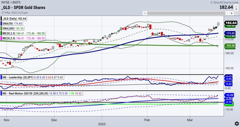
And so, our top pick for 2023 was and still is gold.

This is the monthly chart of gold as seen through the ETF GLD. It dates to pre-2011, when gold was rising after the 2008 crisis.

In August 2011 another huge headline hit the market:

S.& P. Downgrades Debt Rating of U.S. for the First Time

In August 2011, gold ran up to 184.82 before the political dance resolved and everyone played nice again.

Since then, as seen in the thick horizontal line you see that stretches across the page to this month, GLD has not had a monthly close above those 2011 highs. However, in August 2020 the GLD daily high was a short-lived pop to 194.45, yet later that month GLD closed much lower.

Technicians can see this chart in 2 ways. First, as triple, or even quadruple tops around 184-185. Alternately, a huge inverted 12-year head and shoulders bottom, which if the neckline clears, measures the gold move to around 260. Pretty much close to the 2023 call for gold to double or go to around $3000 an ounce.

You decide which side of the TA call you want to be on. However, watch the dollar as your best indicator.

Under 104, inflation hits us in 2 ways: High cost of goods and lower purchasing power. Of course, keep chaos in your analysis, assuming we have yet to see all the ripple effects of recent headlines (not to mention China, Russia, North Korea all persistently on the back burner).

Forget the Analysts, Follow the Math

Above is MarketGauge’s GEMS Global Macro (Global Equities: Macro Sectors). Current holdings based on MG’s proprietary indicators show GLD and gold miners GDX in the portfolio. Additionally, the model holds NASDAQ QQQ and Semiconductors. It will be fascinating to see how the quants will resolve going forward. 

Finally, check out my interview with Dave Keller on The Final Bar. Lots of excellent information.

For more detailed trading information about our blended models, tools and trader education courses, contact Rob Quinn, our Chief Strategy Consultant, to learn more.

IT’S NOT TOO LATE! Click here if you’d like a complimentary copy of Mish’s 2023 Market Outlook E-Book in your inbox.

“I grew my money tree and so can you!” – Mish Schneider

Get your copy of Plant Your Money Tree: A Guide to Growing Your Wealth and a special bonus here.

Follow Mish on Twitter @marketminute for stock picks and more. Follow Mish on Instagram (mishschneider) for daily morning videos. To see updated media clips, click here.

Mish in the Media

Mish sits down with Kristen on Cheddar TV’s closing bell to talk what Gold is saying and more.

Mish and Dave Keller of StockCharts look at longer term charts and discuss action plans on the Thursday, March 17 edition of StockCharts TV’s The Final Bar.

Mish covers current market conditions strengths and weaknesses in this appearance on CMC Markets.

Mish sees opportunity in Vietnam, is trading SPX as a range, and likes semiconductors, as she explains to Dale Pinkert on ForexAnalytix’s F.A.C.E. webinar.

Mish and Nicole discuss specific stock recommendations and Fed expectations on TD Ameritrade.

Coming Up:

March 20th: Madam Trader Podcast with Ashley Kyle Miller

March 22nd: The RoShowPod with Rosanna Prestia

March 24th: Opening Bell with BNN Bloomberg

March 30th: Your Daily Five, StockCharts TV

March 31st: Festival of Learning Real Vision “Portfolio Doctor”

April 24-26: Mish at The Money Show in Las Vegas

May 2-5: StockCharts TV Market Outlook

ETF Summary

S&P 500 (SPY): 390 pivotal and 380 support.Russell 2000 (IWM): Still weak comparatively — 170-180 range now.Dow (DIA): 310 support, 324 resistance.Nasdaq (QQQ): 328 is the 23-month MA resistance, 300 support.Regional banks (KRE): 44 support, 50 resistance — still looks like lower in store.Semiconductors (SMH): 255.64 last month’s high. 248 nearest support.Transportation (IYT): Clutch hold 218 and needs to clear 224 weekly close.Biotechnology (IBB): Closed inside the prior week’s trading range.Retail (XRT): 60 big support and 64 big resistance.

Mish Schneider

MarketGauge.com

Director of Trading Research and Education

This week, stocks started in a position of strength and ended in a position of weakness. While some groups, like semiconductors, have managed to remain strong, the major benchmarks managing to pound out a positive return for the week, the broad market message appears cautious-at-best by my read.

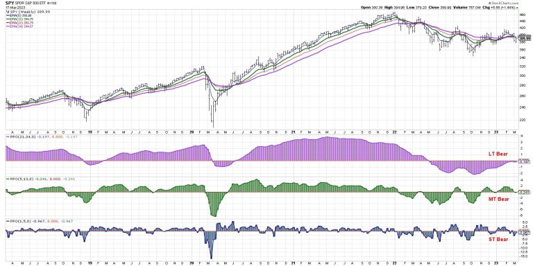
My main Market Trend Model is based on weekly exponential moving averages and helps me gauge the market trend on three time frames on the same chart. On Friday’s close, the medium-term model turned slightly negative, which means the model is now bearish on all three time frames.

This has only happened 11 other times since the tech bubble in 2000, and represents a confirmed distribution pattern for equities. Meaning it’s either a raging buy signal (if you think we’re in a secular bull market) or a serious sell signal (if you believe we’re now in a secular bear).

Allow me to explain.

Building a Market Trend Model

Years ago, I was trying to create a systematic model to mirror the subjective analysis I was doing every week. I’d always look at a weekly chart of the S&P 500 and ask, “What is the short-term, medium-term, and long-term trend?”

After lots of trial and error, I ended with something similar to the current setup using three sets of weekly exponential moving averages. Why did I choose exponential instead of simple moving averages? I’ll get to that below!

This chart will be one of many we’ll discuss in our upcoming FREE webcast, Charting a Financial Crisis. Join me on Tuesday, March 21 at 1:00pm ET for a visual review of the evidence and where opportunities can emerge in a period of great uncertainty. Sign up HERE for this free event!

For my model, I use the PPO indicator to show these three moving average combinations. If the indicator is above zero, it’s bullish. Below zero, and it’s bearish. Simple.

The long-term model turned negative in May 2022 after being confirmed bullish since June 2020. The medium-term model was briefly bullish in March and August of last year, then switched to a more consistent bullish reading in November. The short-term model has been volatile, switching often between bullish and bearish settings.

I should note that the medium-term model is my main risk on/off gauge. When its reading is bullish, that suggests a risk-on positioning and that I should be actively looking for new long ideas. When the model is bearish, that tells me to go more risk-off; in other words, I should focus more on capital preservation than capital growth.

So what does it mean that the model is now bearish on all three time frames? Now we need to bring in more history.

Counting the Bearish Trifectas

Let’s go back to the market top in 2000 and see how often this “bearish trifecta” has occurred.

We’ve had this “triple bearish” reading now 12 times since 2000. Only three of those happened before the 2009 market low, and the other nine came after. Four of the signals have triggered since the 2022 market peak.

What does this mean? Well, the left half of the chart shows the secular bear market that I would loosely define as 2000-2013. The first three signals occurred after the long-term model was bullish for years, and the rotation to a negative LT trend was an unusual event. Selloffs in 2001-03 and 2008-09 happened really accelerated after this bearish pattern.

After the 2009 low, this bearish trifecta could almost be considered a contrarian bullish signal, similar to a stock pulling back to an ascending 50-day moving average or the RSI dropping down to 40 during an uptrend. The bearish trifecta signals pretty much line up with every major bottom since 2009. So where does that leave us today?

Don’t Fight the Fed

Here’s where the macroeconomic argument comes in. If you believe that the market drop since the end of 2021 represents a major change of character for stocks, and that the Fed’s tightening cycle represents an end to the “easy money” era of the 2010s, then this could be just the beginning.

I would have discounted the likelihood of this scenario in a big way up until about a week ago. But with the latest financial crisis potentially still in its early stages, a larger waterfall decline from current levels now seems like a scenario we should all be considering.

On the other hand, if you think of 2022 as another buyable long-term dip along the lines of 2018 and 2016, and you assume that the Fed will reverse course quickly to alleviate further market downside (and you assume that it will work!), then perhaps this is yet another buy signal in the great secular bull market.

In either case, I’ve learned not to get too married to a narrative, and to consider all the potential outcomes. That has helped me to be better prepared for whatever comes next. And in this environment, it will definitely pay to be prepared!

By the way, interested in learning more about why I used exponential instead of simple moving averages for my Market Trend Model? Head over to my YouTube channel.

RR#6,

Dave

P.S. Ready to upgrade your investment process? Check out my free behavioral investing course!

David Keller, CMT

Chief Market Strategist

StockCharts.com

Disclaimer: This blog is for educational purposes only and should not be construed as financial advice. The ideas and strategies should never be used without first assessing your own personal and financial situation, or without consulting a financial professional.

The author does not have a position in mentioned securities at the time of publication. Any opinions expressed herein are solely those of the author and do not in any way represent the views or opinions of any other person or entity.

In a recent StockCharts special presentation, Larry Williams revealed his detailed forecast of the broader US market, gold, and stocks Apple (AAPL), AMD (AMD), and Amazon (AMZN).

A Quick Preface to Larry Williams’ Presentation

In the early 2000s, at the start of my finance-related career, I came across two old and dusty books at the Los Angeles Public Library—The Definitive Guide to Futures Trading Vol I and II by Larry Williams (two of his earlier publications).

What struck me about those books, in contrast to many others in the same game, was Larry’s novel, and almost angular way of thinking:

His ideas weren’t entirely derivative of what came before or what everyone else was currently doing;He regularly sought insights from economic data that many, if not most, traders weren’t looking at.And when he did look at technical patterns or economic data that most traders regularly viewed, Larry seemed to view the same thing from a completely different (and sometimes unexpected) angle, yielding not only different viewpoints, but, more importantly, different uses based on that angular shift in perspective.

If you’re not familiar with Larry Williams, here’s a brief summary of the events that made him something of a rock star in the trading world. His first big claim to fame was winning the 1987 World Cup Trading Championship, where he turned $10,000 (real money) into $1,000,000 in one year—a whopping 11,376% gain that, to this day, has never been beaten.

Ten years later, he coached his daughter, the actress Michelle Williams, to win the 1997 World Cup Trading Championship at the age of 17. She notched a 1,000% return. In addition to Larry Williams winning the same competition again in 2001, several of his students have also taken first place in the competition.

Larry Williams’ approach may (or may not) resonate with you. Perhaps the most you’ll get from his presentation (or reading at least two of his books for comparison) is the sheer creative impulse that drives him to incessantly discover new relations between market data that may yield actionable insights. Or, maybe his approach might nudge you to rethink your own approach to analyzing and trading markets. In short, there’s plenty of potential upside in viewing his presentation and very little to no downside if you decide it’s not for you.

Looking where nobody else is looking …

Here’s an example. Larry Williams’ read on inflation, and the general economy, is derived from data and reports that most traders tend not to look at. He covers several of these less-viewed reports in the presentation. Additionally, his method of putting it all together is also worth checking out. At the very least, you’ll see how his unique mix of data and arrangement allows him to construct an approach to the markets (and economy) that differs greatly from most other speculators and analysts.

Seeing the same things but from an entirely different angle…

A simple example is how he reverses the popular view on, say, gold and inflation. While most hold the popular view that gold responds to inflation, he sees it in reverse—that inflation tends to follow gold prices.

CHART 1: GOLD AND INFLATION. In this chart, you can see that inflation follows gold prices.

Chart source: Larry Williams. For illustrative purposes only.

In the presentation, he questions many common assumptions (such as the relationship between the Fed funds rate and inflation), putting them to the test and suggesting alternative and more actionable ways to look at them.

He also demonstrates the value of using cyclical models to time the markets. Yes, there’s a lot of skepticism surrounding cycle theory, but Larry Williams has his unique and down-to-earth take on it. If anything, he shows how a cyclical perspective can be pragmatic and actionable (see the chart of Apple Inc. below).

CHART 2: APPLE’S SEASONAL PATTERNS. Applying one of Williams’ indicators available in StockChartsACP, such as the Williams True Seasonal indicator, can help identify the seasonal pattern of any security. Here, you see that there’s a high probability of the stock price rising from June to September.Chart source: StockChartsACP. For illustrative purposes only.

Some of the unique trading indicators developed by Larry Williams are available as Plug-Ins in StockChartsACP. Explore the different indicators here.

Where Can I Watch the Presentation?

It’s free to members, and you can access it here. And if you’re not a member, you can sign up for a free trial. A membership gives you access to several tools, including a few of Larry Williams’ indicators, that you can use to level up your market analysis and, if used wisely, optimize your trading.

The financial crisis helped to bring interest rates back down, which is benefiting tech and the growth sector. But the Energy sector is starting to decline which implies a weakening economy. And interest rates going down could be for the bad reason, not the good reason. In this week’s edition of Moxie Indicator Minutes, TG considers how long the tech sector can stay strong in the headwinds of a fractured economy.

This video was originally broadcast on March 17, 2023. Click this link to watch on YouTube. You can also view new episodes – and be notified as soon as they’re published – using the StockCharts on demand website, StockChartsTV.com, or its corresponding apps on Roku, Fire TV, iOS, Chromecast, Android, and more!

New episodes of Moxie Indicator Minutes air Fridays at 12pm ET on StockCharts TV. Archived episodes of the show are available at this link.

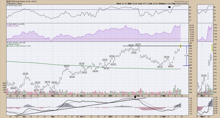
Is Gold the next great trade? We been drawn in before, but today, gold is making a higher high as the banking dilemma unfolds.

Gold pulled back since the beginning of February and bottomed out last week. The chart has been making some aggressive moves higher. While the moves look huge, on a percentage basis, it is up about 9% including the 2% move on Friday.

I think the broader picture on Gold is coming into play. Let’s look at the weekly chart.

1) The SCTR is surging to its highest level on the chart!

2) Relative strength in purple is turning up.

3) Full stochastic is giving a bounce at the 50% level which is a typical bull market bounce location.

4) Price is threatening to break out to new 52 week highs.

5) Volume is accelerating on the breakout.

6) PPO is turning up while above zero. Another bullish clue!

The real question now is can Gold continue?

This looks like a nice setup for a continuation move higher. On the monthly chart it looks nice as well.

Price is moving back above the 2008 high with a nice thrust. We have tested this level for the last three months. I would like to see the volume improveFull stochastic is turning up above 50 for the first time since the Spring of 2022. Is this just coming to the end of its seasonal strong period?I like the PPO crossing the signal line on the monthly chart. This is the first positive cross since 2019. We’ll need to wait for month end to confirm it.

It’s all set up for a run. Keep an eye on Gold in my opinion.

Sometimes markets trend, sometimes they oscillate and sometimes they simply frustrate. I would venture to guess that trading since 2022 falls into the frustration basket. Trend following and momentum strategies are suffering because big moves are failing to extend and develop into trends. Mean-reversion strategies were doing well, but got hit with the regional bank crisis the last two weeks.

Recent selling pressure, however, was not limited to regional banks and the finance sector. In fact, selling pressure was broad enough to push our Composite Breadth Model into negative territory, which signals a bear market. A bear market signal does not always lead to an extended decline, but it does indicate above average risk for stocks and stock-based ETFs. With the environment for stocks looking shaky, today’s commentary will focus on a risk-off ETF and a defensive ETF in a trading range.  

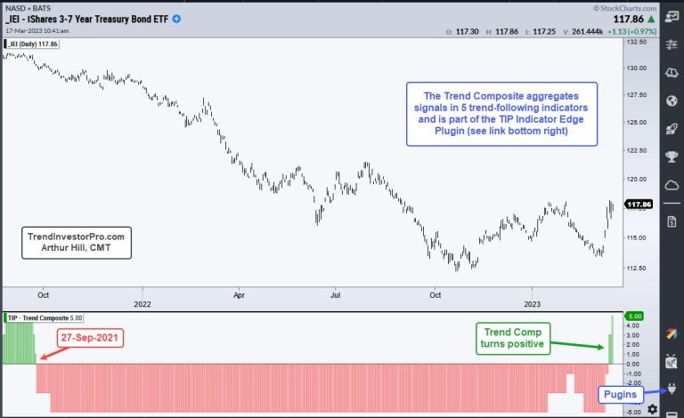
First, we have a non-stock ETF that reversed an extended downtrend with a big surge this month. The chart below shows the 3-7 Yr Treasury Bond ETF (IEI) with the Trend Composite turning positive this week. This reverses a downtrend signal from September 2021. With the March surge, IEI is on the verge of breaking its January-February highs. Also note that IEI was recently added to our All Weather ETF strategy because it was a high-ranking non-stock ETF.

The next chart shows the Healthcare SPDR (XLV) with the Trend Composite. As with any other trend indicator, the Trend Composite does not work when prices oscillate (do not trend). The indicator window shows the Trend Composite whipsawing as XLV gyrates between 140 and 120. XLV is in a trading range so I will be watching the swings for signals, not the Trend Composite. The current swing is down with the early March high marking resistance. A breakout here would reverse the downswing.

Looking for a more systematic approach to trading and analysis? TrendInvestorPro has three quantified trading strategies for ETFs. First, there is an All Weather Strategy that uses market timing to set the tone. Second, we have a trend-momentum strategy that trades the strongest stock-based ETFs in bull markets. And third, we have a short-term Mean-Reversion strategy that trades in any kind of market. Click here to learn more and get immediate access.

The Trend Composite, ATR Trailing Stop and nine other indicators are part of the TrendInvestorPro Indicator Edge Plugin for StockCharts ACP. Click here to learn more and take your analysis process to the next level.

————————————-

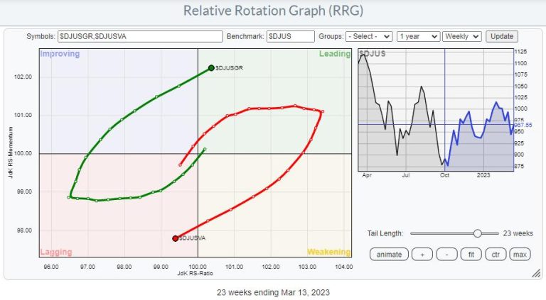
Since late 2021, value stocks have been dominating Growth. The $DJUSGR:$SJUSVA ratio rode the way down together with $SPX. I highlighted this development in a few articles back in 2022.

At the moment, that situation seems to be reversing.

The Relative Rotation Graph above shows the Growth Value rotation on the weekly time frame, with Growth crossing over into the leading quadrant while value moves into lagging.

The rotation on the daily RRG underscores this rotation as it shows how the Growth tail is completing a rotation from leading through weakening and back into leading, getting back in line with the weekly tail. A similar rotation has occurred on the opposite side, with value rotating through improving and now back into lagging.

This means that Growth is now advancing on both RRG axes on both the weekly and the daily time frames.

Adding the Monthly Rotation

Finally, when I bring in the monthly RRG of this comparison.

It becomes visible that the tails have just started to rotate. Value has rolled over inside leading while Growth is curling up inside lagging.

Putting all this together suggests a more significant rotation back to growth stocks is underway.

The 1-1 Ratio Chart is Confirming

Above is the updated version of the 1-1 comparison chart for Growth vs. Value I have used in the last two years.

The big double top is clearly visible. But what’s also interesting is that the price target, based on this double top, was reached almost to the dot. This target coincided with support offered by old highs formed in 2018-2019. A strong rally in favor of Growth is now emerging from this freshly created low.

For this occasion, I have added the RSI (9) and MACD indicators below the plot to point out the positive divergences that have formed between the ratio and these indicators over the last year.

These setups confirm the rotational behavior as seen on the Relative Rotation Graphs.

The Ultimate Growth Universe

The NY FANG+ Index is probably the ultimate growth universe.

Plotting the universe against $ONE clearly shows the general strength of these stocks. Except for NFLX, all are traveling at a strong RRG Heading and inside the leading quadrant or inside, improving and moving towards leading.

Bringing in the $NYFANG index as the benchmark changes the image. First of all, it is now a closed universe, meaning that all index members are on the plot. This enables us to find the strongest and weakest stocks in the universe.

For this occasion, I want to focus on two tails inside the leading quadrant and moving at a strong RRG-Heading; NVDA and AMD.

NVDA

From a relative perspective, however, NVDA is just breaking to new highs against $NYFANG, making it an interesting stock to hold to outperform that index.

NVDA is already well underway on the price chart after completing an H&S reversal in the first weeks of 2023. It is now getting closer to overhead resistance in the range around 280, with support only showing up around the breakout area, making it look like a risky trade from a price perspective right now.

The daily chart shows that over the last few weeks, resistance was built up around 240, and yesterday’s (Thursday, 3/16) jump took NVDA above that resistance level, making it support in the days/weeks to come. Hence from a (shorter-term) trading perspective, this area can be used as a stop-loss level.

AMD

AMD is lagging behind the move, as seen in NVDA on the price chart and the RRG. The good news is that there is probably a bit more upside left to capture in AMD.

On the RRG, AMD has only just crossed into the leading quadrant, while NVDA has the highest JdK RS-Ratio reading in this universe.

On the price chart, AMD is now underway to the next resistance area near 105, while relative strength is about to break its previous high and improve further, targeting the relative highs of 2021 and 2022.

Running the daily RRG for the $NYFANG universe makes this even more apparent. AMD is inside, leading and moving further into it, while NVDA has just rolled over into weakening and seems to be taking a break.

For those who like to trade short-term and a bit more aggressively. Pairing AMD against NVDA could be an interesting combination to watch!

#StayAlert and have a great weekend, –Julius

U.S. Transportation Secretary Pete Buttigieg said Wednesday that the country’s air system was skirting disaster in the wake of multiple near-miss aviation incidents in the past year.

Speaking at an air safety summit convened by the Federal Aviation Administration, Buttigieg said that while the U.S. continues to enjoy ‘the safest and most complex system in the world,’ there are indications that the system is under strain.

‘We can’t wait for the next catastrophic event when we can see the warning signs today,’ he said.

The summit comes amid a recent spate of runway incursions and other near disasters in the skies that have shaken the public.

Buttigieg was joined by Jennifer Homendy, chair of the National Transportation Safety Board, who cited six serious runway incursions since January, including an incident at JFK Airport in New York City involving an American Airlines flight narrowly avoiding an outbound Delta Air Lines flight, and a landing FedEx Cargo plane coming within 100 feet of a departing Southwest Airlines flight at Austin-Bergstrom International Airport in Texas.

The NTSB also continues to investigate two wrong-runway incidents from last June, in Burbank, California, and Pittsburgh, Homendy said.

And it is also looking into two episodes in Hawaiian airspace — one involving severe turbulence aboard a Hawaiian Airlines flight that injured 25 people, and another that saw a United Airlines flight plunge within several hundred feet of the Pacific Ocean.

Homendy said there had been ‘far too many close calls and near collisions’ recently. The incidents, she said, should serve as a ‘wake-up call’ for the industry — yet too often actions are taken only after a disaster has occurred, she said.

She also hit out at long-outstanding recommendations, including a 23-year-old request for technology that would help avoid runway collisions, that have yet to be implemented.

In his February letter convening the summit, acting FAA Administrator Billy Nolen said he hoped it would serve as a ‘call to action’ to implement changes to further strengthen U.S. aviation.

On Wednesday, Nolen cited the recent spate of near-misses, as well as unruly passenger incidents ‘that defy logic,’ as posing threats to air safety.

‘These events are concerning,’ Nolen said. ‘They are not what we come to expect during a time of unprecedented safety in the U.S. aviation system.’

In an interview with NBC ‘Nightly News’ anchor Lester Holt that aired Tuesday, Nolen cited ‘pressures in the system,’ including increased demand for air travel and a wave of retirements in the industry.

This post appeared first on NBC NEWS

WASHINGTON — The former head of Wells Fargo’s retail bank is facing prison time after agreeing to plead guilty to obstructing a bank examination in relation to the sweeping phony accounts scandal that roiled the bank in 2016.

Carrie Tolstedt, 63, faces up to 16 months in prison under a plea agreement with federal prosecutors filed Wednesday. The development marks a rare instance of a senior bank executive facing prison time as a result of their job.

Tolstedt agreed to plead guilty to one count of obstruction of a bank examination and is expected to make her initial court appearance in Los Angeles in the coming weeks, the Los Angeles U.S. attorney’s office said in a statement.

She also faces a civil penalty of $17 million announced separately by the Office of the Comptroller of the Currency, who said Tolstedt was “significantly responsible” for the widespread sales abuses at the bank, where potentially millions of accounts were opened without customer approval.

A lawyer for Tolstedt, who ran the bank’s retail and small business lending from 2007 to 2016, declined to comment. Reuters previously reported prosecutors were targeting Tolstedt.

Wells Fargo paid $3 billion in February 2020 to settle federal civil and criminal probes, admitting at the time that it pressured employees between 2002 and 2016 to meet unrealistic sales goals, which led them to open fake accounts for customers.

A spokesperson for Wells Fargo declined to comment.

No criminal charges against individuals were announced at the time, though in 2020 the OCC filed civil charges against and fined Tolstedt and several other former senior bank executives and barred its former CEO, John Stumpf, from the banking industry. Tolstedt is also now barred from the industry. The penalty announced on Wednesday resolves those charges.

“The justice system and regulators rely on corporations and their executives to fully cooperate during investigations into potential wrongdoing. But, in this case, Ms. Tolstedt took steps to cover up misconduct at Wells Fargo,” Joseph McNally, acting U.S. attorney for the central district of California, said in a statement.

Some said the development did not go far enough.

“Finally, decades after the largest fraud in American history, a banker is going to jail,” said Bartlett Naylor, a financial policy advocate with Public Citizen in Washington. “But Tolstedt did not operate alone; she had bosses. They must face real justice as well.”

This post appeared first on NBC NEWS