Archive

2023

Browsing

On this week’s edition of StockCharts TV‘s StockCharts in Focus, Grayson explores a unique new collection of 7 technical indicators designed to help you identify crucial support and resistance levels and more easily determine how far any security is trading from new highs or lows. You’ll learn how each tool works and see exactly how you can start using them in your own market analysis. PLUS, learn more about our limited-time Summer Sale where you can save up to 30% OFF with 2 FREE months of StockCharts service. Visit StockCharts.com/special to sign up or renew now!

This video originally premiered on July 7, 2023. Click on the above image to watch on our dedicated StockCharts in Focus page on StockCharts TV, or click this link to watch on YouTube.

You can view all previously recorded episodes of StockCharts in Focus at this link.

In this episode of StockCharts TV‘s The MEM Edge, Mary Ellen reviews pockets of strength amid last week’s pullback that signal investor’s bias heading into the second half of the year. She also shares key characteristics of successful base breakouts, as well as a rules-based sell system.

This video originally premiered July 7, 2023. Click on the above image to watch on our dedicated MEM Edge page on StockCharts TV, or click this link to watch on YouTube.

New episodes of The MEM Edge premiere weekly on Fridays. You can view all previously recorded episodes at this link. You can also receive a 4-week free trial of her MEM Edge Report by clicking the image below.

I consider the goal of the trend follower to be threefold: identify trends, follow those trends, and anticipate when those trends may be exhausted. Every day, every week, every month, I’m trying to do those three things in a consistent and repeatable fashion.

That third piece is perhaps the most important. After all, it’s fairly easy to identify new uptrends, and it’s pretty straightforward to follow those trends using a basic stop-loss approach. But anticipating when the trend is over? That’s where things can get pretty challenging, because trends often seem really bullish right up until they aren’t.

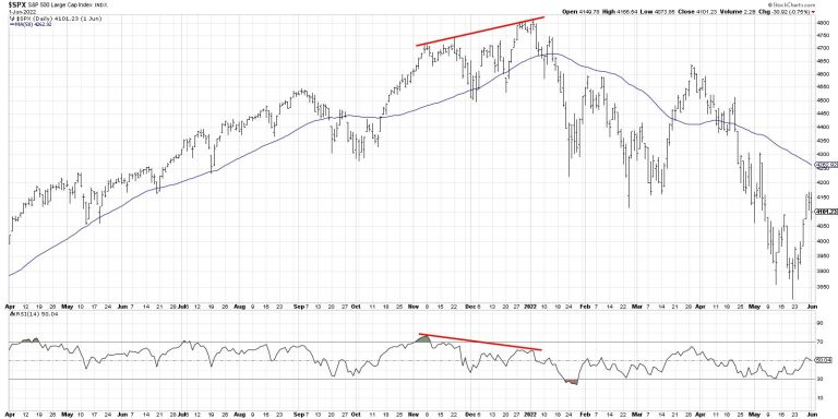
Bearish momentum divergences have become one of my favorite ways to identify potential trend exhaustion points, because they represent a shift in momentum. Instead of the price moving higher on stronger momentum, that positive “mo” is beginning to dissipate.

Here’s a classic example, where the S&P 500 moved higher through the end of 2021 while the RSI sloped lower. A classic bearish divergence occurred, implying that the bull phase of 2021 was nearing its endpoint.

What concerns me here as we begin the 3rd quarter of 2023 is that I’m seeing a growing number of bearish divergences on key growth stocks, as well as with some of our major benchmarks!

Let’s start with the semiconductor group, which was one of the top performers in the first half of 2023.

While so many investors are focused on the upside potential for stocks like NVDA (which is also showing a bearish divergence, by the way), I’m thinking Lam Research (LRCX) provides a perfect illustration of this bearish technical signal.

Note the higher highs in May and June and the downward-sloping RSI over the same time period. Again, this indicates a likely upside exhaustion point, as there is less bullish momentum behind every time the price has moved higher in recent weeks.

Amazon.com (AMZN) provides another great example, because this chart shows both the bullish and bearish momentum divergences in the last 12 months.

While the S&P 500 and Nasdaq made their lows in October of last year, AMZN actually made a new low into year-end 2022. Here, you’ll see that the RSI actually sloped higher from November through December, while the price was making its new low into January. That’s a perfect illustration of downside trend exhaustion in the form of a bullish momentum divergence.

Now, look to the right of the chart and you’ll see the bearish version of this divergence playing out. Higher prices with a lower momentum reading suggest likely upward exhaustion and downside rotation for AMZN. 

Keep in mind that, in both cases, these stocks are in well-established uptrends. As my guest Mary Ann Bartels shared on The Final Bar this week, these stocks have room to pull back, but still be considered in a long-term uptrend. I don’t disagree with that assessment, and I would argue there is plenty of room for downside in the 10-15% range on many leading names. I’d also say that I don’t necessarily feel the need to participate in that downside move if I can avoid it!

That brings me to the most concerning chart of all, the S&P 500 index itself.

The S&P 500 made higher highs in mid-June through the 4th of July holiday, although it trended lower over this timeframe. You may notice a similar pattern in November 2021, which provided a key warning season leading into the end of 2021.

In 2021, of course, the S&P 500 made one final gasp higher, which created a larger bearish momentum divergence using the November 2021 and January 2022 highs.

Could July 2023 end up being very similar to December 2021, with a pullback to an ascending 50-day moving average before a push to new swing highs? Absolutely. And it’s worth noting that, with all of these divergences, there are upward-sloping 50-day moving averages that could serve as an ideal support level in a pullback phase.

But my key takeaway, for now, is that the uptrend phase is most likely exhausted, and to prepare for downside tests of key support levels.

RR#6,

Dave

P.S. Ready to upgrade your investment process? Check out my free behavioral investing course!

David Keller, CMT

Chief Market Strategist

StockCharts.com

Disclaimer: This blog is for educational purposes only and should not be construed as financial advice. The ideas and strategies should never be used without first assessing your own personal and financial situation, or without consulting a financial professional.

The author does not have a position in mentioned securities at the time of publication. Any opinions expressed herein are solely those of the author and do not in any way represent the views or opinions of any other person or entity.

In this episode of StockCharts TV‘s The Final Bar, Dave wraps the week with a focus on a growing number of bearish momentum divergences, including on the S&P 500 index itself! He answers viewer questions on trailing stops, taking profits on strong performers, and running technical indicators on ETFs and mutual funds.

This video was originally broadcast on July 7, 2023. Click on the above image to watch on our dedicated Final Bar page on StockCharts TV, or click this link to watch on YouTube.

New episodes of The Final Bar premiere every weekday afternoon. You can view all previously recorded episodes at this link.

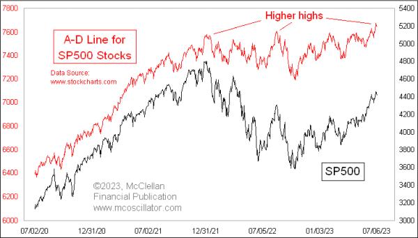
I heard it claimed recently that, because the S&P 500’s daily Advance-Decline (A-D) Line is making a new all-time high, breadth is therefore strong and it is a positive sign for the stock market. But is that really true?

It is indeed factual that the S&P 500’s daily A-D Line has made a new all-time high. But that is not necessarily a bullish development for the stock market, especially when breadth is weak elsewhere.

The whole point of even looking at an A-D Line is to get a different answer from what prices are saying, and hopefully a useful answer. In the A-D statistics, every stock gets an equal vote, unlike the capitalization-weighted indices, which are dominated by the top handful of stocks. The stocks which make up the S&P 500 are the big winners, the varsity team of the stock market. They are not the stocks that are going to give us the first message about liquidity turning bad. For that, we need to turn to the message of the less-deserving small-cap stocks. That is why I prefer getting messages from the NYSE’s A-D Line, which has proven itself to be more reliable over many years.

The NYSE’s A-D Line in late 2021 was showing us a big bearish divergence versus prices, saying that liquidity was having problems. Those problems eventually came around to bite even the big-cap stock indices. And it is still not looking that great now, especially compared to the S&P 500’s A-D Line shown in the top chart, a difference which says that liquidity generally is not doing that well. What liquidity that is out there is being hogged by the big-cap tech stocks, which are the ones that dominate the big-cap indices.

Years ago, I used to believe, as others still do, that the best A-D data was from the “common only” set of stocks. After all, they were the “real” stocks, and not contaminated by the bond closed-end funds, preferred stocks, rights, warrants, SPACs, and other odds and ends that trade line stocks on the NYSE. But that belief changed once I looked at the actual data.

I calculate the A-D data myself for those several different flavors of NYSE-listed issues, and that allows me to create the Common Only A-D Line (and others). Having those data allows me to proclaim that the common-only data are NOT better, and can give misleading indications.

As the stock market was topping in late 2021, the Common Only A-D Line was still making higher highs all the way to early December 2021, saying everything was fine. Other measures of liquidity, however, were screaming that there were big problems. If one had listened to the Common Only A-D data, one would have been misled. the same thing happened in August 2021, when the Common Only A-D Line surged to a higher high, looking better than prices, but that was a bad message about supposed strength.

I also do not like to use the A-D Line for the overall Nasdaq market. It has such a bearish bias that its messages are functionally unusable.

The Nasdaq exchange has much lower listing standards, and because of that the A-D Line for Nasdaq stocks has a tremendously bearish bias. And it always has. If a company is going to go public and go broke, it is more likely to do that on the Nasdaq. And every down day from the IPO price to zero will add to the Declines column of the data. Most technical analysts don’t know that the Nasdaq’s A-D Line has never (not once) made a new all-time high. It started downward from the beginning of the data in 1972, and has never gotten back to that level.

Because of this negative bias in the Nasdaq A-D Line, looking for bearish divergences is pretty much pointless, because they are happening all the time. It is like the Aesop fable about the boy who cried wolf.

The point of using any A-D Line is to have a canary in the coal mine, which will tell you about troubles before the bad gases accumulate to a high enough concentration to kill the big burly coal miners. The S&P 500’s A-D Line is usually stronger than prices, so we never get that message from it. The Nasdaq’s A-D Line is so weak that it is warning of catastrophe all the time. Neither offers useful insights in a consistent way.

One of the best and most reliable A-D Lines is the one using A-D data for high yield corporate bonds.

These issues drink from the same pool of liquidity as the stock market, and so, when liquidity is strong, they do great. When liquidity starts to dry up, they will often show that ahead of prices, which is the warning one hopes to get from using any A-D Line. Right now, the message is that the higher highs being made by the S&P 500 here are happening without strong liquidity; in other words, this is just coming from optimism and not from money. That is a problematic way to run an uptrend.

Sometimes, it’s just that simple.

The Economic Modern Family has had its share of rotation. By rotation this year, we mean that, while Semiconductors wowed, Regional Banks soured. We have looked to certain members of the Family to hold their lead and wait for the other members to catch up. Or, conversely, we have held our breath as we have watched the leaders take a pause while the laggards need to hang in there.

2023 has been a bit of a cha cha cha in that way. No doubt the consumer has participated.

First, the retail investor has gotten the rally right. Secondly, the consumer has gone out this year and spent money. That money has been mainly spent on services though that include restaurants and travel. However, year-over-year credit card spending continues to decline, with the low-income consumers showing the largest rate of decline. We ask, is this sustainable?

Let’s see what Granny Retail (XRT) has to say.

On the Daily chart, XRT is in a bit of a tight range between 63.00-64.50. We love the leadership against the SPY benchmark.

On the weekly chart, we got a second close over the 50-week moving average, or a confirmed phase change to a recuperation. SPY continues to show leadership on a weekly closing basis. Momentum is lagging considerably.

On a monthly chart, XRT has a far distance to go to clear the 23-month moving average. To see sustained expansion, that blue line has to clear.

Putting together all three timeframes, XRT is key. Granny has to breakout over 64.50. Then, we need to see XRT clear the 200-WMA at 65.80 area. Finally, on a monthly chart, we cannot get too excited unless it clears over 70.50.

It’s a battle for sure, and one that will give you the best heads up on recession, stagflation or expansion. At the very least, we can say for now that, while Granny may need her cane to bow, she is yet to leave the mall.

For more detailed trading information about our blended models, tools and trader education courses, contact Rob Quinn, our Chief Strategy Consultant, to learn more.

“I grew my money tree and so can you!” – Mish Schneider

Get your copy of Plant Your Money Tree: A Guide to Growing Your Wealth and a special bonus here.

Follow Mish on Twitter @marketminute for stock picks and more. Follow Mish on Instagram (mishschneider) for daily morning videos. To see updated media clips, click here.

Mish in the Media

Mish, Brad Smith and Diane King Hall discuss and project on topics like earnings, inflation, yield curve and market direction in this appearance on Yahoo Finance.

Mish reviews her first-quarter trades in this appearance on Business First AM.

Mish talks women in the trading space and covers a wide variety of ideas in this interview for FreeFX.

Mish runs through bonds, modern family, commodities ahead of PCE on Benzinga.

Mish explains her bullish call on Bitcoin and provides her price target for the cryptocurrency in this video appearance on CNBC Asia.

Mish shares why the transportation ETF is such an important measure of economic strength and how retail stocks (XRT) continue to underwhelm on the Tuesday, June 27 edition of StockCharts TV’s The Final Bar with David Keller.

Mish discusses how business have been watching Russia in this appearance on Business First AM.

Read Mish’s commentary on how the situation in Russia impacts the markets in this article from Kitco.

Watch Mish’s 45-minute coaching session for MarketGauge’s comprehensive product for discretionary traders, the Complete Trader.

On the Friday, June 23 edition of StockCharts TV’s Your Daily Five, Mish covers a variety of stocks and ETFs, with eyes on the retail sector for best clues in market direction.

Read Mish’s interview with CMC Markets for “Tricks of the Trade: Interviews with World-Class Traders” here!

Mish delves into the potential next market moves for several key markets, including USD/JPY, Gold and West Texas crude oil in this appearance on CMC Markets.

Mish and Dale Pinkert cover the macro, the geopolitical backdrop, commodities, and stocks to watch on FACE Live Market Analysis and Interviews.

Mish and Ashley discuss buying raw materials and keeping an eye on Biotech on Fox Business’s Making Money with Charles Payne.

Coming Up:

July 12: Real Vision

July 13: TD Ameritrade

ETF Summary

S&P 500 (SPY): 443 now resistance, 440 pivotal and 430 support.Russell 2000 (IWM): 185 pivotal.Dow (DIA): 34,000 back to pivotal resistance.Nasdaq (QQQ): 370 now resistance with 360 support.Regional Banks (KRE): 40.00-42.00 current range.Semiconductors (SMH): 150 back to pivotal number.Transportation (IYT): 250 pivotal; under 245, expect more selling.Biotechnology (IBB): 121-135 range.Retail (XRT): 63 support.

Mish Schneider

MarketGauge.com

Director of Trading Research and Education

On this week’s edition of Moxie Indicator Minutes, TG explains that while the market is still strong out there, we just have to be patient for the right opportunities. Many stocks are flagging before they leg up. It’s a fishing kind of market; buy the lows of a range, and then wait for the market to lift things up.

This video was originally broadcast on July 7, 2023. Click this link to watch on YouTube.

New episodes of Moxie Indicator Minutes premiere weekly on Fridays. Archived episodes of the show are available at this link.

On Thursday, the ADP jobs number came in much higher than expected, and annual pay rose at a 6.45% rate. The FOMC minutes earlier this week were tilting towards a hawkish bias. The strong jobs market and the hawkish comments spooked investors. Equity indexes dropped on fears that the Fed may raise interest rates.

But Friday was a different story. The non-farm payrolls increase of 209K in June came in lower than expected, alongside the slowest job growth since December 2020. The number is also well below May’s job creation, which is an indication of a slowing down in job creation. The unemployment rate was 3.6%, marginally lower than 3.7% in May.

The bottom line: Even though the labor market shows signs of modest cooling, the labor market is still hot.

What does this mean as far as interest rate hikes are concerned? The Fed is focused on the labor market. One month’s data doesn’t make a trend, but the general thinking is that the slowing in the job market may not be enough to convince the Fed to keep interest rates unchanged. The probability of a 25-basis point rate hike in the July 26 meeting, according to the CME FedWatch tool, is at 92.4% at the time of this writing.

The State of the Stock Market

The S&P 500 index ($SPX) continued its uptrend, despite the selloff after investors became slightly nervous. The weekly chart below shows the index is still moving higher (higher highs and higher lows) and is on its way to its all-time high. The index has moved above its Fibonacci retracement levels. One resistance level it could hit is the March 2022 high; if it breaks through that, it would be very positive for the S&P 500.

CHART 1: WEEKLY CHART OF S&P 500 INDEX. The S&P 500 is approaching its all-time highs. It could face resistance on its way up. Chart source: StockCharts.com (click on chart for live version). For educational purposes.

The daily chart of the S&P 500 is also bullish. The index is trading above its 50-, 100-, and 200-day simple moving averages (SMA), all trending upward. Market breadth is also positive, with the percent of stocks trading above the 200-day SMA trending higher and more advances than declines.

CHART 2: DAILY CHART OF THE S&P 500 INDEX. The index is trading well above its 50-, 100-, and 200-day moving averages. The percentage of stocks trading above their 200-day SMA is trending higher but declines are greater than advances. Chart source: StockCharts.com (click on chart for live version). For educational purposes.

When a broad index looks overbought, there’s always the risk that it may experience significant declines on any bad news. When the regional banking crisis erupted in March, the index fell, retested its December 2022 lows, and bounced back. Although Technology stocks are the heavily-weighted stocks in the index, financial stocks are also represented. And with big banks on deck to report earnings next week, it’s worth analyzing the KBW Bank Index ($BKX).

KBW Bank Index ($BKX) Technical Outlook

Last month, the big banks passed their annual stress test, which was a welcome relief after the banking crisis in March. Wall St. will be closely watching earnings reported by the banks.

The banking sector took a hit after the banking crisis earlier this year. In light of higher interest rates and an inflationary environment, investors will be looking to see how banks with exposure to interest rates vs. banks with exposure to investment banking, trading, and wealth management will perform. Remember, even though higher interest rates can be profitable for banks, they also elevate the risk of a recession.

CHART 3: THE WEEKLY CHART OF THE KBW BANK INDEX IS STILL WELL BELOW ITS HIGHS. The index is trading well below its 50-, 100-, and 200-week moving averages and its relative strength with respect to the S&P 500 index is weak. Chart source: StockCharts.com (click on chart for live version). For educational purposes.

As you can see, $BKX is still down around 20% for the year. Its relative strength with respect to the S&P 500 index ($SPX) is deeply negative at -51.47%. The 50-, 100-, and 200-day week moving averages are trending lower and $BKX is trading well below these averages.

The daily chart of $BKX is a little more optimistic. At least the index has moved above its 50-day SMA. The index is also underperforming the S&P 500 on the daily timeframe. If $BKX moves to its 100-day SMA, it could hold well for the banking sector. It all depends on the upcoming earnings. JP Morgan Chase (JPM), Citigroup (C), and Wells Fargo (WFC) report on Friday.

CHART 4: THE BANKING SECTOR MAY SHOW SOME STRENGTH. On the daily chart, $BKX is showing some optimism. The index is trading above its 50-day SMA. Will upcoming bank earnings push this index higher? Banks start reporting on July 14. Chart source: StockCharts.com (click chart for live version). For educational purposes.

Stay on top of earnings season with the StockCharts Earnings Calendar. From Your Dashboard, scroll down the Member Tools section and click on Earnings Calendar. Click the Upcoming Earnings tab, filter using the dropdown menu, and identify which earnings will be announcing earnings.

Final Thoughts

With the S&P 500 close to its highs, investors and traders should tread with caution. The upcoming earnings season could have an impact on the performance of the broader market. Keep a close watch on potential support and resistance levels on your charts. Besides earnings, there’s a Fed meeting at the end of the month. Any scenario could play out and, while you can never be fully prepared for what the stock market throws at you, it’s worth anticipating the different scenarios that could play out.

End of Week Wrap Up

US equity indexes down; volatility down

$SPX down 0.29% at 4398.95, $INDU down 0.555 at 33734.88; $COMPQ down 0.13% at 13660.72$VIX down at 14.83Best performing sector for the week: Real EstateWorst performing sector for the week: Health CareTop 5 Large Cap SCTR stocks: SMCI, NVDA, CCL, TSLA, PLTR

On the Radar Next Week

Earnings season kicks off with big banks JP Morgan (JPM), Citigroup (C), and Wells Fargo (WFC) reporting on Friday, July 14.June CPIJune PPIJobless ClaimsFed speeches: Daly/Barr/Mester/Bostic/Bullard/Kashkari/WallerMichigan Consumer Sentiment

Disclaimer: This blog is for educational purposes only and should not be construed as financial advice. The ideas and strategies should never be used without first assessing your own personal and financial situation, or without consulting a financial professional.

Crypto is one man’s anti-soul, and another man’s guiding light. Crypto seems accurately defined as a take on Superman’s kryptonite, where just being near it, has a negative connotation to some investors. Stored in a remote wilderness, and hidden from view, others love the unique traits of cryptocurrency. Most investors have tried to figure out if its a game of selling to a higher loser, or something worth investing in.

Image: courtesy of PixabayIt’s up 80% on the year, and working through the 30000 level to start the second half of the year. The article today talks about some of the setups and different ways to invest around crypto until the US SEC allows direct ETF’s.

What better way to kick off the Calgary Stampede than looking for some bullish crypto setups? Sometimes, just trying to rope them in is tough.

Image: Greg Schnell

After three weeks of sideways movement, what is the trend for Bitcoin? Flat?

American regulators are looking at allowing crypto ETF’s. Canada already has crypto ETF’s, but as I mentioned there are also other ways to play it.

Individual Stocks

Hut 8 Mining (HUT, HUT.TO) continues to climb, working its way up. Bitcoin is sideways and this chart is going up at a 45 degree angle. It’s almost a double since the middle of June.

ARBK is another nice setup. Argo Blockchain has been consolidating similar to Bitcoin, and the stock is paused right at the 200 DMA. Thinly traded is one caution.

Galaxy Digital is a Canadian ticker, where the chart has built a beautiful base.

Coinbase continues to push higher, and also has some significant volume.

Dwight Galusha who works with me, has built a list of charts to invest around the crypto trade and we’ve published a complete Crypto opportunity list to help investors choose from some of the best charts. If you’d like more suggestions on good setups, I strongly recommend trying the Osprey Strategic trial for one month at only $7. It will give you all the current and historical newsletters and videos, along with daily setups and the comprehensive Osprey Opportunities page.

PS. Its the start of the Calgary Stampede! Which marketing slogan is better?

1) “The Greatest Outdoor Show on Earth”

2) ‘The most fun you can have with your boots on! “

Bottom line is its time to kick off the second half of the year, so get out and enjoy!

Gold and silver prices fell on Thursday morning after the US ADP report showed the largest monthly increase since July 2022. The private sector added 497,000 in June, more than twice what economists had expected. At the time of writing, the DJIA plunged nearly 500 points, while gold and silver fell 0.38% and 1.93%, respectively. The report also pushed the US Dollar and US Treasury yields higher.

What’s Causing the Market Reaction?

Three words: Rate hike fears.

Yet gold and silver are at a critical “technical” juncture.

Gold and silver have followed a bearish trend over the last two months. Still, bulls can find a couple of compelling reasons why the ‘correction’ might be at an end. Gold bears had the opportunity to push the yellow metal (COMEX) below $1,900. That was a big fail. Bearish pressure on silver prices, on the other hand, saw a strong rebound at the 200-day simple moving average (SMA).

If you look at gold and silver using their ETF proxies—SPDR Gold Shares ETF (GLD) and iShares Silver Trust ETF (SLV)—you see the same dynamics as in their COMEX futures counterparts.

CHART 1: DAILY CHART OF SPDR GOLD SHARES ETF (GLD). GLD appears to be rebounding from its two-month decline.Chart source: StockCharts.com (click on chart for live version). For educational purposes.

Bears have been in control for a while now, but they’re facing some obstacles ahead. Their immediate goal is to push GLD below its $175 support level, corresponding to a COMEX gold price of $1,900. After that, they’re aiming for the February lows of $173 and then $168 (dashed green lines). On the other side—the bulls—are up against tough resistance levels at $180 and then $184 (red dashed lines), with the latter matching up with a COMEX gold price of $2,000.

Making These Levels Actionable. Actionability depends on whether you’re biased toward the bull or bear side.

If you’re bullish, the upside resistance levels can serve as near-term profit targets. The downside targets can be potential entry points to scale in your long position.If you’re bearish, the upside targets can serve as potential entry points for a short position, while the downside support levels serve as your profit targets.As far as stop losses are concerned, it depends on your trading method. Some traders prefer to place stops at the opposite swing low or high (depending on whether you’re going long or short).

This applies to SLV’s chart below. Note that a break below SLV’s 200-day SMA may provide an immediate trade entry signal should the price cross below and close below the moving average. Speaking of SLV, let’s get to that chart next.

CHART 2: DAILY CHART OF ISHARES SILVER TRUST ETF (SLV). SLV is bouncing resiliently off its 200-day SMA.Chart source: StockCharts.com (click chart for live version). For educational purposes.

Bears are facing immediate challenges as SLV has been rebounding quite resiliently off the 200-day moving average Still, their goal remains to force SLV below the 200-day SMA with possible objectives at historical support/resistance areas at $19.50, $18.80, and $18.35. As for the bulls, SLV faces resistance at $22.50.

Looking at Support and Resistance on a Weekly Scale

On a weekly scale, widening your view to a four-year lookback, you can see how strongly markets have reacted at the $186.00 (resistance) and $165.00 (support) levels. Note that GLD has attempted to break above the $186.00 level three times in four years but failed at each attempt.

CHART 3: WEEKLY CHART OF SPDR GOLD SHARES ETF (GLD). Looking back four years, you can see the most heavily traded areas and how those areas have contained most of the price action since mid-2020.Chart source: StockCharts.com (click on chart for live version). For educational purposes.

Volume by Price reflects the significant amount of trading at these levels. Looking forward, you can expect that these “popular” levels may continue to hold unless compelling fundamental factors give bulls or bears a reason to break the range.

As for silver, looking back over the last two decades, there’s a strong range of support within the heavily traded range of $16.00 to $18.50 (green dashed lines).

CHART 4: WEEKLY CHART OF ISHARES SILVER TRUST ETF (SLV). Over a 20-year lookback period, $25.50 looks pretty formidable, as does $16.00.Chart source: StockCharts.com (click chart for live version). For educational purposes.

The level of $25.50—the 2011 low above which SLV attempted to break above four times between 2020–2022—marks a strong level of resistance that SLV will eventually have to challenge should it get above $22.50 and then $24.00.

The Bottom Line

The recent rise in employment figures has spurred concerns over potential rate hikes, significantly impacting gold and silver prices. However, current market dynamics suggest that gold and silver are at a critical technical juncture, showing signs of resilience despite ongoing bearish trends.

Crucial support and resistance levels have been highlighted for both metals, indicating potential thresholds for future movements. While the bears have their sights set on pushing prices below these support levels, the bulls face an uphill battle against formidable resistance. Ultimately, the path forward depends on how well each side can navigate these obstacles and how future fundamental factors influence investor sentiment. For now, all eyes remain focused on these key price points as the struggle between bulls and bears continues to play out.

Disclaimer: This blog is for educational purposes only and should not be construed as financial advice. The ideas and strategies should never be used without first assessing your own personal and financial situation, or without consulting a financial professional.